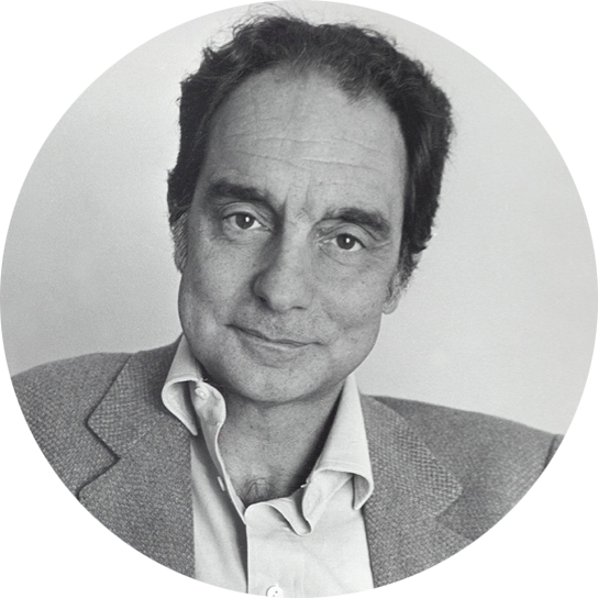
Designing in the Borderlands
In April 2014, I was invited to speak at Harvard University by the Graduate School of Design. Thanks to Craig Mod and Rob Giampietro for listening as I developed these ideas.
Today, I want to begin by pointing to the writer Italo Calvino, and more specifically, a small book of his named Six Memos for the Next Millennium. In 1985, Harvard invited Calvino to participate in the Norton Lectures, and he chose to share what he considered the six ideal qualities of literature.
- Lightness
- Quickness
- Exactitude
- Visibility
- Multiplicity
-
Consistency
The memos were written in preparation for the talks, but Calvino suddenly died on the eve of his scheduled departure for Cambridge. The last memo on consistency remained unwritten, but the rest were published a few years later as Six Memos in their unresolved entirety. I’d like to share a quote from the first memo on lightness, which has been on my mind the past few weeks. Calvino wrote:
“Whenever humanity seems condemned to heaviness, I think I should fly like Perseus into a different space. I don’t mean escaping into dreams or the irrational. I mean that I have to change my approach, look at the world from a different perspective, with a different logic and with fresh methods of cognition and verification.”
I’m not in a position to fret about humanity’s condition, but I do sympathize with Calvino’s desire to shed weight. Design has become very heavy to me the last few years. As I’ve pursued my practice, many of the field’s principles and expectations have become unwanted baggage that slow, fatigue, and sometimes worry me. To be clear: my belief that there are flaws in the mold of a designer does not suggest the mold is wrong, just that we may need more than one kind, simply because I find the mold really, really uncomfortable.
Calvino’s quote offered me a way out this awkward situation: you can drop the baggage and begin a search for new ways of thinking and different methods of validation. I’d like to use my time today to share my personal view, and weave those thoughts through my work and that of others.
Design Ideals
Throughout my career, my ideal of design has changed.
Design as Decoration
Design began as a method of decoration. I discovered the field from a love of drawing and music, so I was very mindful of the need to make things aesthetically beautiful, witty, and charming. I spent years in this mode, and it attracted a lot of work.
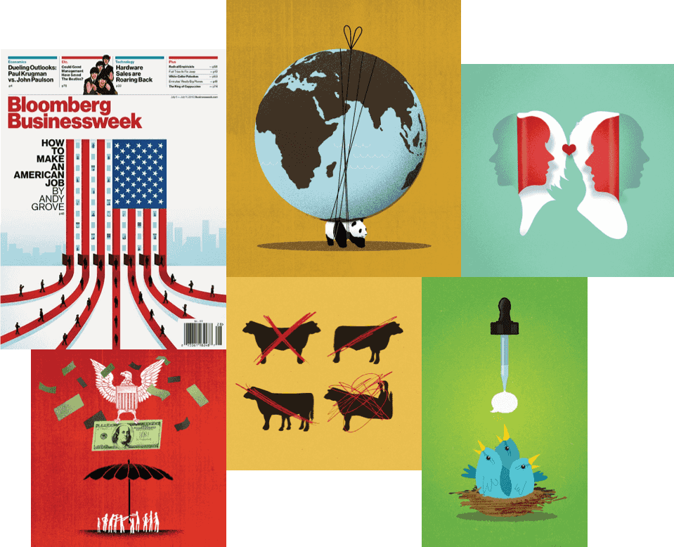
Here are some old editorial illustrations I did for publications like The Atlantic, Time, and Newsweek. I worked this way for years, but eventually became tired of the perpetual cleverness and exuberance the work asked of me. I can’t disown this work—many still like it, and I do too—but the monotony of the media cycle and the necessity for cleverness compounded the anxiety and desperation in trying to be witty and likable to as many people as possible. I found myself slowly turning into the design version of a sad clown. It was time to change my frame of reference, and I began to find relief in the sturdiness of systems.
Design as Construction
Every designer worth their weight eventually reaches beyond appearances and begins to consider how their work operates. A few years ago, design changed for me from a method of decoration into a manner of construction. How do the pieces fit together? How can we design things so they are useful, scaleable, maintainable? I stopped illustrating and began consulting and working as an interface designer. I still love doing this sort of work, but the expectations of this kind of construction often forces a brute simplicity. This fulfills the need for interchangeable, stable pieces, but often zaps the potential for heart, individuality, and resonance. I’ve come to understand that some things are truly diminished when they are simplified and forced to scale.
The principle of design as construction had other flaws: mainly that I continued to maintain an unusual side-practice of writing and personal projects, and design as construction didn’t fit what is my most well-regarded work. So, again, I went searching.
Design as Articulation
Today, I believe design is also a process of articulation. This third definition emphasizes clarity, fluency, and coherence over the maddening prettiness of my first definition and the reductive cohesion of my second. Perhaps the best thing you can do with a problem is describe it as accurately as you can, then chip away at it with as much insight, clarity, humility, and kindness as you can muster.
Of course, all three of my definitions mix to form the whole truth, but now that I’ve discovered the third, I feel I have the full map of the terrain. I’ve made an X on the third territory to mark it as my creative homeland.
“A process of articulation” is an apt phrase. The writer George Eliot has a quote I quite like. She wrote:
“For character too is a process and an unfolding.”
Of course, she is discussing the character of people, but I believe projects also have character. In other talks, I’ve said that problems have a natural grain, just like materials. The grain suggests the best way to treat the problem, much like how the grain of wood can show you how to cut, bend, or fasten it. Go with the grain and your work improves by using natural affordances; go against the grain and you undermine the integrity of your construction by weakening its materials. It takes time for the problem’s grain to unfold, but once it starts to show itself, the articulate designer can begin describing what they sense.
With this new focus, the design process becomes an attempt to make the work ever more definite, nuanced, and clear. My first attempts at being articulate with my design were odd, like I was working with phantom limbs.
Graphic design so often resembles drawing, yet this new approach more closely mimicked my experience writing. The challenge was the same: words, often to my frustration, force the writer to be specific, and now I was fighting the same battle against ambiguity on a different field. The similarities were striking, and one question kept coming up: Can you write a design?
Unfortunately, I don’t have an answer for that question today, but the asking shifted my focus. I started to chase verbs, and began to see how limiting nouns can be.
Homelands
When it comes to nouns, I have a public relations problem: no one knows what I do.
Let’s say I’m at a party with professional peers who are familiar with my work: designers, typographers, illustrators, web folks, and so on. The party, naturally, is all sectioned off into cliques like a middle school dance, so I make my way around and enjoy conversation. No one notices it, not even me, but I’m shapeshifting. I talk to the designers and they think I’m an illustrator. The illustrators think I’m a web guy. The web folks think I’m a typography person. The type people think I’m a designer.
In reality, I’m probably an amalgamation of all of those things, and each person I’m talking to is cherry-picking a facet of a whole.
Maybe I was born this way. If so, at least I’m named correctly: Chimero is the male version of Chimera, the Italian mythological beast with the head of a goat and lion, the body of that lion, and the tail of a serpent. The beast is goofy looking, but I take some comfort that they were also believed to breathe fire. That’s pretty cool, but I still don’t know what to do with that extra goat head.
From Wikipedia:
“The term chimera has come to describe any mythical or fictional animal with parts taken from various animals, or to describe anything composed of very disparate parts, or perceived as wildly imaginative or implausible.”
Implausible is a nice word. Increasingly, I feel my standard mode of working is implausible. For a long time, I perceived my practice’s sprawl as a defect—evidence of an itchy mind or a fear of commitment—but I am starting to learn that a disadvantage can turn into an advantage with a change of venue. The ability to cross borders is an asset. Who else could go from group to group and be welcomed? The pattern happens over and over: if you’re not a part of any group, you can move amongst them all by tip-toeing across the lines that connect them.
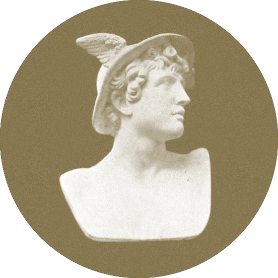
In mythology, these figures are called tricksters: the shape-shifting Loki, Coyote across the American West, Hermes, the god of transitions, boundaries, trade, thieves and wit, and Prometheus, who pulled off the greatest heist in history by stealing fire from the gods and giving it to man. Then there’s me, I guess, doing my idiotic things.
A trickster’s chief job is to be a walking contradiction and creative idiot—to move among realms to mix things up and keep it from getting static and stymied. Sometimes the pot is stirred from the trickster’s cunning, other times from their sheer stupidity. I identify with that a lot. I may have a public relations problem, but it’s nice to finally have a job description.

Walking the Line
Let’s talk a bit more about those lines that connect. There are couplings in design that are frequently presented as dichotomies.
- physical / digital
- text / image
- writing / designing
- criticism / participation
- authorship / client work
- art / design
We spend a lot of time making arguments over how to choose sides on these splits. But after a lot of reflection, I’ve decided that I’m not particularly interested in choosing sides.
I want to be the line, and I want to mess with that line, because that line is a total fabrication. Why fall on the side of print or digital if what’s usually needed is both? Isn’t that a more interesting design problem? Why make books with only text or images if they get better with both? The questions go on and on.
Luckily, these distinctions were drawn by us, which means that we can redraw them. We can move the line, toe it, and breach it with a transgressive practice that tries to turn opposition into symbiosis. But you can only cross the line and confuse the distinction if you commit to the middle space.
These borderlands are the best place for a designer like me, and maybe like you, because the borderlands are where things connect. If you’re in the borderlands, your different tongues, your scattered thoughts, your lack of identification with a group, and all the things that used to be thought of as drawbacks in a specialist enclave become the hardened armor of a shrewd generalist in the borderlands.
This isn’t a new position—not everything used to be so swayed toward specialization. I look at my heroes, most of whom were working in the 60s:
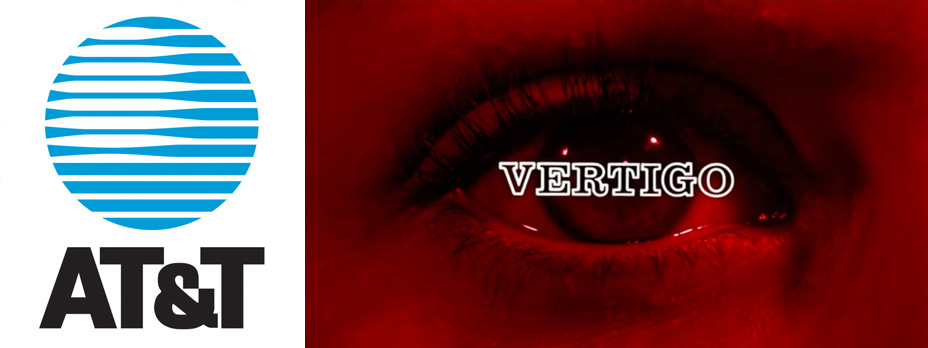
Saul Bass designed the logo for AT&T and the title sequence to Vertigo.
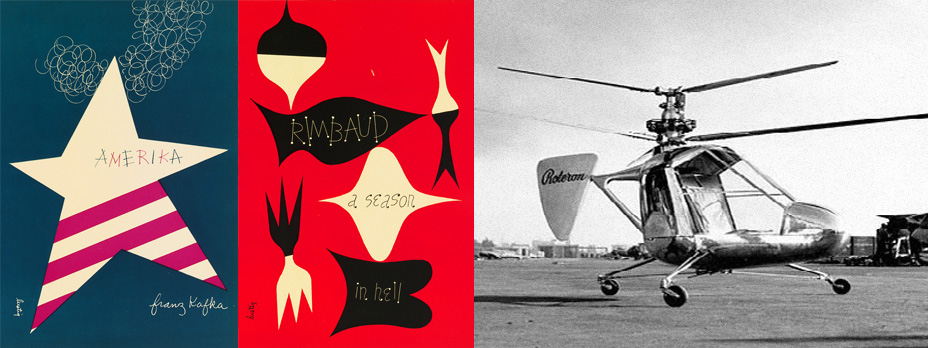
Alvin Lustig made some of the best book covers, but also designed this helicopter.
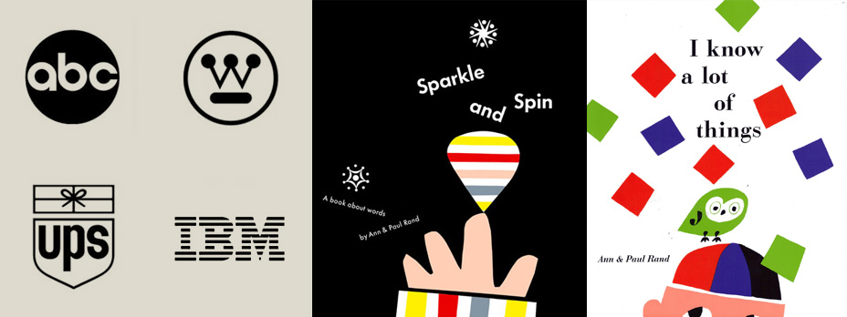
Paul Rand did quintessential corporate identity work while illustrating his wife Ann’s children’s books.
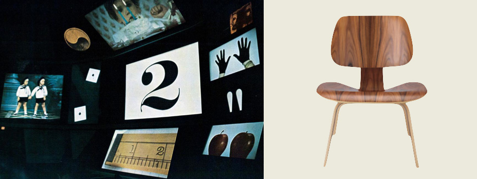
The Eames made films about information theory and the scale of the universe, then designed the theater and chair you’d sit your ass in to watch them.
Granted, the walls between the disciplines are much higher now than they were back then. But, I believe, every once in a while it’s worth having someone stand in front of you and say that the walls that separate things are usually stupid, and they deserve to be stepped over whenever possible.
Translation
There’s one particular stupid wall I’d like to focus on today: the one we built between print and digital formats. I’m skeptical, so I have some questions. Why do we think they’re at war with one another? Why does one need to kill the other? What kinds of interesting things happen if we keep both on the table?
The main line of inquiry of my career has been about undermining that barrier between print and digital. Rather than having a division, I make things that trade across the boundary. I’m acting as a merchant, a translator, and at my worst, maybe even a smuggler.
physical ↔ digital
We’ve spent the better part of the last two decades digitizing elements of the physical world, but it’s important to remember things can go both ways. We’re aware that digitizing print makes information indexable, searchable, networked, and hyperlinkable, but we too often forget that pulling digital data out of the computer has its benefits too. In my mind, making a book is the main form of stabilizing screen-based content.
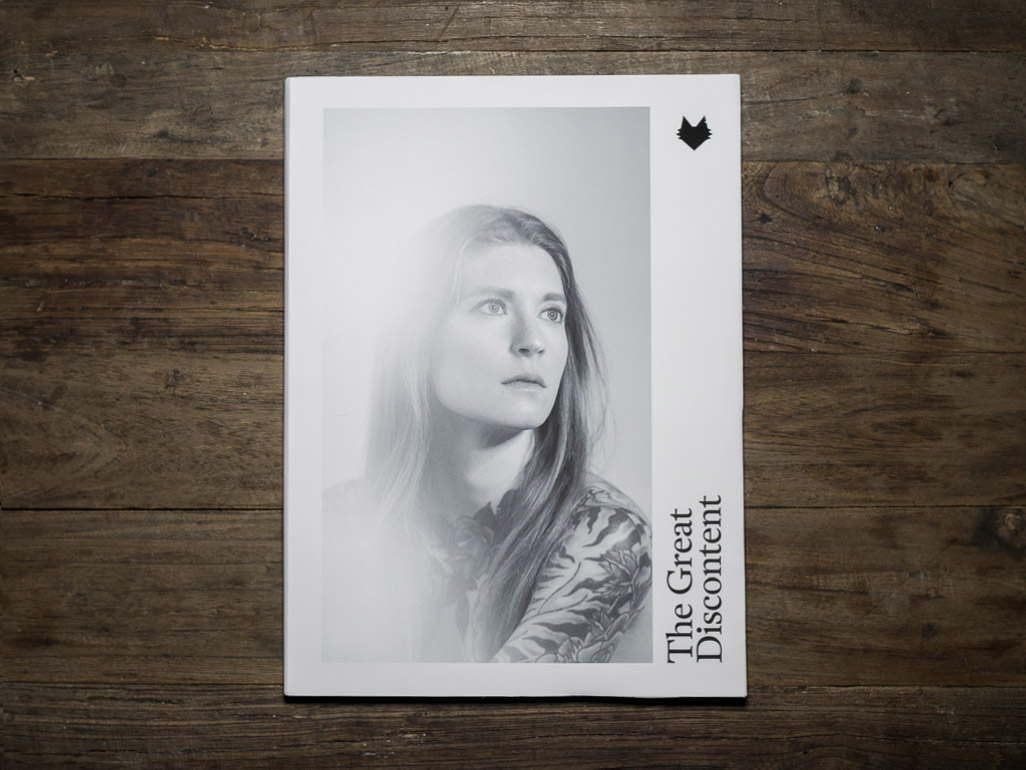
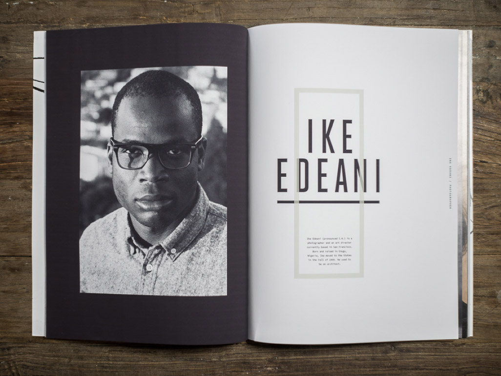
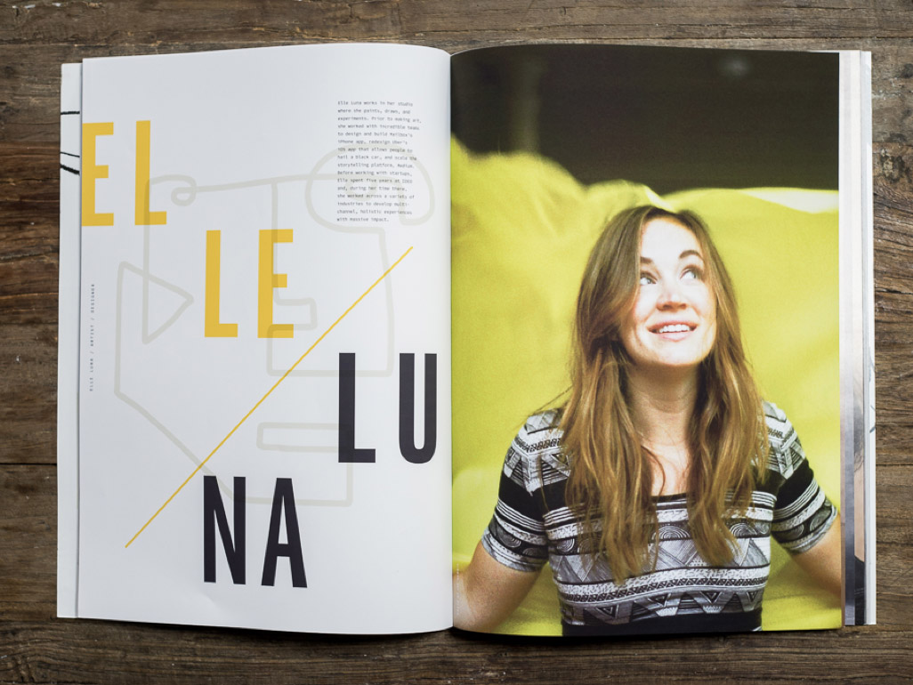
Stabilization across mediums is the main design challenge of a current project of mine. My friends Tina and Ryan Essmaker run an interview site called The Great Discontent, and in March of this year, they raised funds to catalog their best interviews in a bi-annual magazine. They hired me to design it, so now I’m acting as design translator.
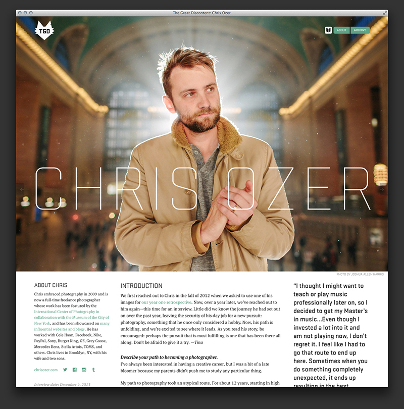
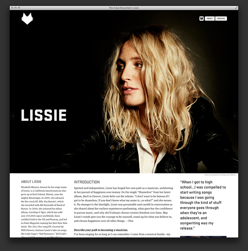
The site has a design vocabulary that borrows heavily from print: strong portraiture and photography, bold typography, pull quotes, and a modulated grid. My job is to take the existing design system, develop it further for the printed magazine, and position it so Ryan—who designs the site—can grab some of my design choices and apply them back to the web. So, we’re going:
physical → digital → physical → digital
Needless to say, Ryan and I are flip-flopping inside a design process that’s a bit like the telephone game. Things get distorted in interesting ways as they move along.
Moving things from screen-based mediums into printed matter to stabilize them isn’t new territory. We’ve been doing it since screens became commonplace in the ’70s.
Perhaps you’ve seen this clip:
If you’ve ever studied art history or taken an art appreciation class, you’ll recognize John Berger and his television series Ways of Seeing, which aired on the BBC in 1972. Or maybe you’re more familiar with the seminal book that came after, designed by Richard Hollis.
Ways of Seeing provides an interesting case study of how translating from one medium to another informs certain design decisions. For instance, the text begins on the front cover, almost like the cold-opening of the first episode of the series, embedded above.
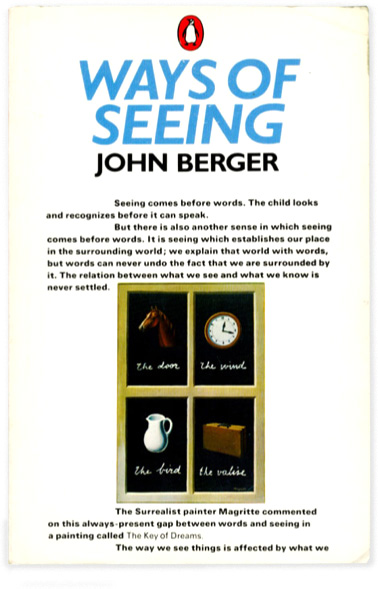
Most interesting to me is the choice to typeset the book in a bold weight of Univers, justified by Hollis as an attempt to give the text the same color and weight as images. The printed design choices are meant to mimic the dual stream of television: being able to simultaneously see an image and hear a word.
Of course, this is an impossible task because both images and the printed word depend on the eye. In spite of this, the book adaptation of Ways of Seeing still captures the magic and clarity of the original television series.
Ways of Seeing wasn’t the first book to integrate images and text into a unified narrative stream—different approaches have existed since medieval illuminated manuscripts and Laurence Sterne’s Tristram Shandy. In 1967, five years before Ways of Seeing, Bantam Books released The Medium is the Massage, a pocket-sized paperback intended to be a visual translation of Marshall McLuhan’s media theory originally published as Understanding Media.
Here are a few spreads from Medium is the Massage, so you can better understand what I mean by “visual translation.”
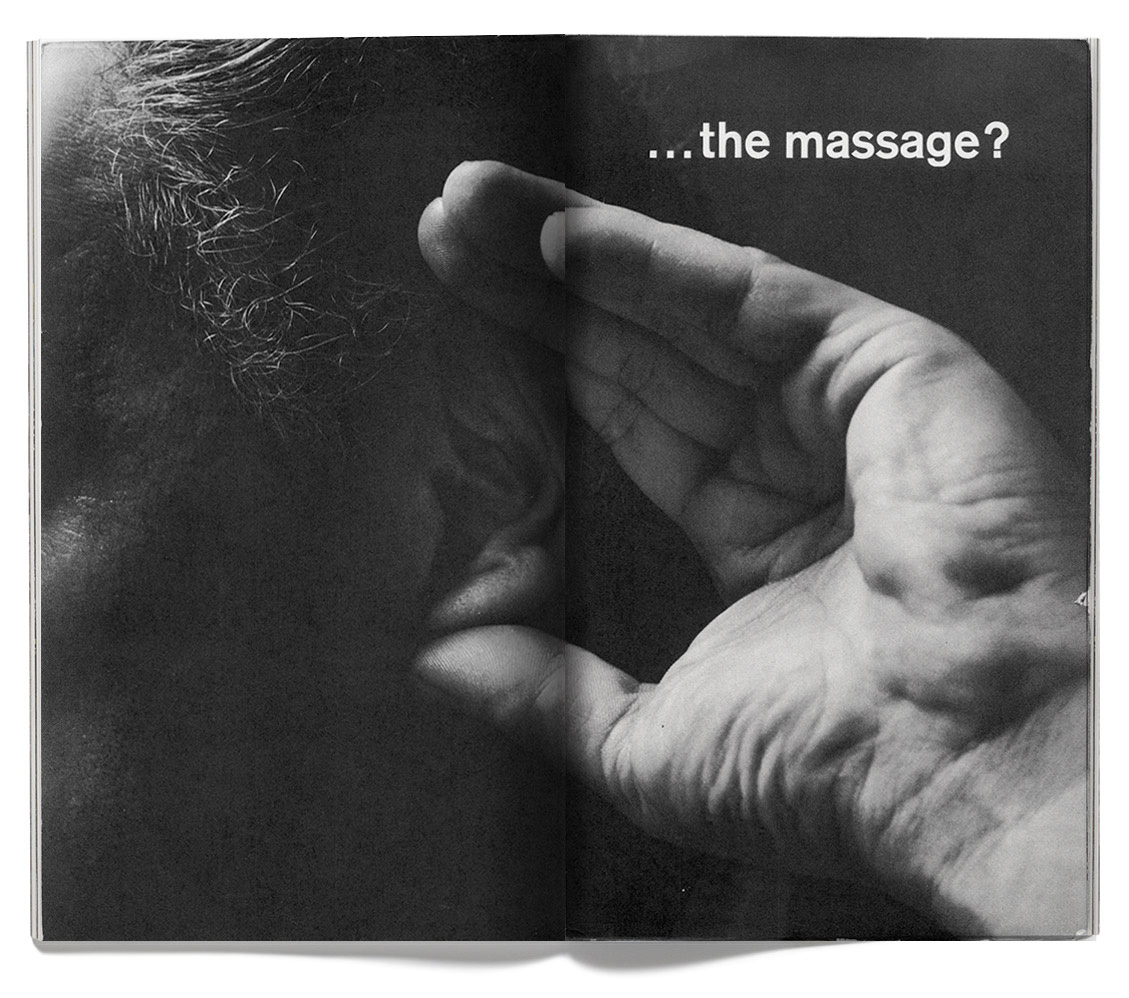
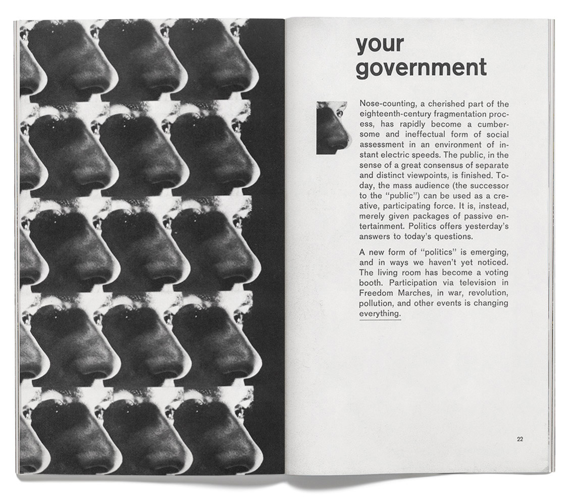
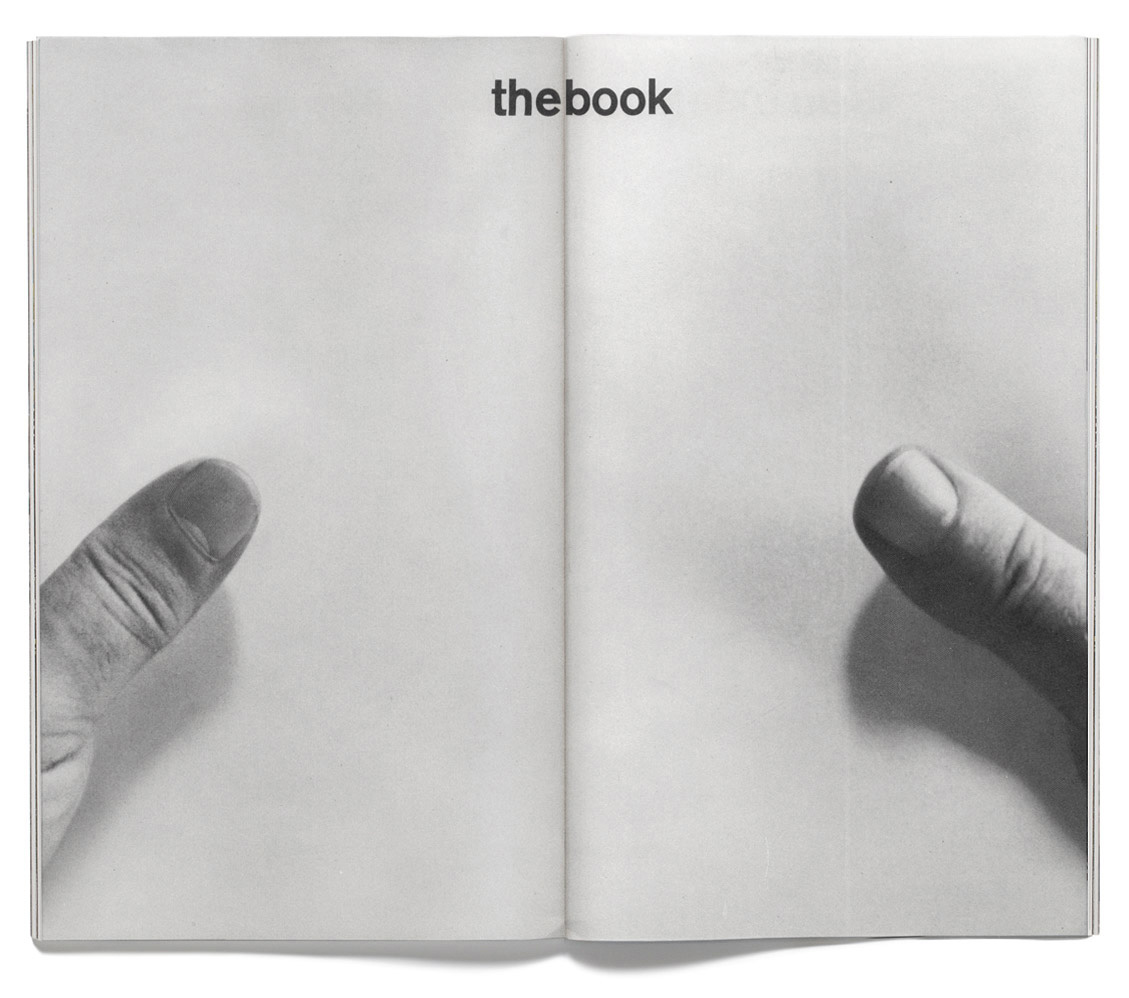
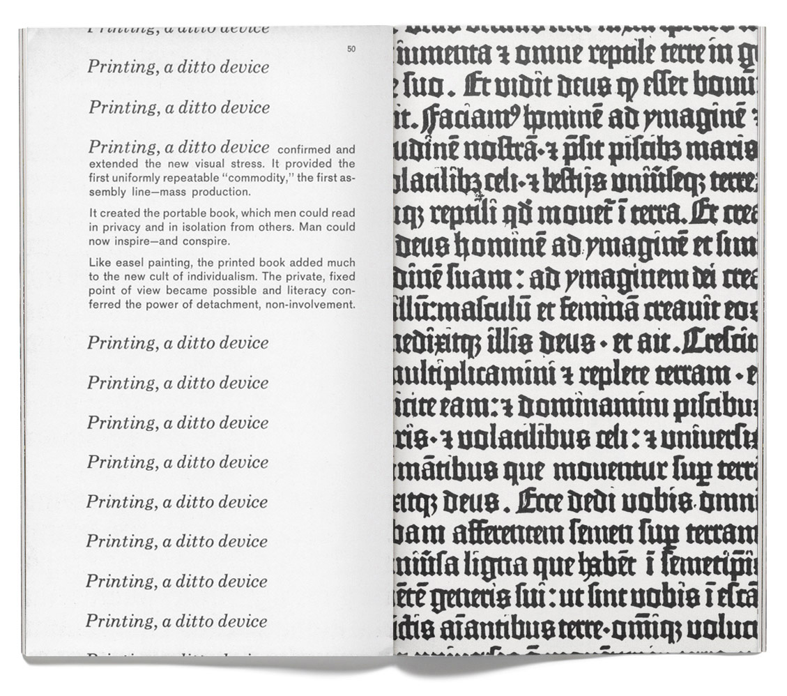
Returning to the cover, you’ll notice a second name with Marshall McLuhan: Quentin Fiore, the Canadian designer. The concepts were McLuhan’s, but the expression of those ideas belonged to Fiore, rightfully earning him the title of co-author. Concept, text, and imagery are so tightly braided together they can’t be stripped of one another without loss of meaning.
The paperback translation of Understanding Media was such a success the translations continued. Fittingly enough, Massage began to jump from medium to medium. Shortly after the release of the paperback, CBS Records released a record based on the book. Of course, it was not a vanilla audiobook: McLuhan and Fiore collaborated with producer John Simon to release The Medium is the Massage on vinyl in 1967. The record was publicized as the “first spoken arts record you can dance to.” If you’re skeptical like I was, here’s a little sampling:
Yes, that voice is McLuhan himself.
Other similar projects were initiated by Jerome Agel (credited as “book producer” on Massage, who introduced McLuhan to Fiore, and was listed as having conceived and coordinated everything). Titles included collaborations with Carl Sagan, Stanley Kubrick, Buckminster Fuller, and Issac Asimov; all retained the textual/visual authorship exemplified in Massage.
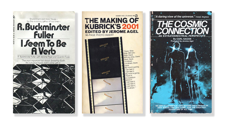
I discovered the more rare titles in Agel’s production portfolio a few years ago, and they have aged very well: their design approach to visuals and authorship seem to be just as appropriate today as they were in the late ’60s. But a question kept coming up when I considered the books in the context of the visual literacy we now all possess by being steeped in this multi-media internet. I kept asking myself: Why aren’t designers still making work like this?
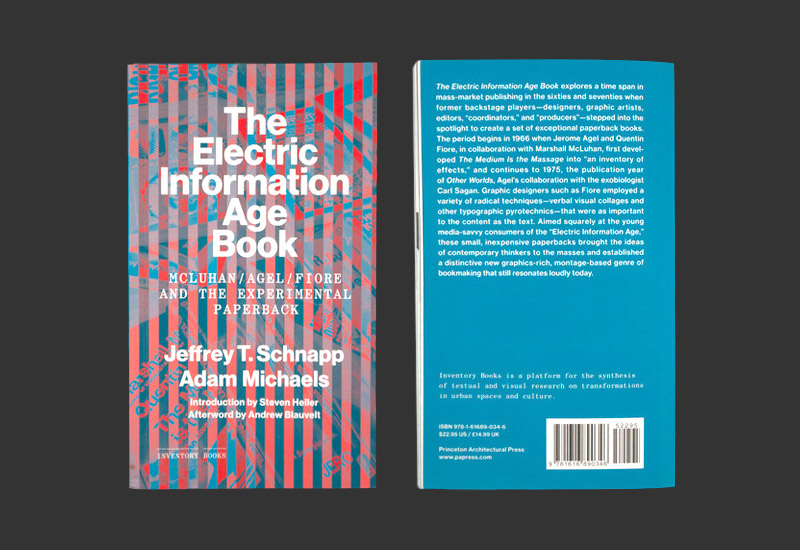
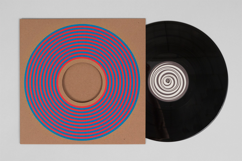
Others have been asking the same question. In 2012, Princeton Architectural Press published The Electric Information Age Book by Jeffrey Schnapp and Adam Michaels, a survey of Agel’s projects and other related titles. EIAB is similar to Message in that the project is a collaboration between a scholar (Schnapp is the director of metaLAB at Harvard) and a designer (Michaels is a principal at Project Projects in New York).
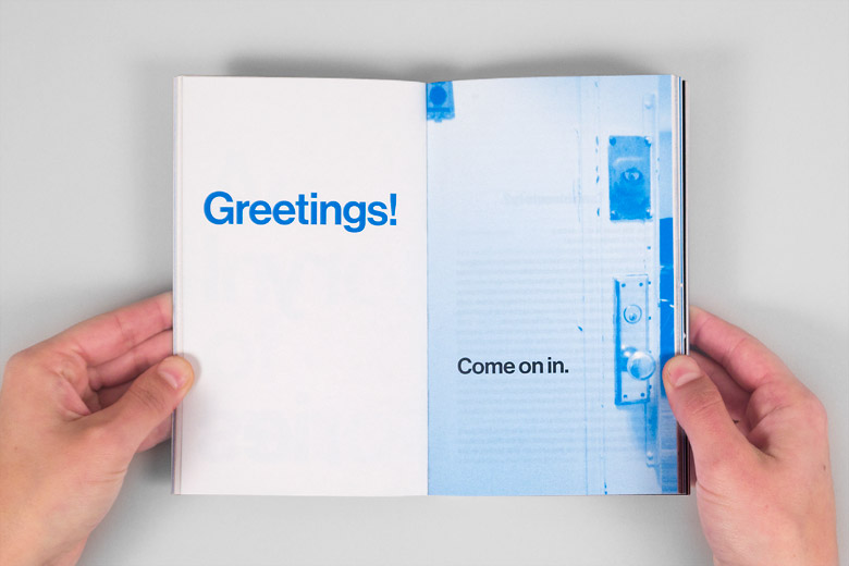
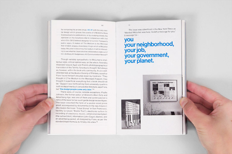
The design approach is similar, too:
EIAB followed a similar translation process. As with all things this decade, the book eventually found its way into a tote.
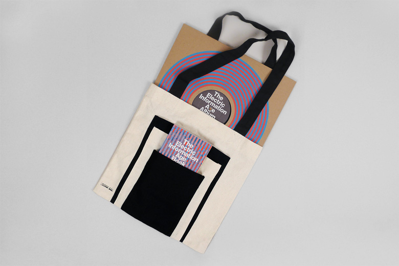
But this is no normal tote. The bag is about formats—each pocket is designed to hold a paperback, a Kindle, an iPad, and, of course, a vinyl LP.
Schnapp and Michaels formed a band called , then recorded an homage to The Medium is the Message LP from ’67 by merging post-punk, mutant disco, Chicago juke, and other styles with samples, quotations, and text from The Electric Information Age Book.
Now, to retrace our steps: it started with an academic text. That text was transformed into a visual paperback. That paperback was translated into a record. That record and paperback inspired the writing of another paperback, that paperback led to a band, and that band released a record, which you can go buy on their Bandcamp profile. Our journey:
dense book → friendly book → record → paperback → tote → record
All of these individual artifacts can be conceived of separately, but they are more potent when considered together: a constellation of influence, a set of ideas whose edges keep moving further out. Each piece shines on the rest of them, and like the intermingling of images and text in Massage, attempting to isolate these qualities diminishes them.
But this is tracking the progress of an idea through time. How could a designer straddle the lines of different approaches and formats from the onset of a project? I’m glad you asked.
In early 2012, while Schnapp and Michaels were releasing The Electric Information Age Book, I had a mess on my hands from a book of my own.
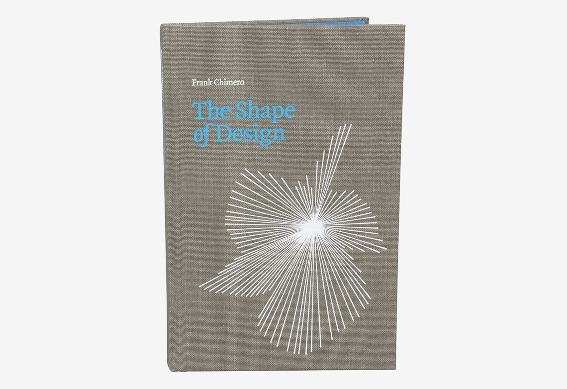
I had finally finished writing The Shape of Design and now had to face its design and illustration. The book was funded through Kickstarter and I was independently publishing the title, so I retained the right and could, literally, do whatever I wanted. I felt obliged to seek an interesting design approach because of my unique situation. My Kickstarter campaign had promised backers physical books, ebooks, and a publicly accessible website with the full text, so I had the opportunity to design the system in a way that most normal publishers can’t (or don’t, or won’t) consider.
After much consideration, I decided that I needed to start with the most limiting factors, develop some rules, then see how those rules applied to the rest of the design system (printed book, ebooks, book merchandise, etc.)
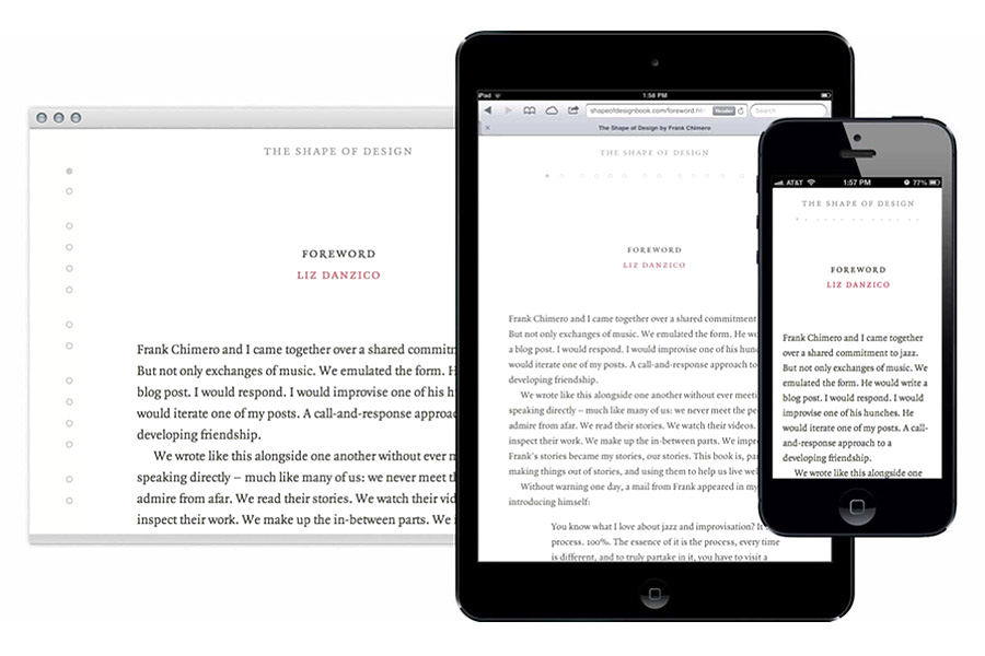
Here’s a photo of an interior spread:

You’ll notice that the book is typeset in one typeface at one size. Kindles made me do it. E-Readers and their interfaces can scale text based on the user’s preferences, which is great for customization and accessibility, but sometimes a nightmare for legibility if the user modifies the type size for easy reading of the body copy, and in the process renders the now-embiggened headlines as gargantuan. By making all the type the same size, and using negative space and capitalization to produce hierarchy, all the book’s text retains its hierarchy, regardless of the user’s settings.
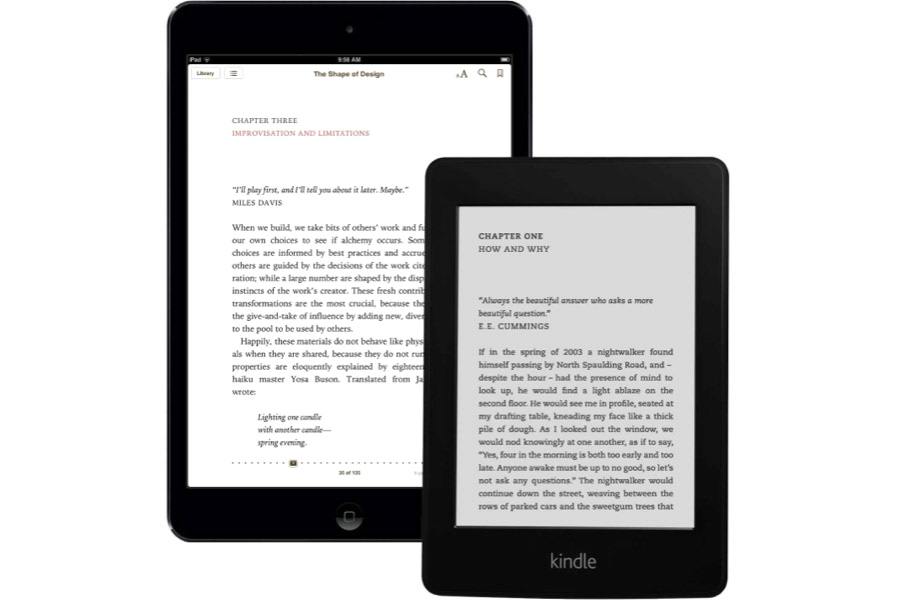
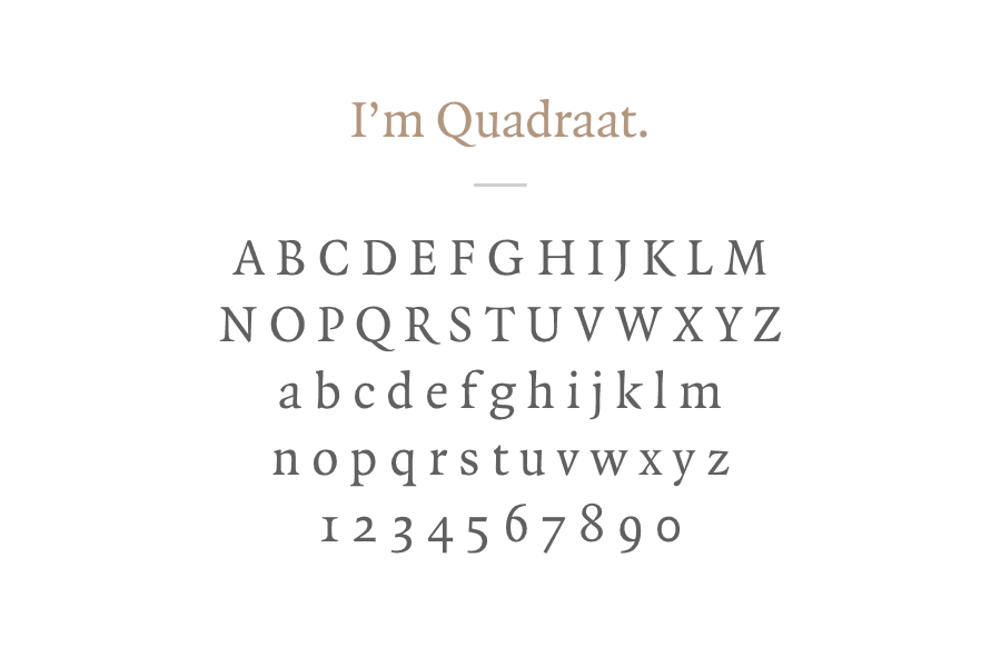
Even the choice of typeface, Quadraat by Fred Smeijers, was influenced by the most limiting environment. Quadraat’s bookish air, legibility on screens, quality hinting, and availability for webfont use made it a clear winner. (Since early 2012, webfont selection has greatly improved.)
Digital considerations even influenced the cover. The design was made to scale well, from the belief that this particular book cover needed to be legible at the small sizes frequently used in reading apps. Here’s a screen grab from Apple’s iBooks interface:
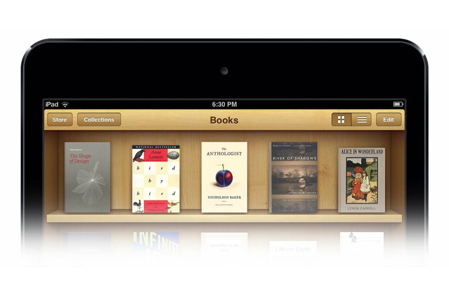
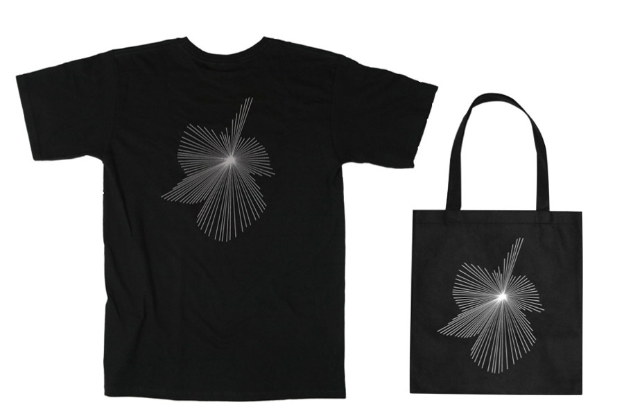
In a strange way, the design of the cover turned into a logo or icon project. The starburst pattern became an important asset, especially when I had to design all of the merchandise that was set to ship out to Kickstarter backers with the book. The burst became a brand.
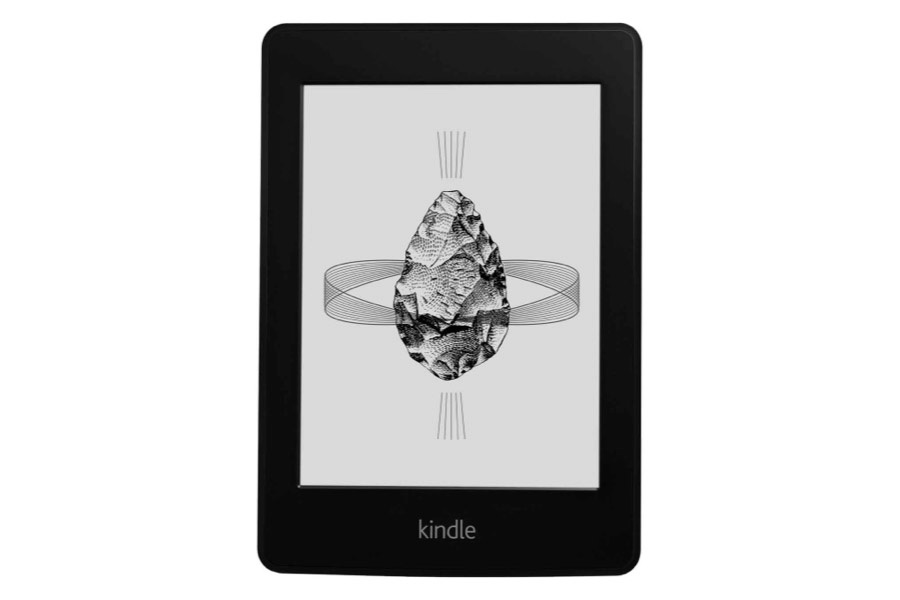
Limitations kept guiding my hand. The line etching illustration style was determined by what looked best on a Kindle’s e-ink screen. And the type system of the printed book and ebooks transitioned over to the responsive website, so anyone could read the book on any device.
I learned a lot through the design process of The Shape of Design. First, that there are opportunities to produce projects that elegantly incorporate multiple mediums. One only needs to look for them. And second, that these design problems become easier to handle if one considers the system as a whole, instead of attempting to chop it up into separate pieces and attack it as smaller bits. Division reduces them in the same way that Massage, Electric Information Age Book, or The Shape of Design would be made small if the individual parts were isolated. The individual bits would behave differently, and the designer would miss the most important thing: these projects are important and big because they are multiple, and to temporarily make them not so is to misunderstand and misconstruct them. For these sorts of projects, my mantra has become: everything all at once, everything all together.
I had two goals today.
First, I wanted to articulate the biggest opportunity I see in design today: designer as translator, designer as integrator, designer as a merchant of ideas. We’ve built up so much knowledge that is tucked away in books and websites, and often all that’s needed to get that knowledge the attention it deserves is a gentle massage of tone and a switch of format. We can introduce physical materials to the web to reap the benefits of the network, but we can also translate the web’s content to the physical realm to stabilize it so it can be held and appreciated.
The second goal was to cast an additional mold for a designer, and to provide an explanation about why a person would want to go make weird little books and sit and write essays instead of working at an ad agency or startup for six figures. It’s worth documenting the different ways one can go about pursuing a design practice. There are many stories and paths, and I hope all of this is a reminder that the lines we draw to create the contours of our expectations can be disrupted. And that this disruption can, somehow, be soothing to those of us who identify as something different than the standard.
I’d like to finish by revisiting that Calvino quote:
“Whenever humanity seems condemned to heaviness, I think I should fly like Perseus into a different space. I don’t mean escaping into dreams or the irrational. I mean that I have to change my approach, look at the world from a different perspective, with a different logic and with fresh methods of cognition and verification.”
I hope you get the opportunity to do this at some point in your career, and that my conclusions will help those of you who identify as generalists. If you do not, perhaps I have convinced you that our conception of work is more flexible than we typically believe. The field is wide open; that is why it’s called a field.