Redesign: Font Swap
Drop some confetti—but only some—to celebrate the tiniest launch. Your pal Frank bought some font licenses, and this site now uses the selected typefaces: Ivar Text and Söhne.
Cue record scratch.
If you’ve read previous posts, they’ve focused on using Scto Grotesk as the sans-serif typeface. I’ve spent the last few days looking at my hierarchy applied to full blog posts in a local dev environment. No bueno, to be honest. Scto and Ivar were having difficulty harmonizing. It was challenging to produce enough contrast in form while maintaining a size relationship between them. I was forcing it, so I changed directions.
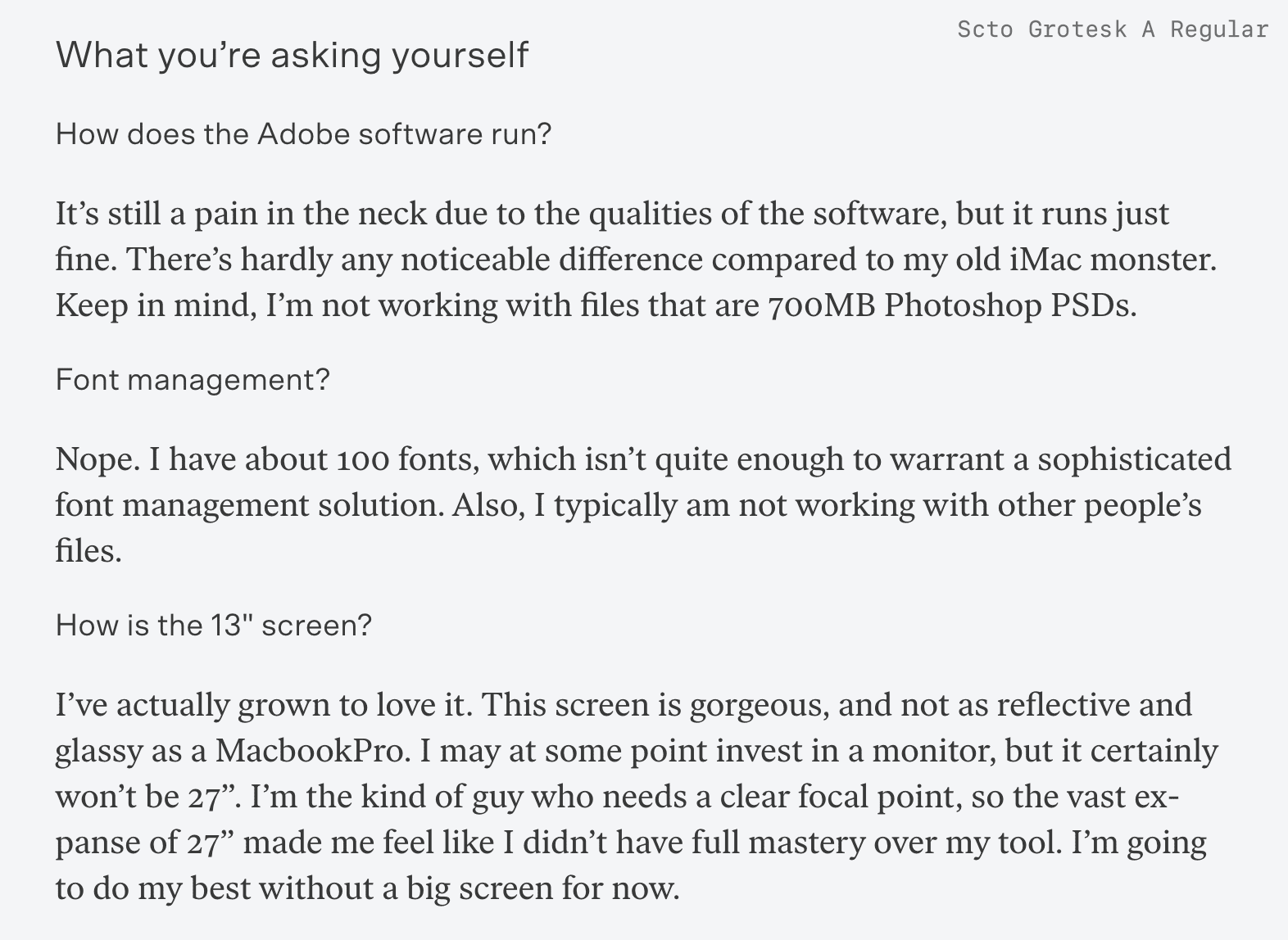
It comes down to weight distribution and letter proportions. In a previous post, I mentioned that I wanted to keep an eye on Scto’s performance at small sizes because of its width and proportionally smaller x-height. Turns out, Scto looks amazing at small sizes (14, 15, 16px), and at large, display sizes, too (over 30px). Check it out:
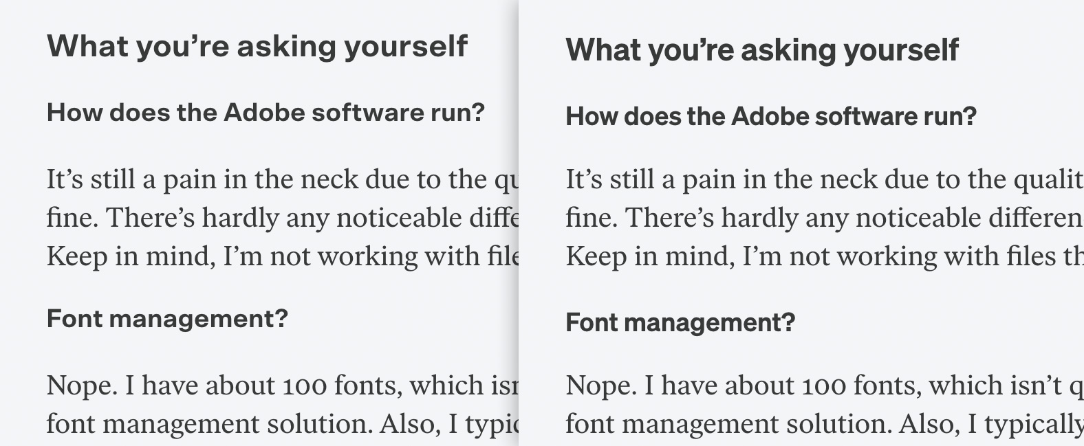
Things are trickier at the in-between sizes, especially in relation to Ivar at its body text sizes (18 and 20px). Using Scto in medium or regular weights for mid-tier headlines felt diminutive and blended in with the body text. Scto in bold felt really dark and wide in relation to Ivar Text. Take a peek:
Sometimes you find yourself fighting against the nature of a typeface’s design. I think this is what’s going on here, made even more clear by dropping in Söhne. It just worked—no alterations necessary to have it play nice.
So, I made the switcheroo to Söhne for this site’s design. Söhne is an interpretation of Akzidenz Grotesk. The larger it becomes, the more one can see its character: a warm idealism, less sterilized than Helvetica, still with a hand in it—a crooked tooth in a perfect smile. The early mockups and moodboards for my book, The Shape of Design, used Akzidenz in them, because I felt it expressed the affable rationality I wanted in the writing. That project eventually went in a different typographic direction once the writing was finished, so I’m happy to have that typographic impulse find a home on this site.
I still love Scto’s proportions at large and small sizes; this is such a unique characteristic, especially for a typeface that initially reads as a quotidian sans-serif. It will eventually find a happy home in a future project.
Oh yeah, I’m using Söhne with the alternate, two-story g. You know, for fun.
