Redesign: Gardening vs. Architecture
The year is 2020, and there’s nothing left to lose, so I am going to risk a question that may open Pandora’s box:
Remember Game of Thrones?
Oof, right? There’s a lot of mess there—from the delayed final novels, to the years-long, mountain-sized hype applied to the television show, culminating in the weak sauce ending that felt like it was the fault of both the show runners and George R.R. Martin, author of the adapted novels. Things ended so poorly that most viewers walked away from Game of Thrones like a bad breakup: desperate to put it behind them and observing an implicit unmentionableness in social situations. It’s a cautionary tale of a story getting ahead of itself, very literally.
There’s one aspect in this that I find fascinating, and it turns the whole fiasco into a parable about writing styles. In interviews, Martin has compared himself to a gardener—forgoing detailed outlines and overly planned plot points to favor ideas and opportunities that spring up in the writing process. You see what grows as you write, then tend to it, nurture it. Each tendrilly digression may turn into the next big branch of your story. This feels right: good things grow, and an important quality of growth is that the significant moments are often unanticipated. But gardening may lead the author to a position where all of that continual branching makes it incredibly difficult to have the story come back together. I have genuine sympathy for George. Still: what’s the point of a working method that undermines your ability to finish?
On the other side of writing is who I’ll call “the architect”—one who writes detailed outlines for plots and believes in the necessity of overt structure. It puts stock in planning and foresight. Architectural writing favors divisions and subdivisions, then subdivisions of the subdivisions. It depends on people’s ability to move forward by breaking big things down into smaller things with increasing detail. This approach should feel familiar: it’s how modern knowledge work happens, because architectural writing is easier to do in groups and hedges against risk with documentation. (I’m not sure anyone really knows how to garden in groups, and most attempts to document an approach invariably reference version control, jazz music, or improv comedy.) That said, it can be hard to stay interested if it feels like you’re painting by numbers, even if they are your own numbers. Can soul be contorted to fit into a bulleted, thrice-indented list? I jest, but only part way. Sometimes you load up a show on Netflix or a song on Spotify and you can feel the algorithm in it.
This is a false dichotomy, of course, but everyone favors one mode of working over the other. It’s a matter of personality, from what I can tell. And by now, I hope, it should be clear that I am a gardener, because an architect wouldn’t spend 500 words blabbing about an extinct TV show to say, “Hey, so now that we have this type scale and I am designing how headlines look, it is worth remembering that I actually won’t be using headlines that often, because my writing isn’t structured like that.” Classic gardener move.
Instead, I bring all this up to say that there are different modes to writing, and they produce distinct qualities to the text. These characteristics determine the robustness and expressiveness required of the typographic system built to support the writing. I am insistent about designers being sensitive to the qualities of the text because of my own experiences trying to string words together. It would be heartbreaking to work hard on a sentence, hand it off, have it be treated haphazardly, and end up looking like crud. Thankfully, I’m the one doing the writing and the designing here, so if it reads like shit and looks like shit, I can be the one to blame for it.
Anyway, I’ll be keeping my approach to hierarchy light because my freewheeling gardener text doesn’t require a lot of support scaffolding to structure it. But I’d be a lot more serious about the hierarchy if I were designing for something more architected, like an academic workbook or the styles for readme files on Github repos.
One of the more agreeable symmetries in design work is that consistency and laziness often lead you to the same solution. If software developers have a crucial lesson for designers, it is to exploit this situation to the fullest extent possible, then use the saved time to get into bread baking or something.
Last time, I defined the two sizes I’d be using for body text: 18/24 on small viewports and 20/28 on larger viewports. That’s a foundational design decision, so in the interest of consistency and laziness, I should try to make it go as far as it can.
A thought popped into my head: “What if I only used spacing, weight, and color for hierarchy?” You know, instead of picking out a bunch of font sizes for each viewport, I stick to the sizes of the body copy and use the other visual tools I described in my last post to create the hierarchy. This is one of those rare times where the devil on one shoulder whispers an idea in your ear, and the angel on the other shoulder hears it and says, “Hell yeah, bucko. Giddyup!”
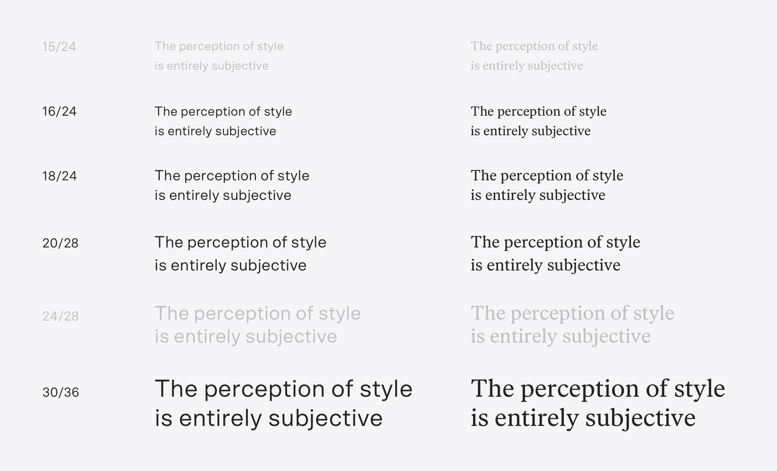
After a search through my previous posts, I found that H4 is the deepest into the hierarchy I go. So, four levels to support, which is very doable without getting wild with the sizes. Taking a look at the previously defined type scale, I wonder: do I even need this many sizes? My thought is that the 15px and 24px values may be unnecessary. Let’s try it out!
For reference, here is where we are starting. This image shows paragraphs set in the proper sizing and line-height, with headlines simply switched over to the sans—no sizing or stylistic modifications beyond that.
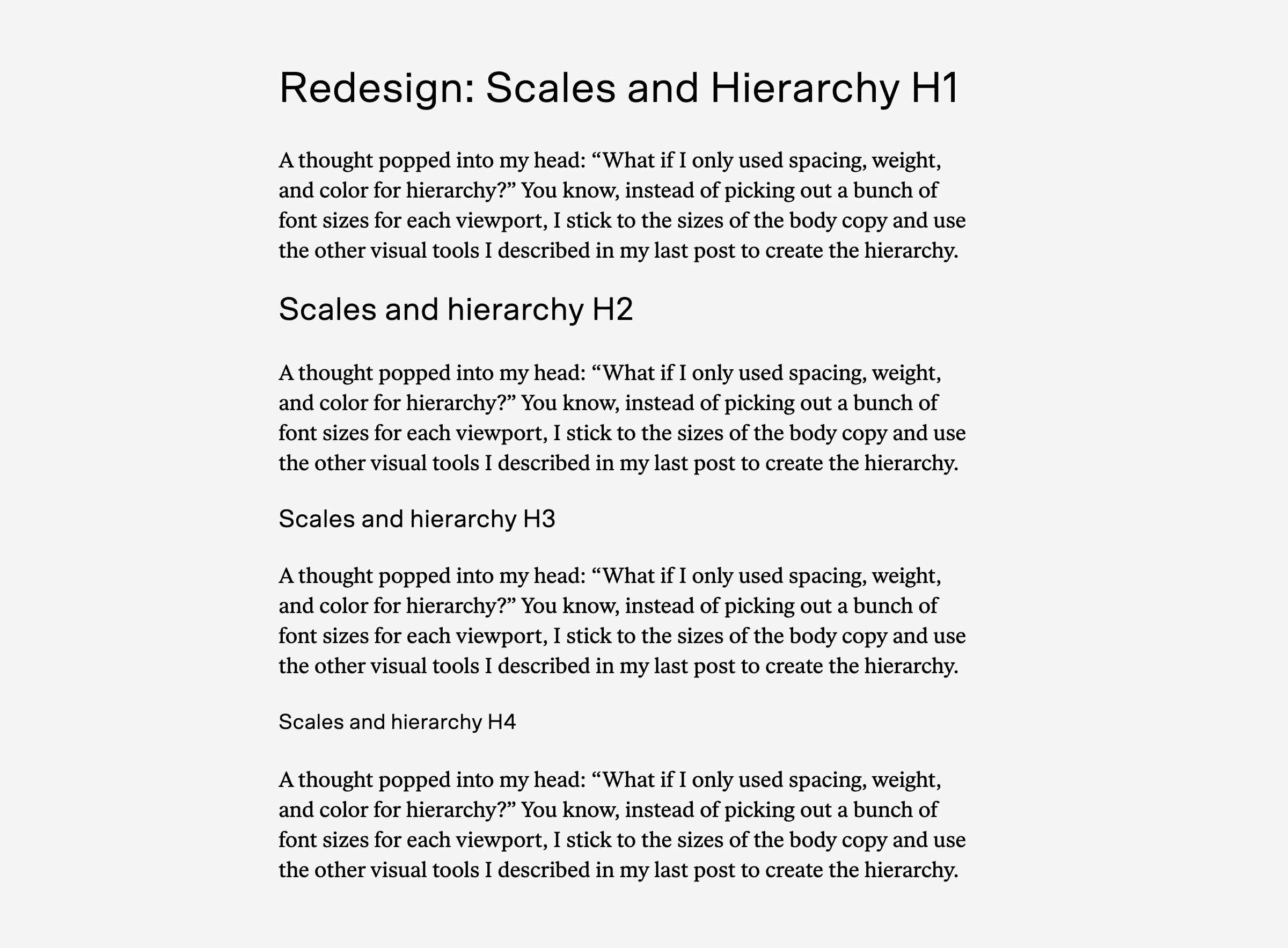
We can do better than this.
Since we’ll be working with spacing here, why don’t we reset the margins on the headlines. It will also make it easier to see where I’m working as I re-style each.
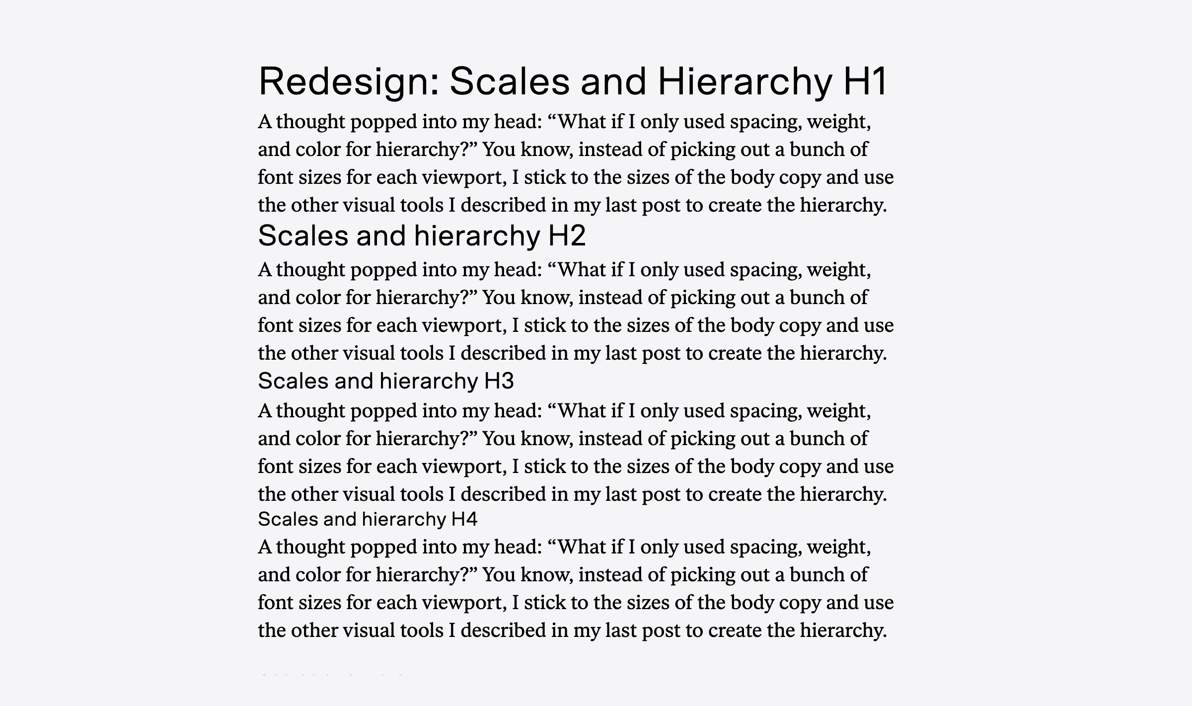
There we go. Now, let’s get down to details.
My personal preference is for the lowest item in the hierarchy to have a strong resemblance to the main text, then each step higher in the hierarchy gets slightly more distinguished from the main paragraphs. This isn’t a hard-and-fast rule, just one of those little Frank heuristics that I find incredibly helpful in the process of design. In this case, since our lowest hierarchical element is an H4, the H4 would feel like it was one step away from the main text, H3 two steps away, and so on.
Here’s another trick you can hang on to that mental framing: items higher in the hierarchy can have more negative space around them, because that extra negative space will elevate their sense of importance. High-order elements represent bigger chunks of content, so placing a slightly larger top margin on an H2 compared to an H3 reinforces this structural quality by making the block labeled by the H2 more visually distinctive.
This guide also works in the opposite direction: lower hierarchy elements can have less space. An H4 could have no bottom margin so long as it keeps sufficient contrast between it and the paragraph. Thought being: if you’ve sliced your content thinly enough to get down to H4s, they’ll typically clump together in the text. The blocks of text between H4s are probably going to be pretty short, and being economical with negative space in the heart of the text is a grace to the reader.
I usually bracket my hierarchy items—I start with the H1 and lowest level, then work my way inward, tweaking along the way. Let’s keep things straight-forward: H1 will be the biggest type size in the sans, H4 will be the body serif, but set in italics.
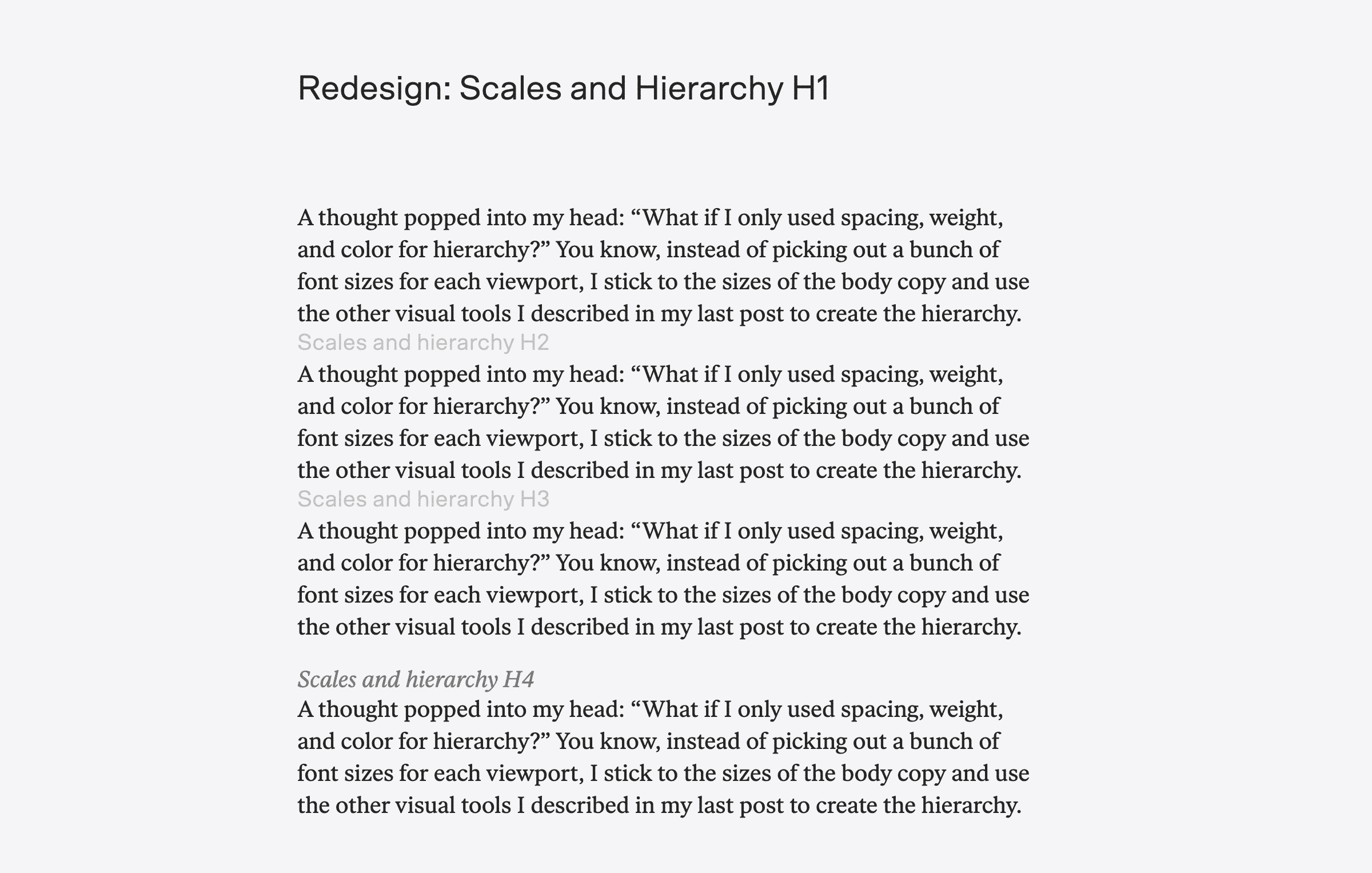
Better, better. This was the result of a little trial and error via CSS. Here, we have the H1 set at 30px with 4rem (root em, aka the size of the body text) of margin under it. I figure I will only be using H1s for post titles, so no harm in letting it have a little extra oomph through negative space. H2 and H3 are dimmed until we get to them. The H4 is styled as stated: italic text set at the same size as the paragraph. Doing so looked good, but needed more contrast to distinguish from the main body text. I’ve changed the color to a 70% gray. I think this works, but worry that it may need even more contrast. I’ll keep an eye on it as I apply the styles to the site—if more contrast is needed, I can prepend the H4 with a section symbol (§) or dash of some kind to signify more clearly. For now, I’m satisfied.
Now for the trickier bit—the H2 and H3. These always trip me up, to be honest, because I find most fonts at medium sizes unappealing, and as a personal preference, I don’t favor bold fonts. This makes these middle spots kind of a conundrum about how to express their structure and distinguish them from the main text without calling too much attention to themselves. Maybe I can sort out something by applying some spacing and reusing the gray trick I played on the H4 also applied to the H3?
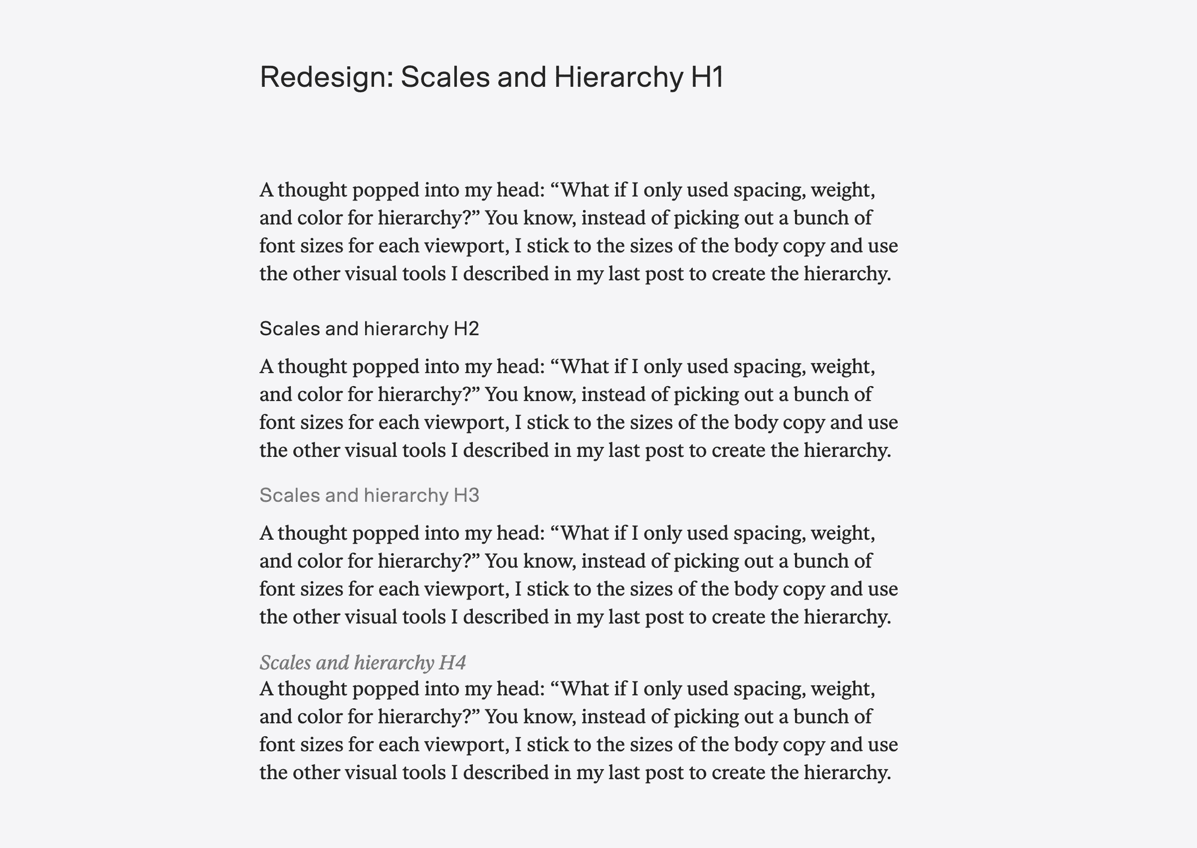
Haha, no. That said, you can start to see how modulating margins clarifies the text’s structure. Here, the H2 has 1.5rem of margin above with 0.5rem below, and the H3 has 1rem above and also 0.5rem below. What about bold?
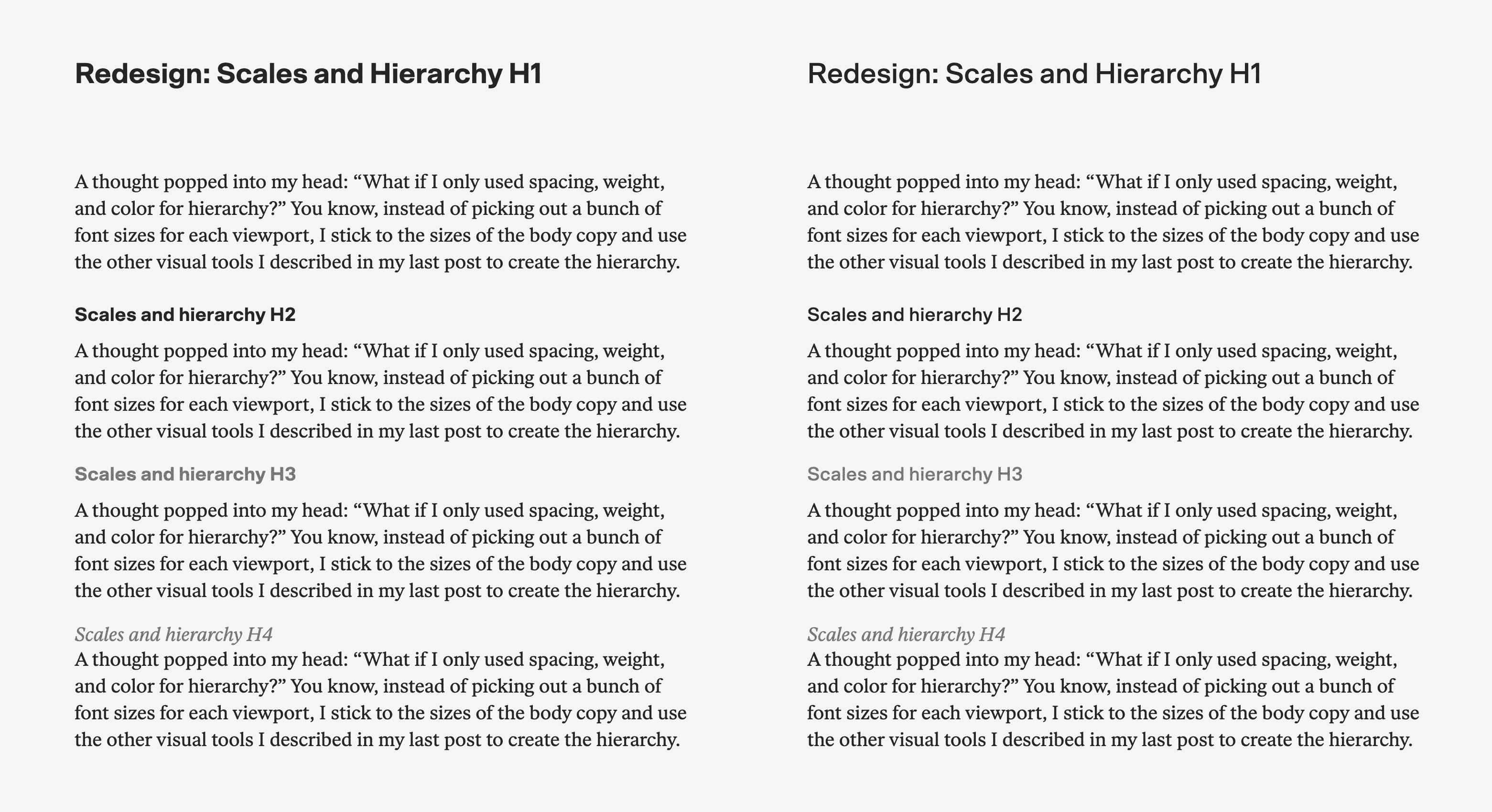
Scto, the sans, bulks up fast. Styling the H2 and H3 in bold looks silly without the H1 also being bold, and all three in full-on bold turns the text into a juggernaut. It’s not really the feel I am going for here, so my preference is with the medium weight on the right, which works pretty well. These variations are also exposing how the gray H3 looks awkward (very noticeable next to the gray H4, which makes perfect sense to my eye). Maybe the H3 should have a stronger relationship to the body text, especially since the H4 will rarely be seen? Maybe all caps or small caps in the serif for the H3?
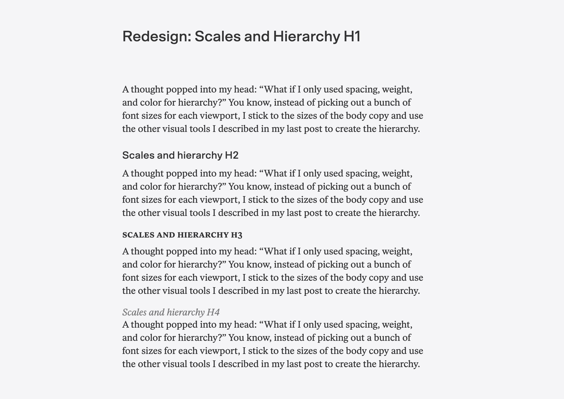
Not bad!
There are a few things going on here: I’ve changed the H1 from 30px to 32px. This has no significant purpose, only the pleasure of knowing that the highest value is twice the lowest value. The H3 is now set in small caps at 20px, like the body. It is in bold, because small caps in regular weight wasn’t providing enough contrast with the body text. The H2’s size has been increased a couple points to 22px, because 20px was too small, and 24px was too big.
Our new type scale becomes:
- 32px
- 22px
- 20px
- 18px
- 16px
I’ll be applying these changes locally to see how they feel over the next few days, and once satisfied, I’ll buy some web licenses and push them up to the hosted site. (I’ve been working locally by pointing the browser to the desktop versions of the fonts I already own.)
Until next time—