Redesign: Gridniking
Making grids sits somewhere between sharpening axes and solving puzzles, part prep work, part game. Some designers are obsessed with grids, and I can understand the appeal. There are enough details that you can get lost in it, and what you produce becomes a tool, an investment. Dividing space is indeed one of the principle tasks of design, and grids offer a way to structure that work. All the same, designs placed on super intricate grid systems can feel a little…sterile? Micromanaged? Over-built? Those aren’t quite the right words, but I think you know what I mean. There is a point where a grid system becomes too elaborate and loses its finesse. The structures that are meant to support creative choices can become a cage.
I’m a big proponent of “just enough grid.” Grids are scaffolding, structures meant to help get the main building done. There is no need to overbuild, especially for this site. I am going to stay organized, but only just so.
Grids can also be used as a communicative device, because hierarchy can be expressed by ordering space. (Previously covered here.) This method is difficult on the web, though, because the canvas is, uh, squishy. It means that a carefully arranged layout on desktop devolves to a vertical stack o’ stuff on smaller viewports. If hierarchy is primarily expressed through layout, you lose it on mobile due to the reduced space. This is usually why you see designers relying more on font size, weight, and so on to express the importance of text. It’s also a strong argument to design these pages mobile-first, reason being that if the hierarchy holds up on mobile, it will adapt to larger viewports, no problemo.
This approach is bulletproof, but only if I ignore my own experience. The designs I create mobile-first usually feel bland when I scale them up to desktop. There is a deficit of imagination. The layout feels like too little butter spread over too much bread. I find that if I start with a more expressive design for a large screen then simplify it down for smaller viewports, both become more interesting.
I am also going to go against my own advice and use space to establish hierarchy. I can’t get around my personal preferences. I love shallow hierarchies with relatively few type sizes. When done right, I think its tone walks the fine line of “the presentation of this information has been carefully crafted” and “I couldn’t be bothered to pick more than one font size, man.” How many ways are there to look both meticulous and aloof? I’m willing to wrestle with this for a bit to send those mixed signals.
I’ll start with a standard 12-column grid on this site, with intentions to subdivide the page into 4 and 6 columns on desktop. (Twelve columns not because I intend to use all of them, but because 12 can easily be spanned into 1, 2, 3, 4, and 6 columns.) The design will also be a good chance to play with CSS grid, something I’ve used for simplistic things like subdividing sections into two columns, but never for more robust page layout stuff. It will be fun to mess around with it.
I spent a bit of time putting together a grid, then zoning a few areas for navigation, content, and so on. Take a look:
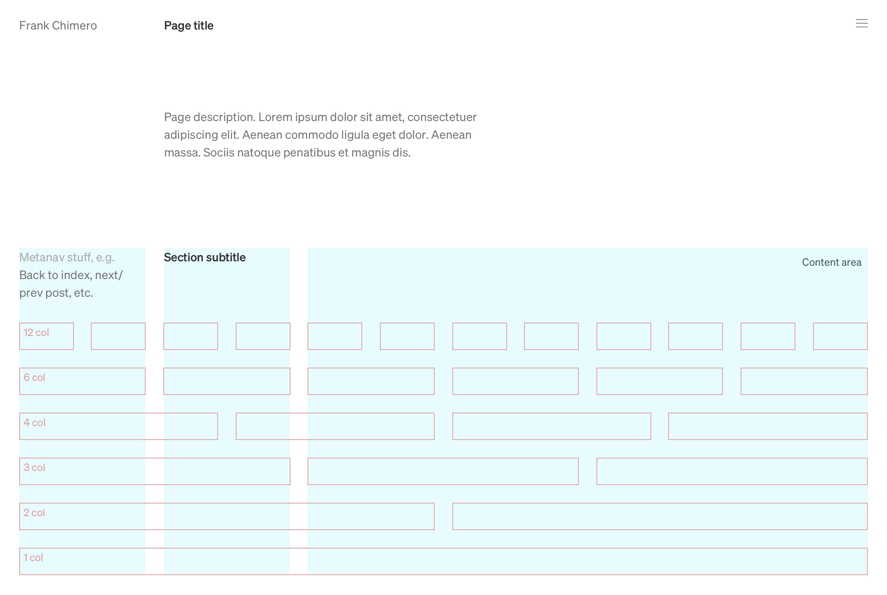
All the type above is 16/24, and the column gaps set to match the text line-height at 24px. Gutters matching the copy’s line-height is one of those standard design conventions I was taught in school. This acts as a starting point. I usually end up fudging the measurement in either direction for optimal optical happiness once the content is flowed into the layout.
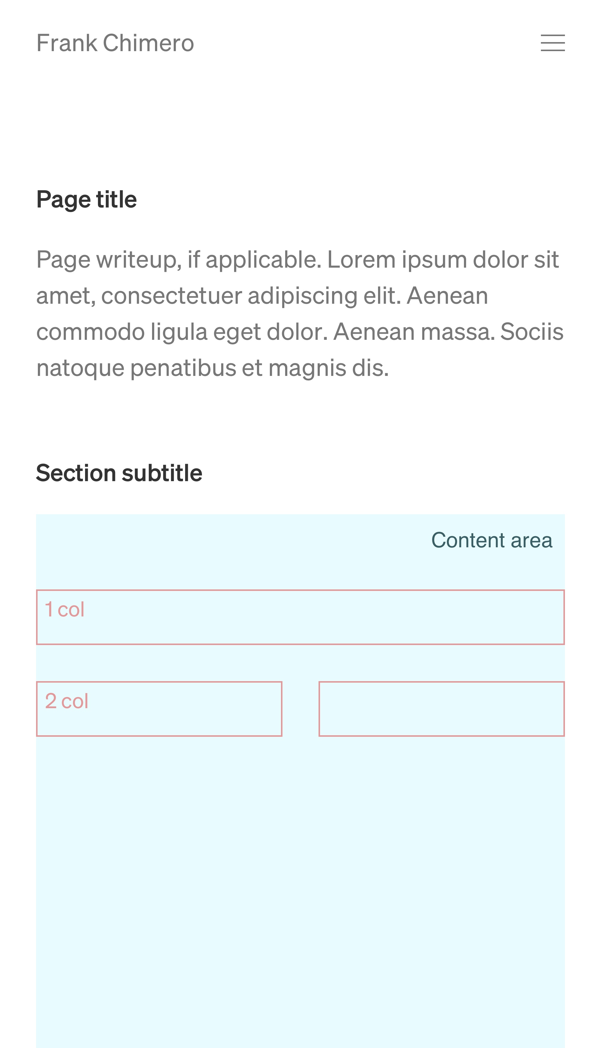
Above is the mobile adaptation of the desktop layout. It looks clean, but you can see how the simplified layout causes a little bit of confusion about the page title and section title’s relationship. There are a few options about how to resolve this: increase the size of the page title (only on mobile or on both pages), make the page title sticky as you scroll to “label the page” and signify greater importance, or just forget it. I’ll leave it for now.
Why don’t we drop in some real content? I want to start with the Reading and Listening pages, because I have a clear idea of their content and they can use the most sprucing up. In the process, I can establish a couple of design patterns that can be used elsewhere.
Right now, the Listening and Reading pages are bulleted lists. I’m going to add some cover art to certain sections to give the pages some visual interest, meaning our layouts will include both grids views and lists.
Let’s normalize the design pattern across book covers and album covers. It is strange, though: each format makes me want to structure the meta data the opposite way. My lizard brain says “album title first, then the artist name.” Then he slithers and says “Books need the opposite. Author on top, title on bottom.” I’m usually pretty good at cooking up plausible reasons for the lizardman voice, but here I have nothing. So, for the sake of consistency, I am going to put work title on top, artist name on bottom.
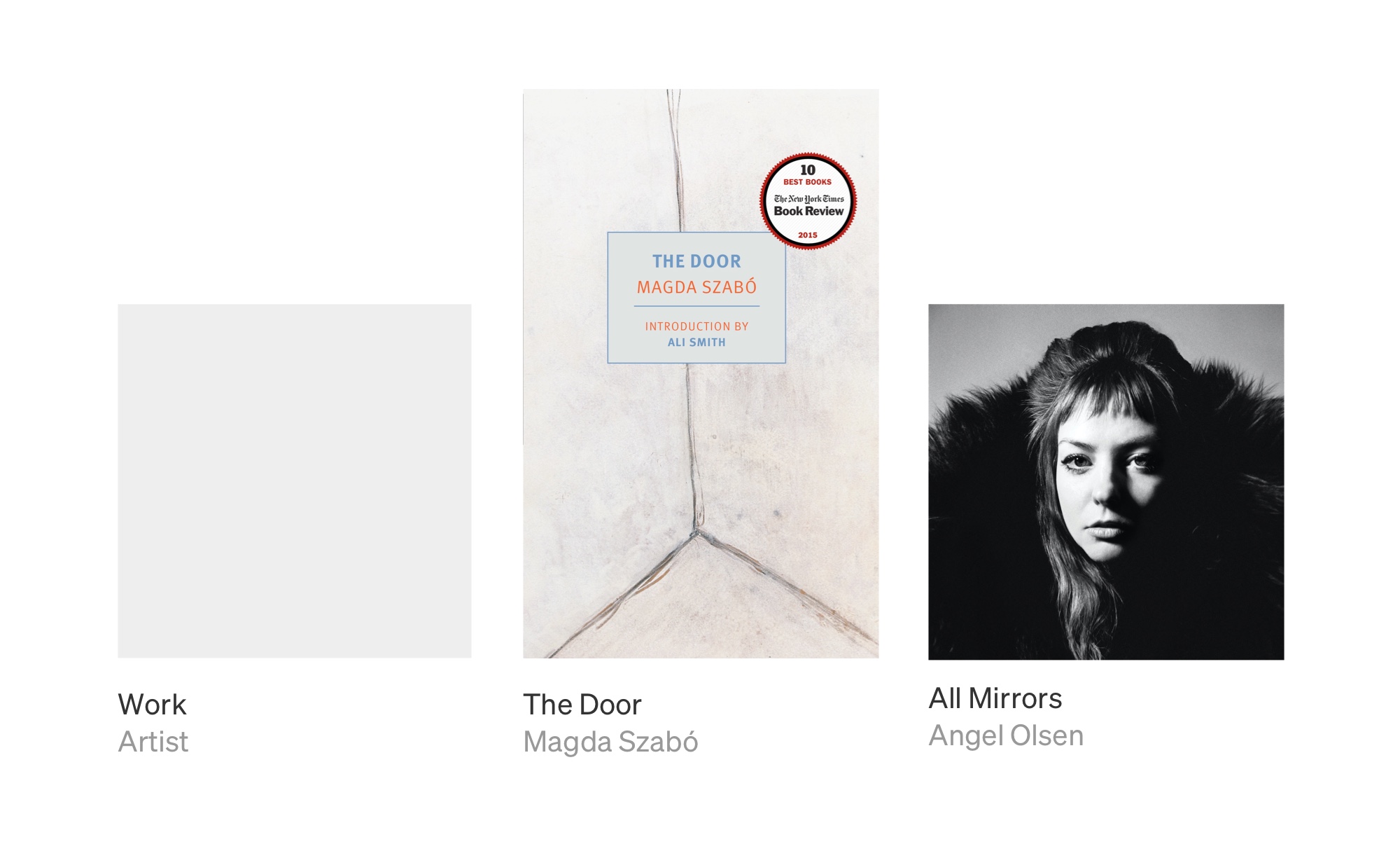
I’ll apply the same order to the list view. I tried a side-by-side layout to take advantage of the increased horizontal space in the list view, but I decided against it. I’d be stacking them vertically on mobile anyway, so might as well keep it the same everywhere. In the mockup, you can see some of the ridiculous titles I am dealing with here. Non-fiction editors: please tell me it is the marketing department that tells you to tack on those gnarly subtitles.
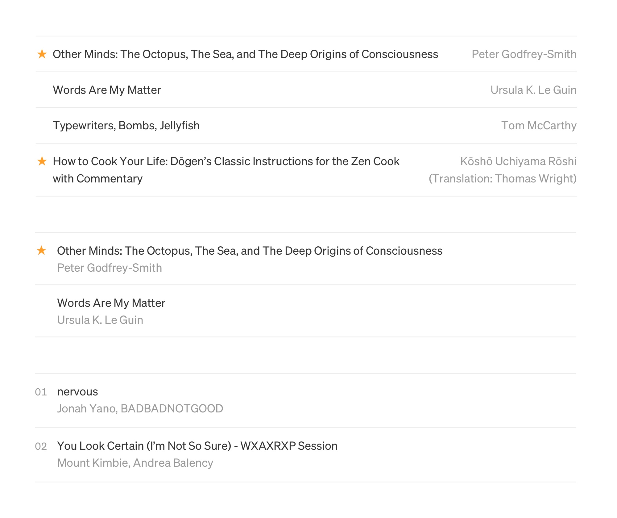
The listings have a couple extra bits of meta data. Some book titles are starred to show they are recommended, and songs have a number showing their sequence in the playlist. Here I am trying to place them on the left to mimic the placement of stars in an inbox view or track numbers in most playlists, but guess what? It isn’t working. At least not to my eye.
Below, you can see the stars and numbers shifted to the right. This works better, because it maintains a clean edge on the left. I would be more rigorous about the track number placement if the songs were representing a sequenced work like an album. But the music diary playlists are not sequenced, so the numbers aren’t critical info.
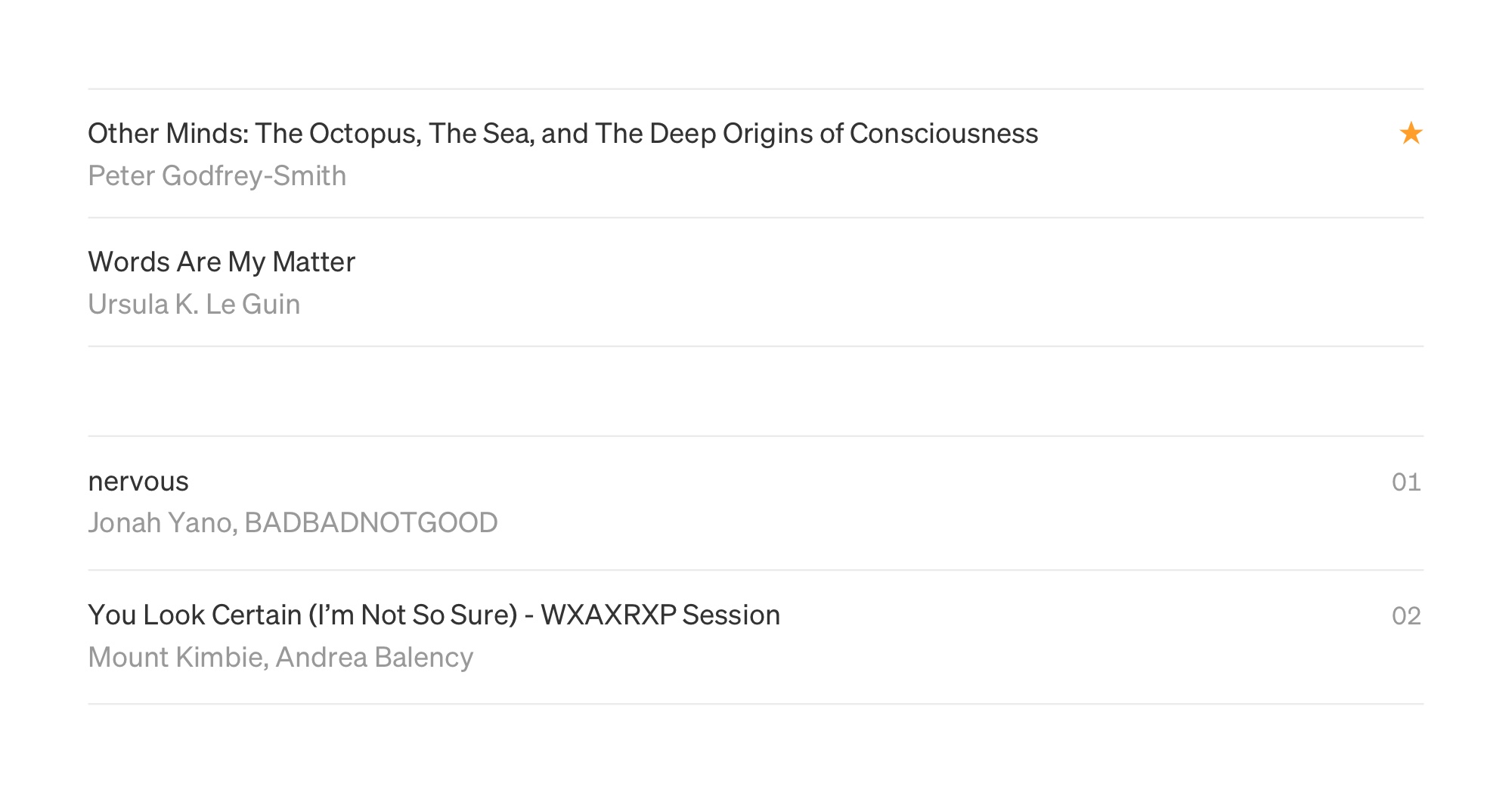
With that settled, let’s drop some content into the layout.
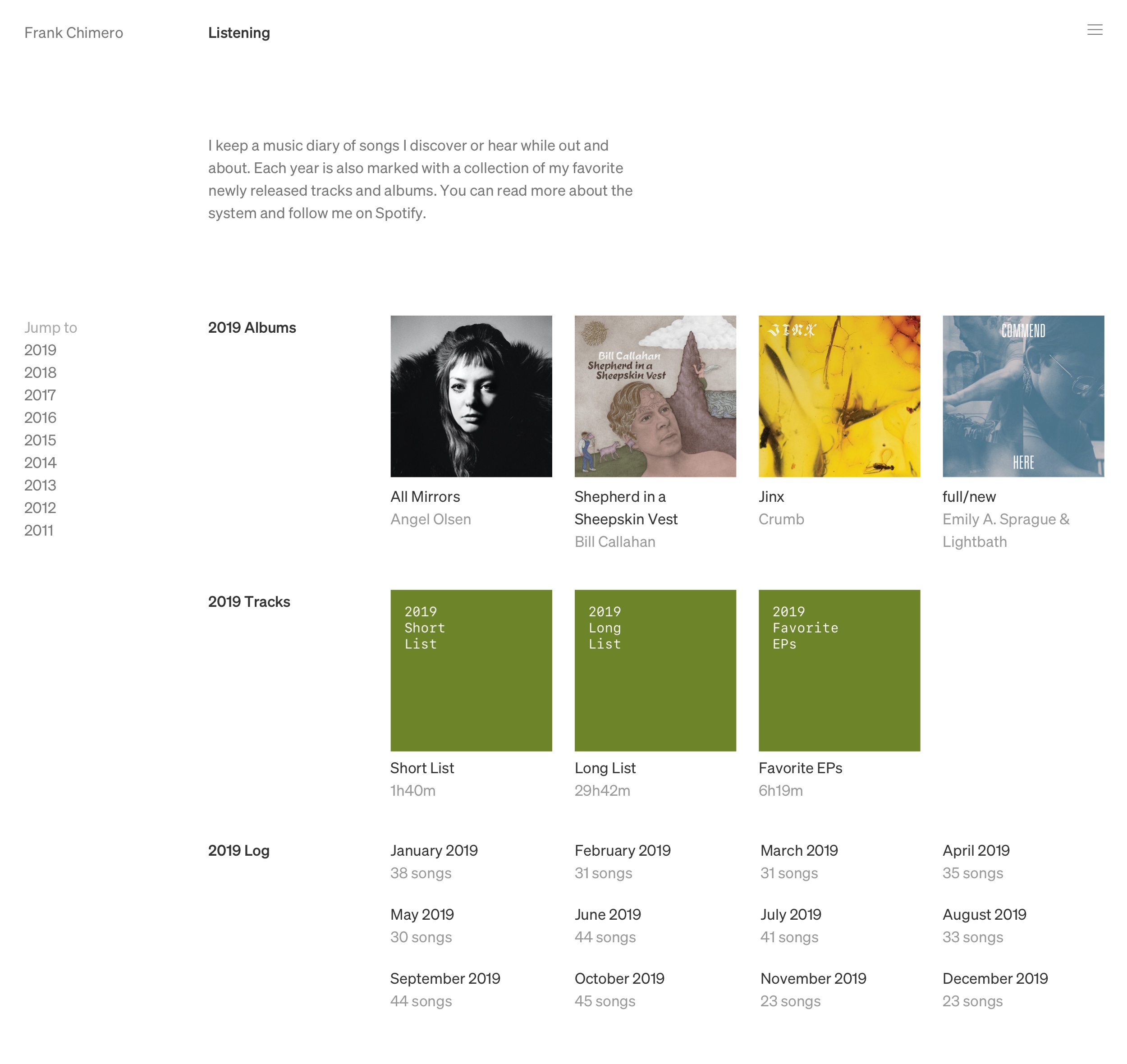
Not bad! The proportions and placement feel good, and I like how the three sections for the year have a distinct visual fingerprint. The type under the album covers feels a little large for the space provided to them. I may need to create a smaller type size in the scale, or change how the album covers flow in the content block. One approach is to have CSS grid auto-fill the content space with specified minimum and maximum widths for the covers, allowing me to claim some more space for the larger type size.
When you click on one of the months, you’re brought to a track list of that month’s music diary. My quick layout of the detail page kind of sucks.
Check it out:
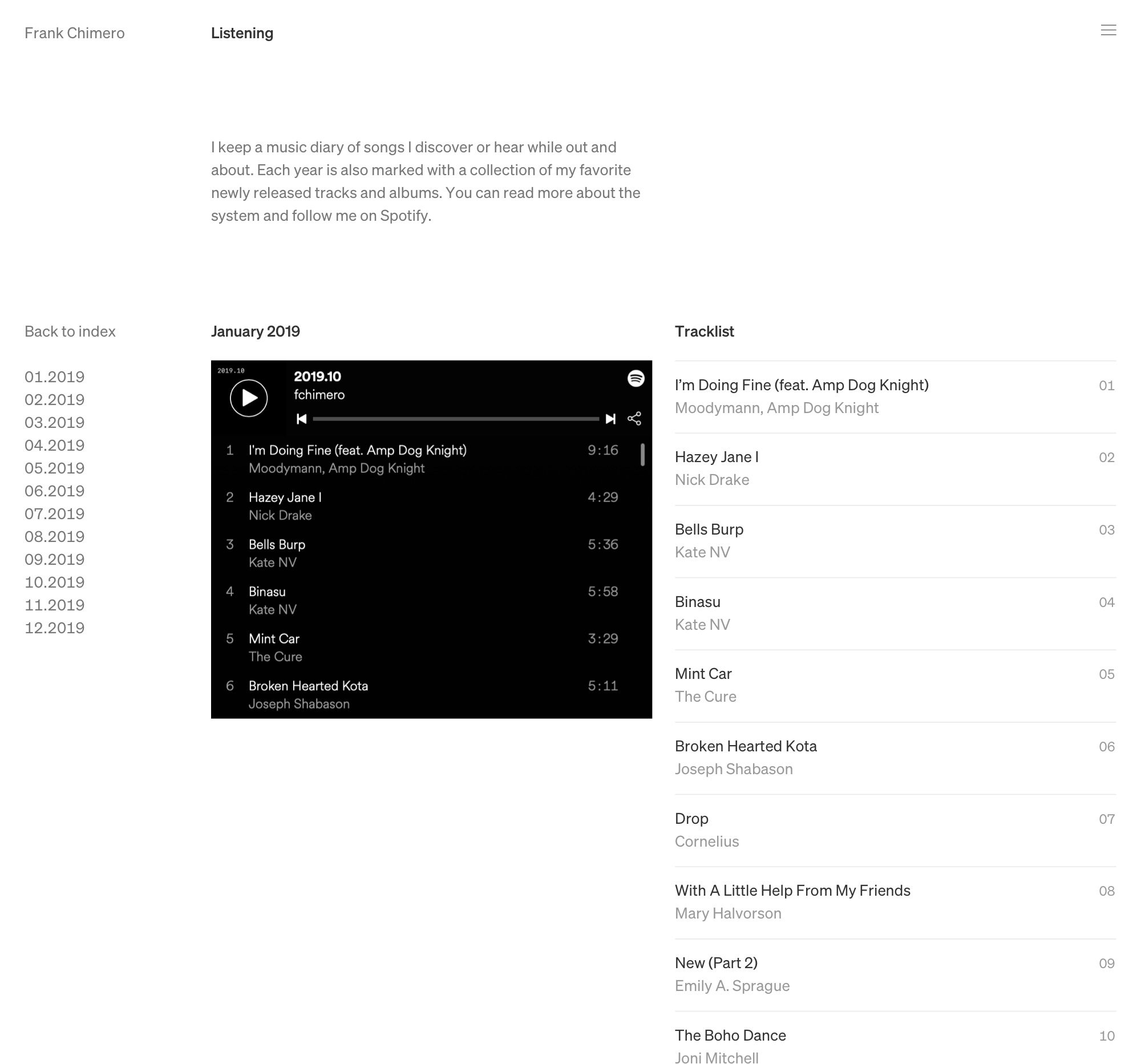
This is… half-baked? At least I know the listing design works well. I’m not satisfied with the two column approach, what with the Spotify playlist embed shoved off to the left. It will be easier to explore the layout in markup, where I can change the proportions of the embed player instead of using a screenshot.
Geez, that Spotify embed is a big black blemish in the center of the page, isn’t it? Uncool. Wait a sec…
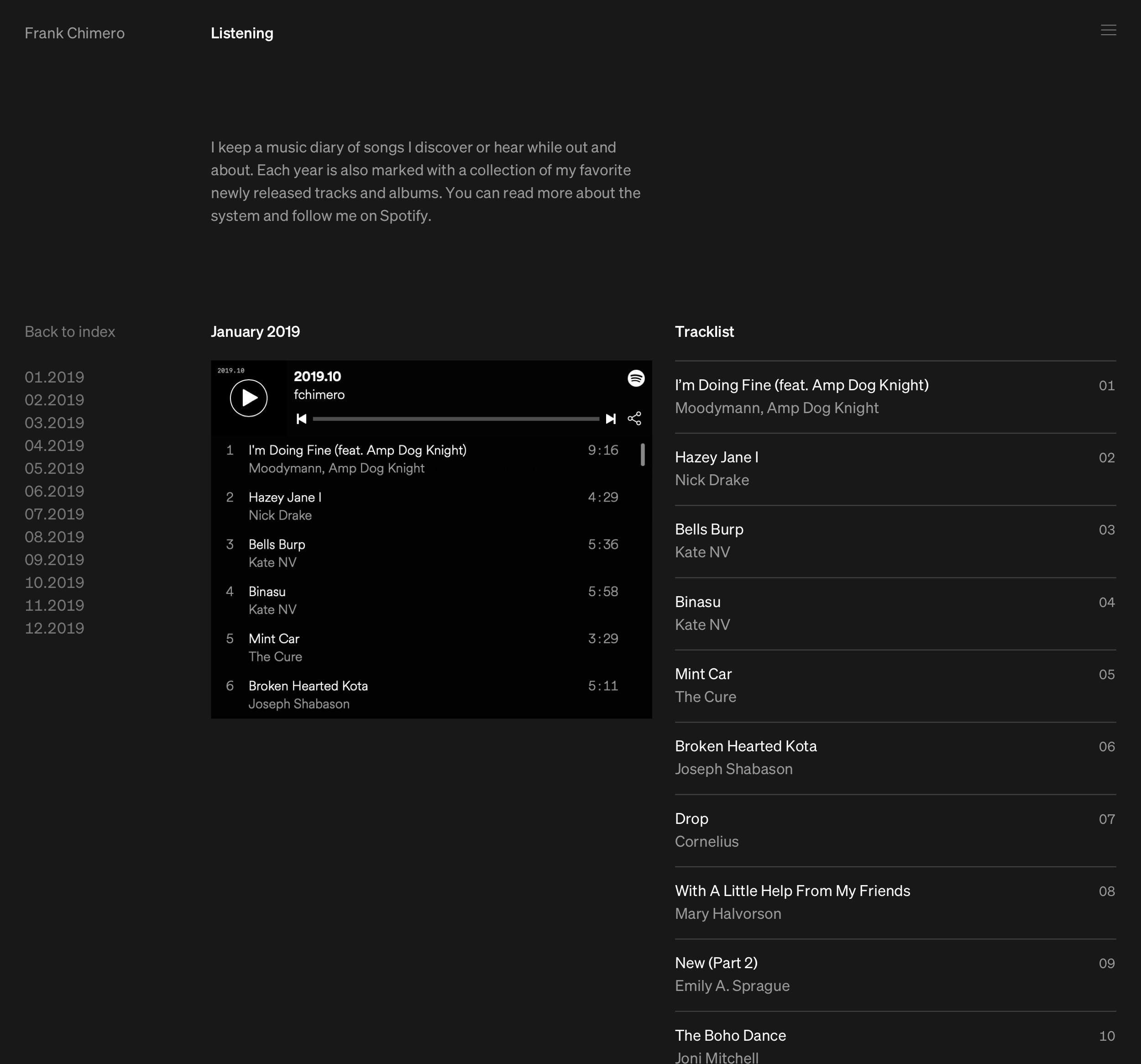
Hey, nice. I was thinking about having different background colors for each section of the site to add some whim to things and soften the austerity of the grid. This works well. How’s it look on the listening index page?
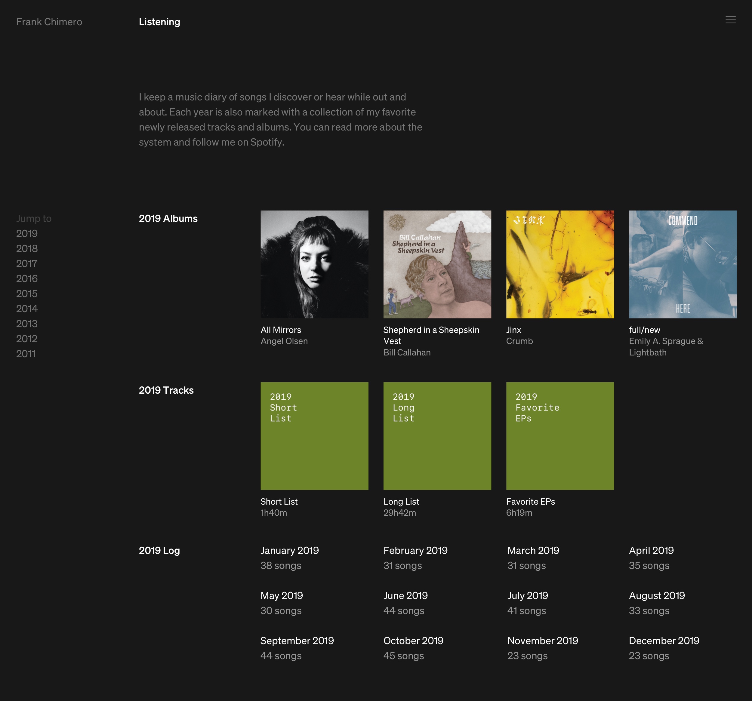
Ok sailor, let’s do it. I will need to sort out gray values so that the “dimmed” value is optically the same on each, but that can be figured out later. By the way, I am opting for an “off-black” here so that the Spotify embed and navigation overlay have enough value contrast to create defined edges.
How’s that Reading page looking?
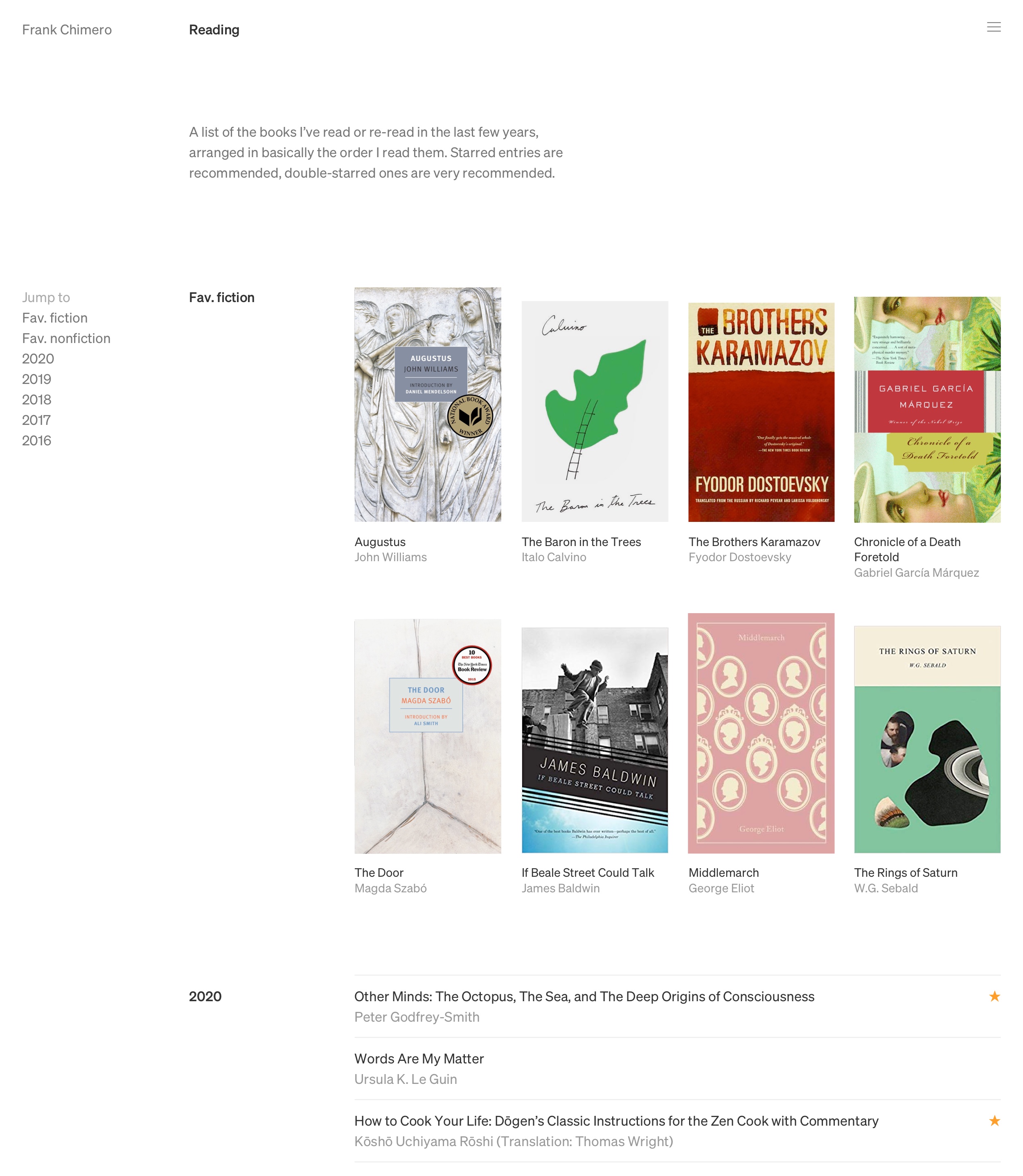
Not bad. Here I’ve used a 14px font for the text under the cover and it feels to be a more appropriate size. I’m uncertain if the text under the cover is redundant, but I do prefer having the live text available in the page source. How about a nice background color for this page, too? Maybe something literary?
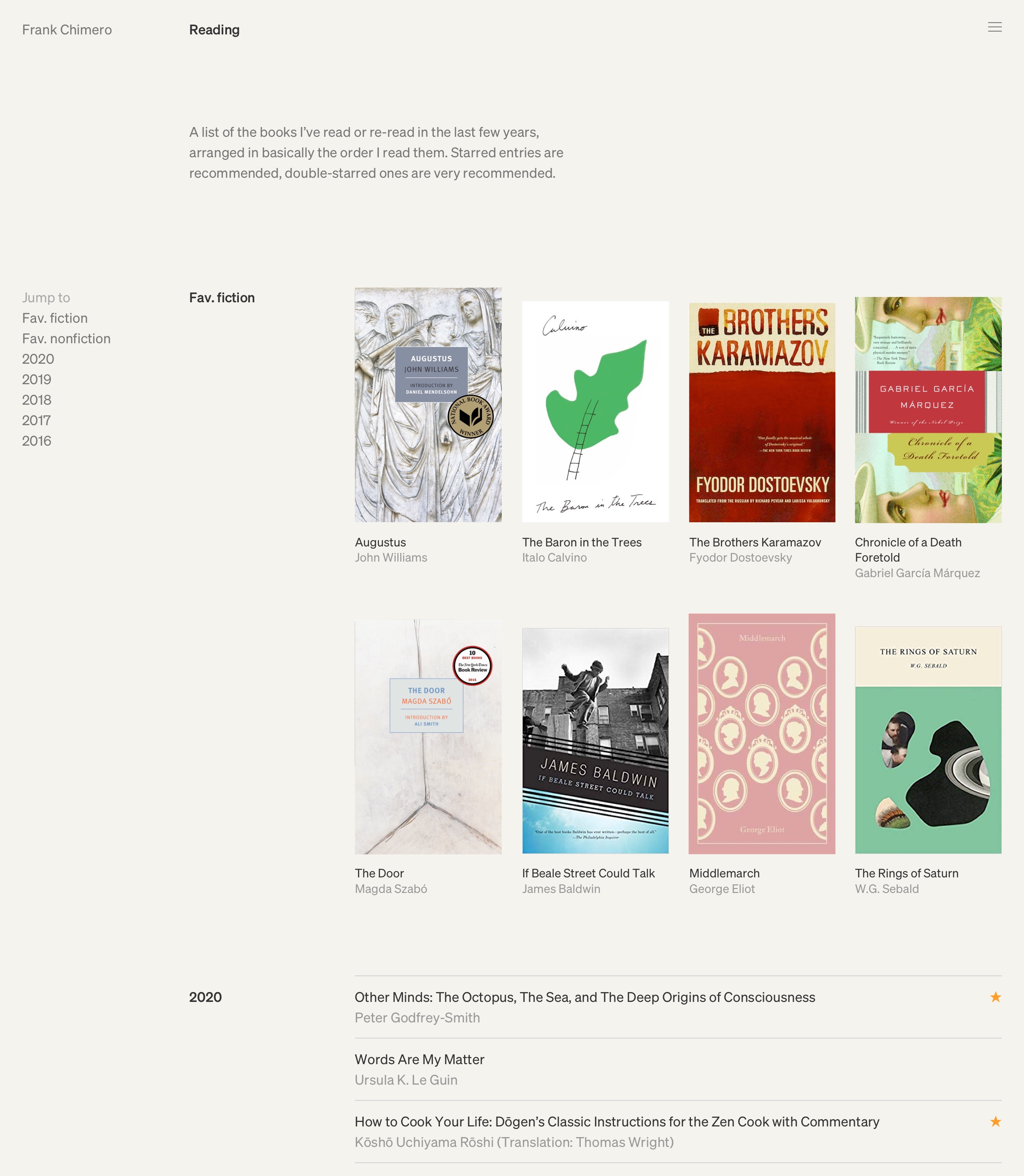
The background color is a nice improvement. Will need to muck about with the color value, and probably waffle between orangey cream and yellowy cream.
The covers feel like they are slightly too big and spaced a little too tightly. Once again, it feels like I am bumping up against what is easily done in a design program versus making a mockup in markup.
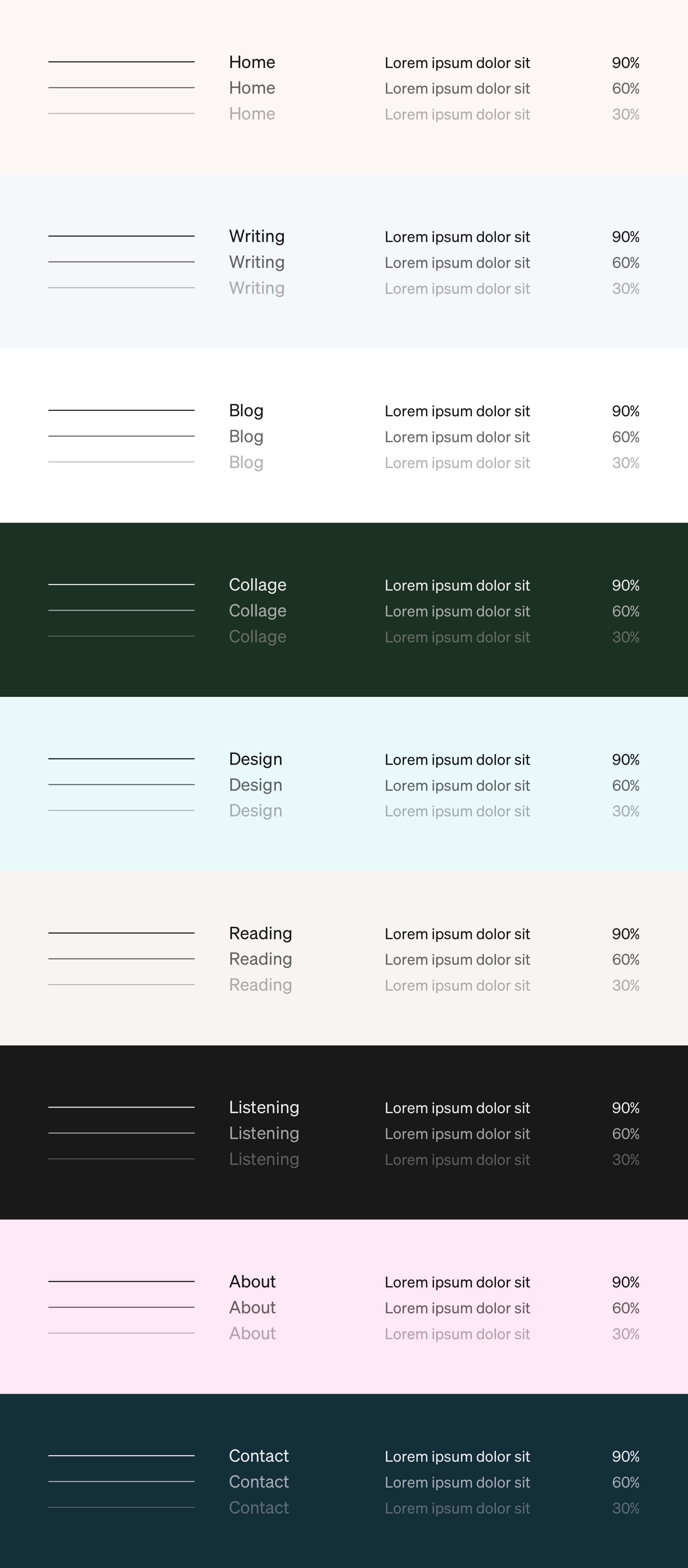
Before I do that, here are some color ideas for each page, along with different tints to use for content on top. It’s a nice set. Some background values may be too close to one another, but again, that will be easier to tell in-browser. Foreground values have semi-transparency so they pick up a bit of the hue of the background—a nice trick to make everything gel, a bit like doing a very thin wash of a color on top of a painting to unify it all before applying the varnish.
Anyway, off to the code editor I go.
