Redesign: Picking Typefaces
Last time, we talked about how the design of letters accumulate into the feel of a typeface. With all that in mind, let’s take a look through my font collection and make some selections.
Sans-serif
I introduced Scto Grotesk A and Untitled Sans in the last post because they are solid choices for this project. I’ve been looking for an opportunity to use them, and what better testing ground than my own needs?
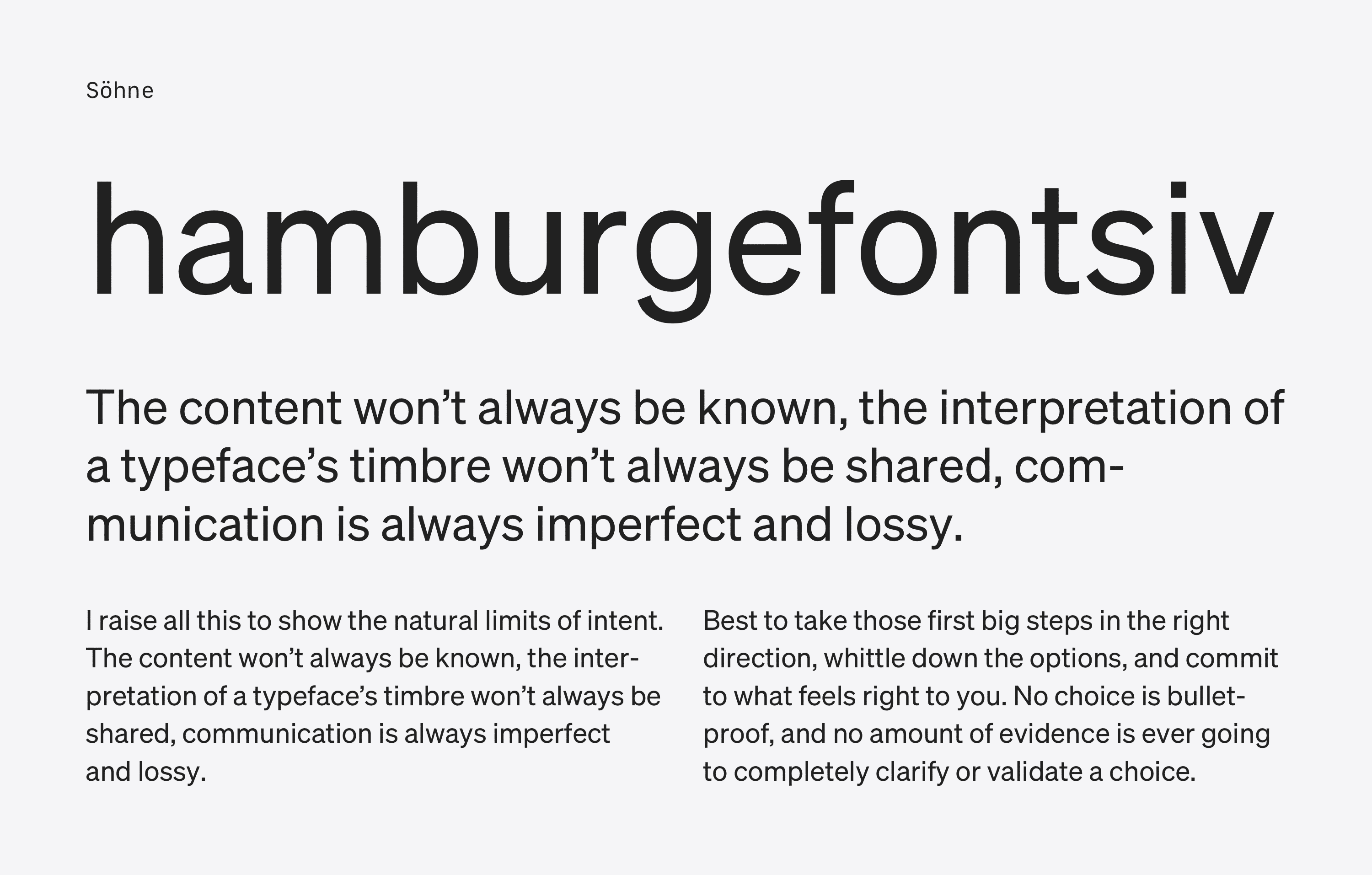
I’ve also added to the list Söhne, Klim Type Foundry’s take on Akzidenz Grotesk. It brings a different kind “elevated default” note by being less “rational” and having more of the hand in it.
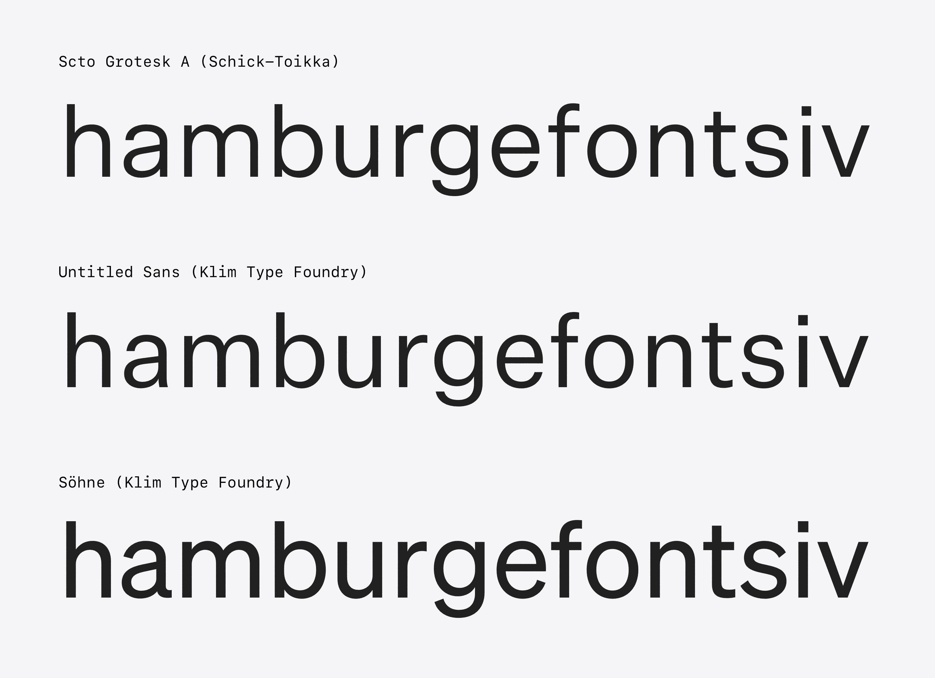
As always, the character of each becomes more clear in running text:
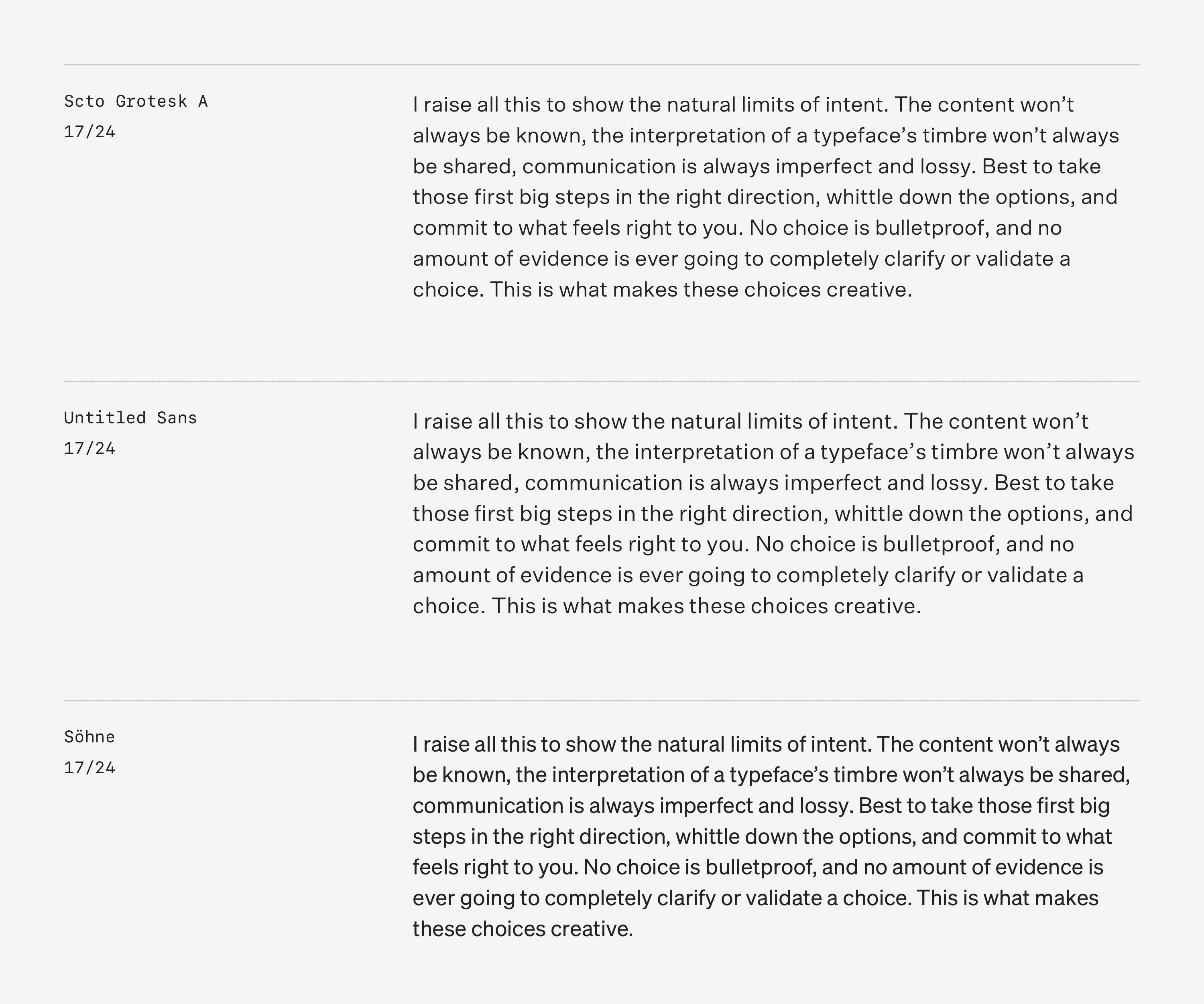
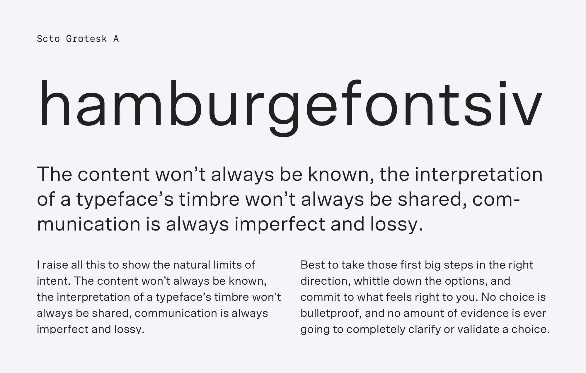
Here, compared to Untitled Sans, you can see Scto’s lighter color and wider proportions. Söhne shows its darker color, tighter spacing, and narrower design. Let’s roll with Scto—an intuitive choice, because my eye is smiling on it. Let’s also set Söhne as a reserve, in case we need something with more economical proportions. Söhne is also a good swap if the designs would improve with a typeface that has more distinct character.
Serif: Georgia-related
We have two suitable directions when it comes to default-ish serifs on the web: Georgia and Times. I’ve lined up a few typefaces with related designs for consideration. First up, Georgia:
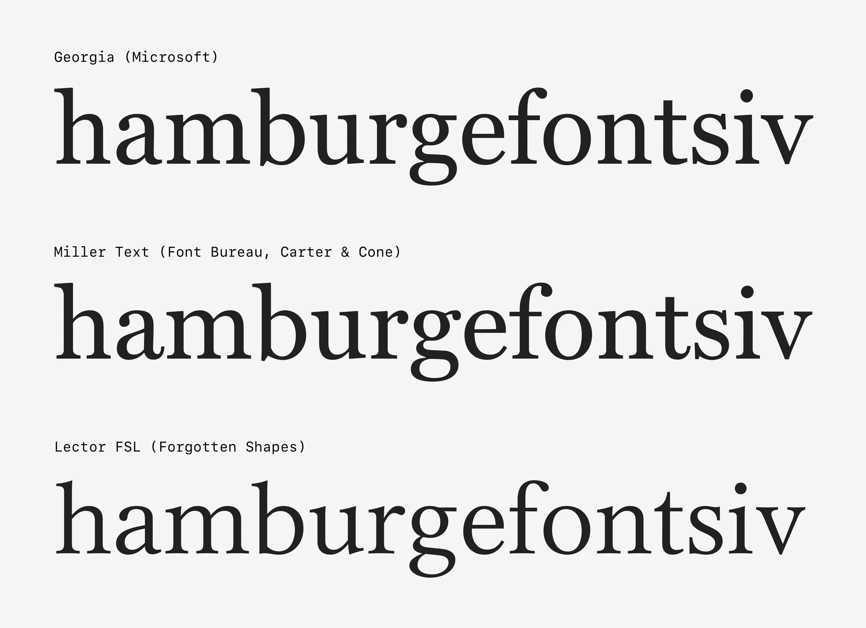
Georgia is a classic, but have you ever typeset it over 18px? It feels blunt and dull. Matthew Carter designed Georgia in the mid-90s. Its design has many adjustments to account for the era’s low resolution screens. Today’s displays, however, make these simplifications unnecessary. Instead, we can use Miller Text—an alternative also by Carter that uses similar forms.
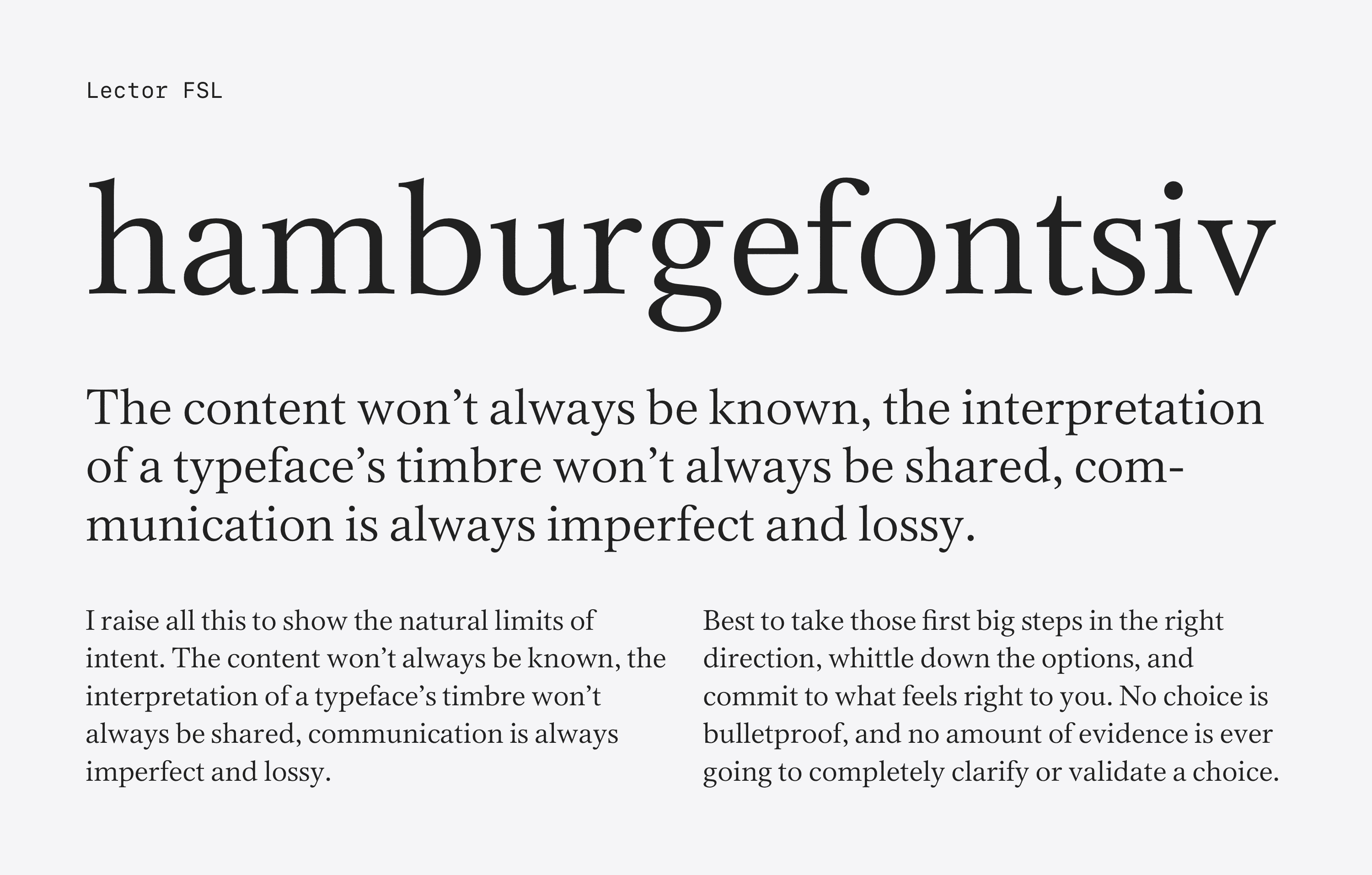
As a third option, we have Lector, a design by Forgotten Shapes. Its letters are straight-forward, open, and upright. Lector’s design sits somewhere between Georgia and Times, so I’ve included it on this list and the next for Times.
Let’s take a look at the fonts as running text:
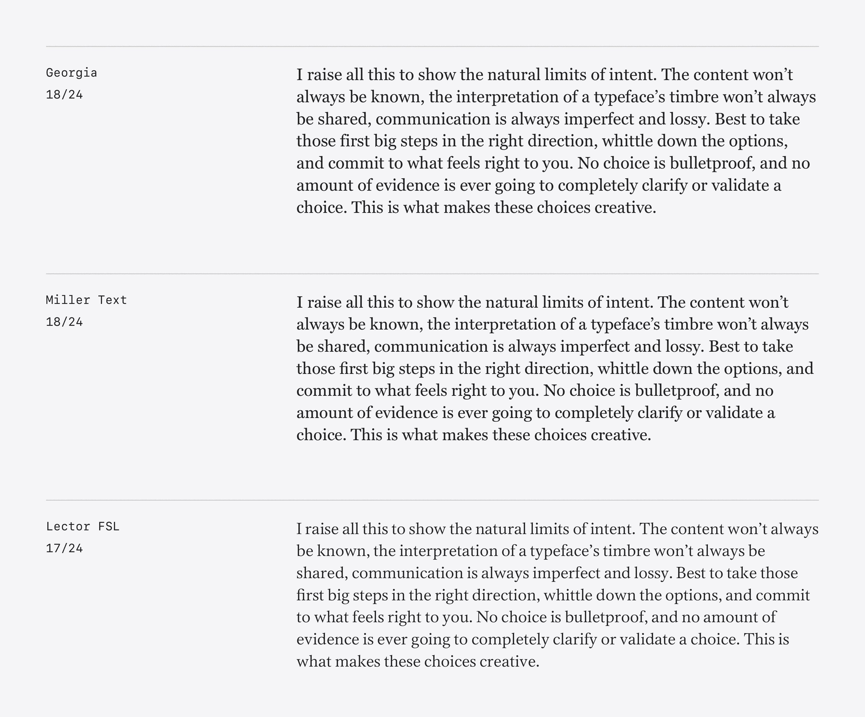
As you can see, Miller feels like a more nuanced version of Georgia. Friendly while remaining cordial, I think the tone is great. I love Miller, and its structural relationship to Georgia makes it an obvious choice, but there is a hitch. Typefaces are software, and like all software, there are implementation details to consider. Case in point: Miller Text’s webfont license gets billed yearly rather than pay-once. The price isn’t prohibitive, but the deal is a no-go for ideological reasons—the yearly renewal costs don’t apply to print. It’s confounding, but people have a right to price their products how ever they wish. I’m uninterested in paying a web tax, so I’ll look elsewhere.
Lector is setting very nicely as well. Its color is lighter, the forms more upright. It’s also showing itself to be more economical in the space it uses versus Miller and Georgia. Lector has a whiff of Times New Roman to it, but feels a little more at home than Times at a wider length of line.
Speaking of that, let’s take a look at some other typefaces that have a relationship to Times.
Serif: Times-related
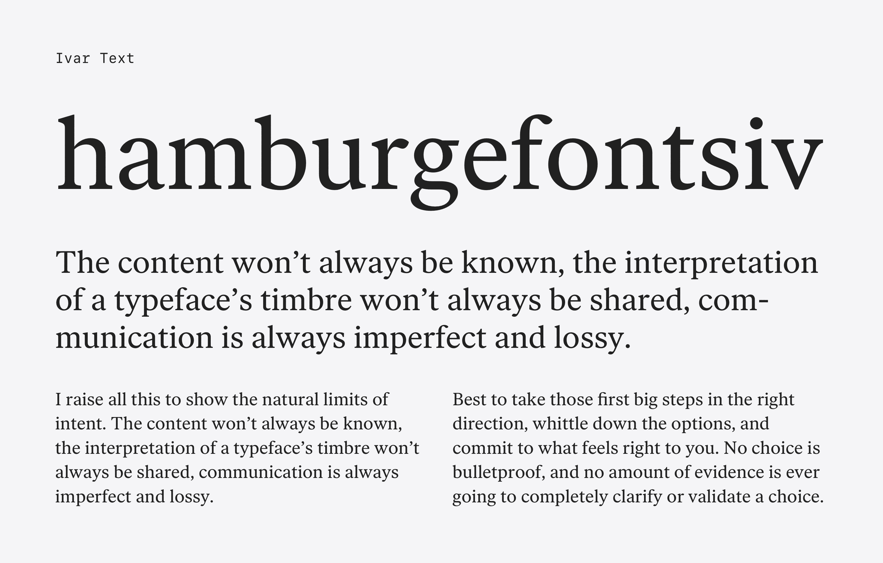
Don’t worry—I’m not considering Times, but there are compelling typefaces that reference it. You saw Lector above, and let’s add a second to the mix: Ivar Text by Letters from Sweden. It sits a bit wider than Times and has less contrast in its strokes.
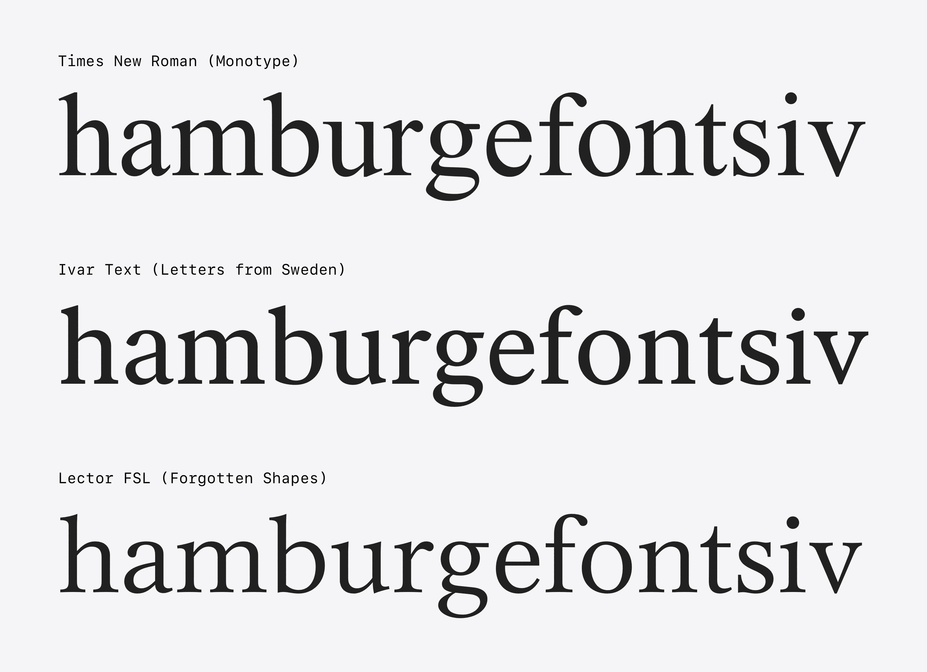
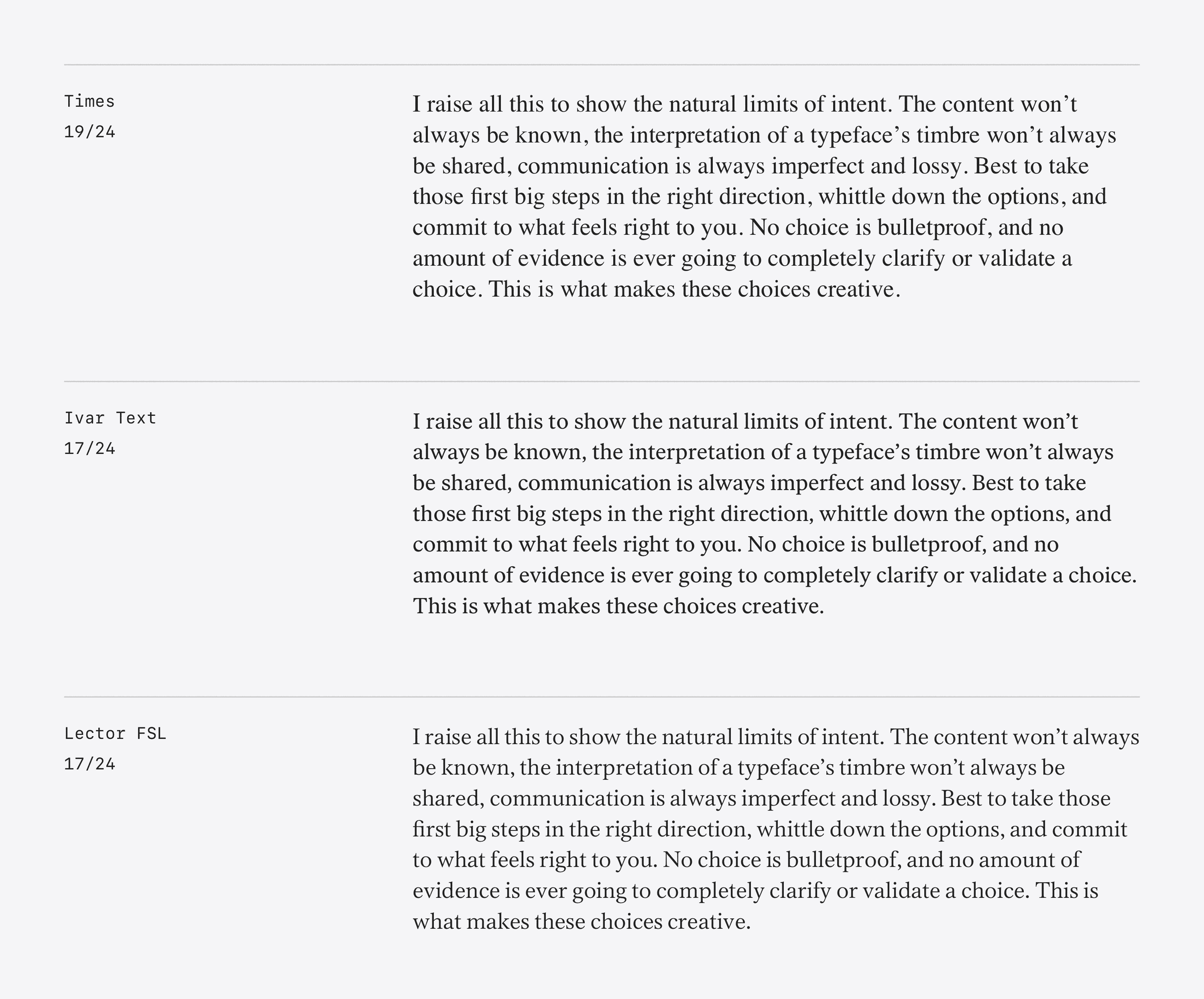
Ivar is looking sharp here—its proportions balance into a nice even text block. It feels reminiscent of Plantin in color without Plantin’s old style, bookish manner. Plus, its shorter ascenders and descenders will let me set the type block a little tighter. Let’s pick up Ivar as our primary, but keep Lector in reserve, like what we did with Söhne.
Serif: Jaunty transitional fonts
Untitled Sans comes with a serif companion: Untitled Serif. The two designs connect in concept, but not in form, as run-of-the-mill interpretations of a serif and sans. It’s a similar concept to my “elevated defaultness,” so I decided to take another look at Untitled Serif.
Its write-up says that Untitled Serif references “the post-Caslon, pre-Times workhorses offered by almost every metal type foundry of the time.” The idea was interesting, so I dug up some options that felt like they could be in tandem with Untitled Serif. I selected typefaces that felt like contemporary, jaunty interpretations of Caslon, Fournier, and the like. Here’s where that landed:
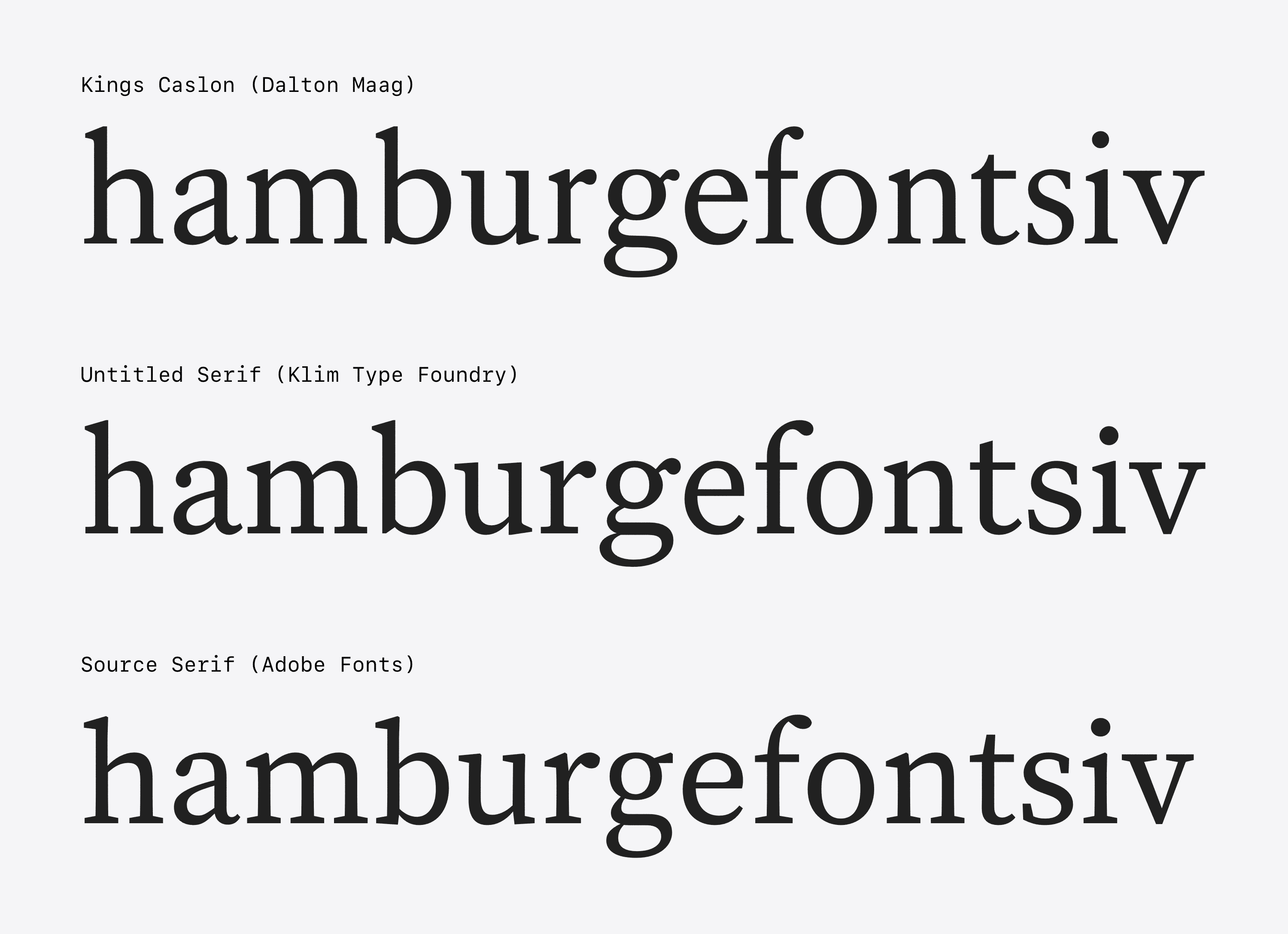
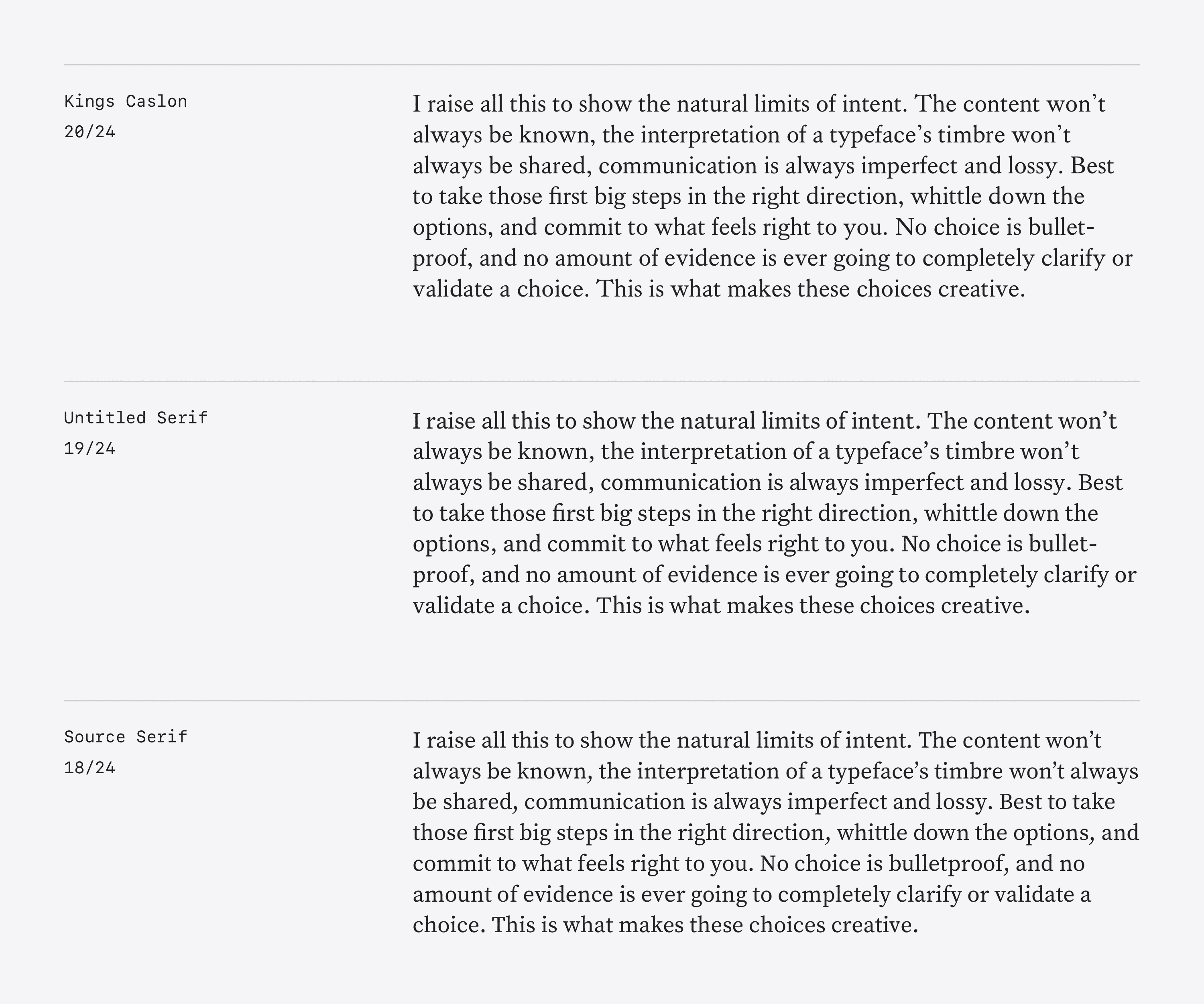
I don’t favor these over the serif typefaces I’ve already selected. All the same, I’m glad I took the time to investigate, if only to explore a different perspective on “defaultness.”
Selections
Let’s take a look at those selections again. These images test the typefaces at body, display, and medium sizes. My intent is a small type palette with few sizes, so I need to ensure that my selections have enough flexibility.
Areas to watch
Seeing the typefaces in different sizes, it’s clear that I have a couple areas to watch while I am designing.
Serif performance at medium sizes
I’m interested in flipping the usage of serif and sans-serif typefaces between pages. For example, the blog would use a traditional serif body and sans-serif headline arrangement, while list-based pages (like Reading and Listening) could flip the stack—sans-serif as the body text, serif for headlines. The flip would suggest the record-keeping focus of the pages by making the body text less “readerly.” It is text for skimming.
This raises a question: how does my text serif feel at medium sizes, e.g. 20-36px? Many of the design details necessary to make a serif work at a text size become liabilities at display sizes—e.g. the wider characters, lower contrast, and longer ascenders and descenders that make a text typeface work can all feel clumsy when the text is too large. Blown up text type often is too heavy letters typeset in a too loose of an arrangement.
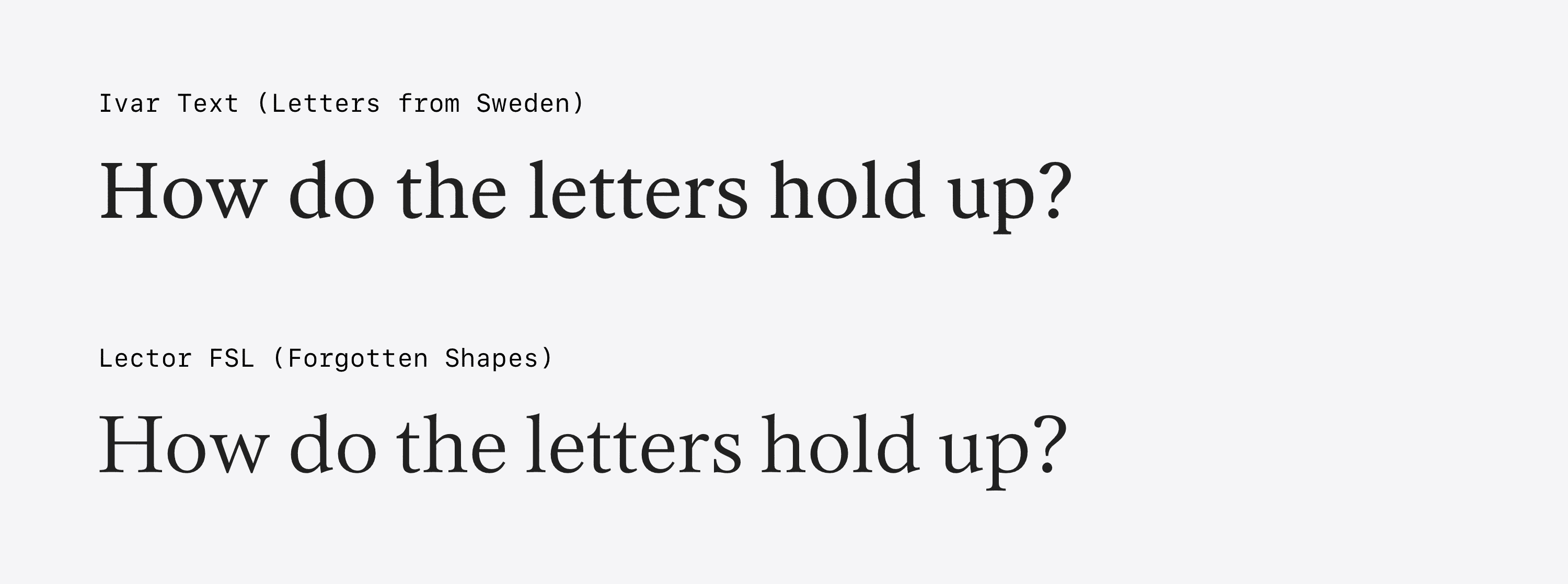
Ivar feels a little chunky at a medium size. And of course it does—“Text” is right in its name and the Headline and Display versions of Ivar exist for a reason. Lector scales up a little better at these medium sizes due to its higher contrast, so let’s see how the design pans out.
I’d prefer to have a serif that works well at both small- and medium-sizes. All this may be a non-issue once I get into page designs. We’ll have to see what the content wants. My fall-back is to give up on the inverted stack and use full sans-serif on the list-based pages. No biggie if necessary.
Sans-serif performance at small sizes and in narrow spaces
Scto Grotesk A is kind of wide, and purposefully so. It’s the primary source of the design’s character, and it’s one of my favorite parts of it. Wideness can be a mixed blessing, though: that wide stance helps with legibility at smaller sizes, but it also takes up more space. Designing with typefaces like these can get gnarly on narrow viewports like mobile or on bigger canvases that get divided up into narrow columns.
Söhne has narrower proportions and tighter spacing, so I have a solid alternative if I find myself fighting the nature of Scto.
Final smoke test
One more test to vet the Scto and Ivar pairing. I haven’t seen this method documented, so I thought I’d share.
When I have two typefaces that I intend to use for similar purposes (in this case, as body text), I typeset them together at a narrow measure (column width) to see if their line breaks correspond. If the breaks frequently match, I can have confidence that the two typefaces’ horizontal rhythms are similar. Their letters are dividing the space in close to the same way.
In musical terms, the two typefaces are keeping the same “time.” In mathematical terms, the division is yielding the same “remainder.”
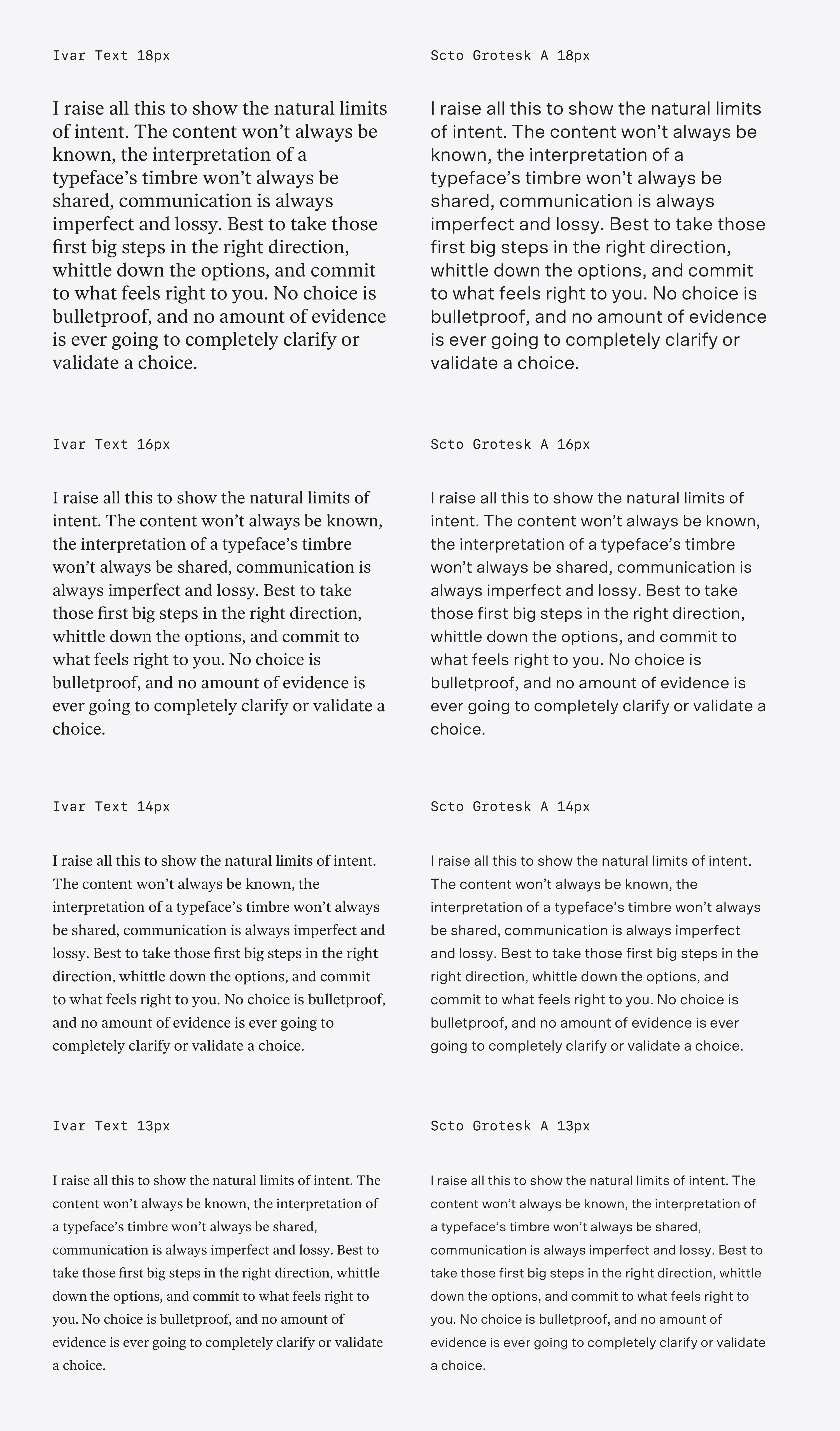
As you can see, Ivar’s and Scto’s line breaks correspond quite nicely.
A note: this example works with both typefaces at the same point size, because they have similar font metrics. In many cases, however, you’ll need to adjust the size of one typeface to have both typefaces’ x-heights match. We need a constant optical vertical size to assess the differences in horizontal rhythm.
I’m feeling good about these choices. It’s time to set up a type scale and typeset a post or two.