Redesign: The Raccoon King of Garbage Mountain
When it comes to websites, I’m a caboose guy—I will happily design footers all day. But headers? I would prefer not to. More hassle than they are worth. Let a young, eager designer who wants glory and visibility have at it. Navigation at the top of the page turns a lack of conviction and corporate incohesiveness into a real estate problem. What a nightmare. Have you sat in an IA meeting for a corporate website redesign? It’s a coin toss whether Kafka or Dante would do a better job describing it.
But down low? Yes, please. Footers are magic, because they can be as big as they need to be—there’s enough room for everyone. Perhaps this my egalitarian streak expressing itself. Come one and all! We can cater to every whim; the doors are flung open for you. Footers are the suburban McMansion of web design, the Pleasantville of pixels. Sprawl, sprawl, sprawl. I love it—everyone relaxes. Space comes cheap at the bottom of a page, so why not get the three car garage, honey? Pixels are free! Build it out and fill it up. But up top? Difficult. Tight quarters. Each pixel counts, and any vacillation about a visitor’s needs pushes everything further down the page. And as time has taught us, power always beats common sense, and nobody is going to spend their political capital on clarifying a website’s navigation. So, cheers to our clumsy and omnipresent art director: consensus.
Web design conventions are cruel and ironic. Look at header navigation: take the hardest thing to decide, then put it up top and in front, so it becomes a tempting place to start. It’s a trap. Trust me: design the footer first, then simplify it to make the header navigation. A good footer is an idealized header, what the header wishes it could be. I can show you psychological scars that have taught me this lesson. Please, listen to my advice, so the baggage I drag behind me is useful. Work from the inside out, from the bottom up. They will think you are working on small things, but no, you are mounting evidence, and you will use that evidence to bring your detractors into agreement. If they don’t listen, quit. Nothing will work in that kangaroo court. This will be my parting design advice before returning to the ultimate negative space. May my last words be every designer’s wet dream. I’ll howl “I told you so!” and then vanish into rich black.
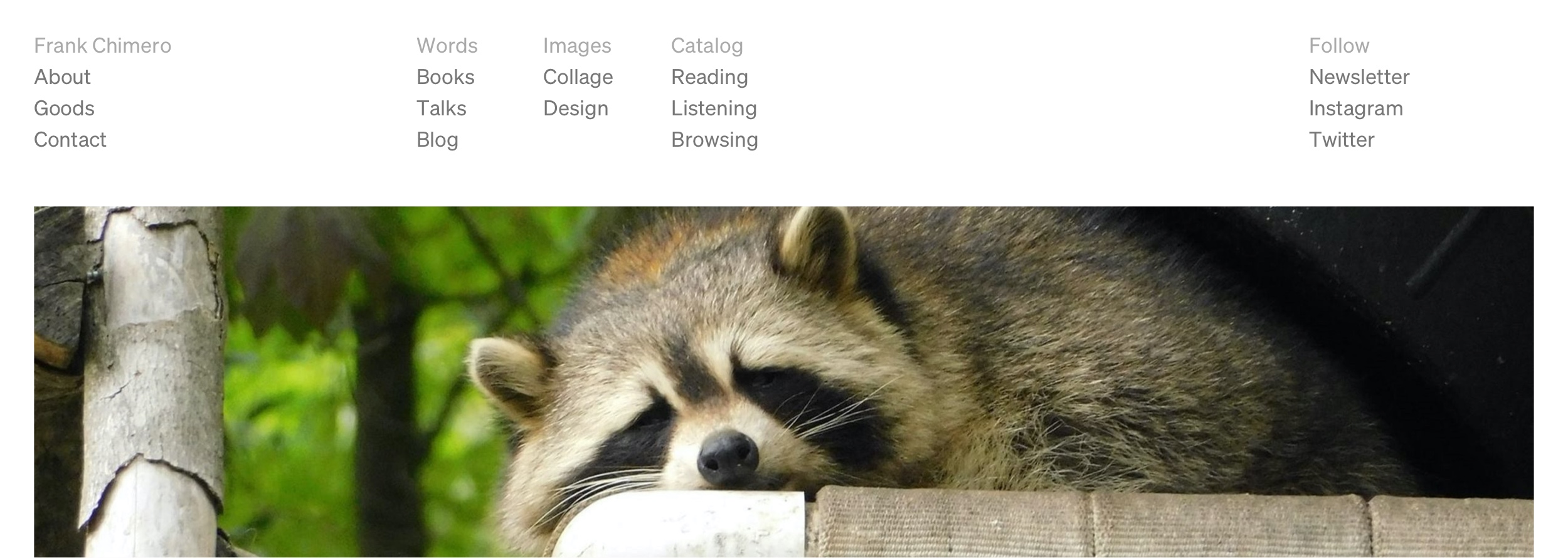
You’d imagine that a seasoned and soured designer would side-step all of these complications whenever they could. And indeed, most do. Visit many designers’ websites and you will see two links in the navigation: Work and Info. Bully for them. I am, on the other hand, an unsympathetic and frustrated creative. I have a sprawling empire of conflicted uselessness locked into the coordinates of www dot frankchimero dot com. Welcome to my personal website, my empire of shit.
I am the raccoon king of my mountain of garbage, and when it comes to organizing it, I am willing to participate in all that I condemn. Imagine Marie Kondo as a slob at home, surrounded by empty pizza boxes and grease-stained, pastel cardigans. It can happen—I have chef friends who regularly order McDonald’s french fries. No judgement here: they are very good fries (the best?) and someone will bring them to you. I defend the choice. All the same, it is something to hide, if only for the expectations created by one’s profession.
But here, this site? Design? It’s meant to be seen. There is no galley to crouch in and nosh on fries while your customers enjoy scallops and whipped parsnips. All transgressions are visible.
Take a look at this website, this leviathan. It could easily have nine items in the navigation. Possibly more? Sure! Why not? It and I are monsters, perfect representations of all that I detest. I will ignore my best advice. How dare I? Precisely. The garbage king slowly unfolds his toothy smile in hypocrisy and satisfaction. See these sparkling eyes? Something will burn. It is good to be king.
I went looking for other people who are willing to do more than one thing, or maybe better put, to be privileged enough (like me) to not be completely flattened out by the market and allowed to publicly contain multitudes.
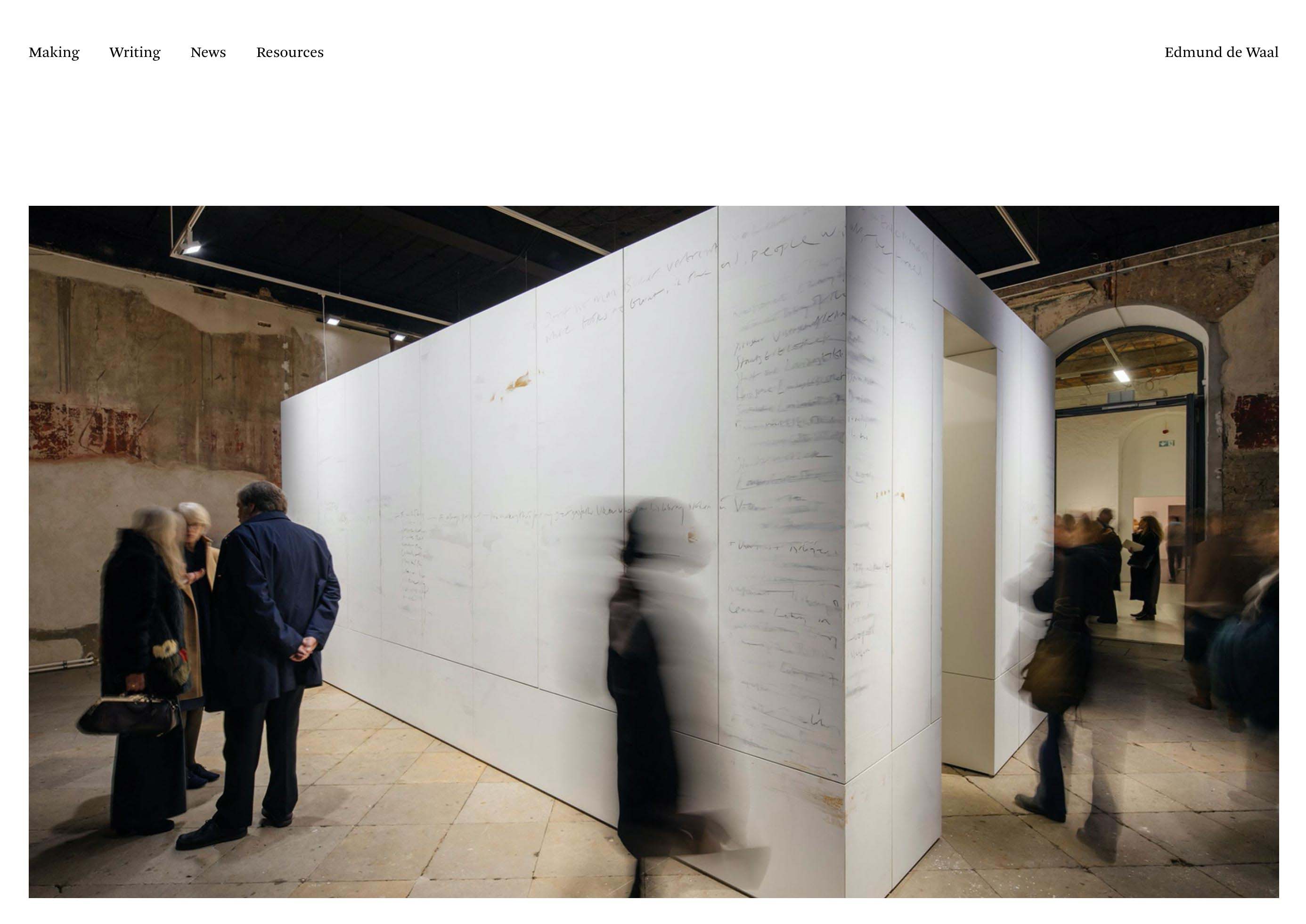
The first person who came to mind was Edmund de Waal—a wonderful writer and artist, master potter of porcelain, and probably the only person who regularly gets to write books and write on walls, but, like, in a fancy way. He is represented by Gagosian; he is published by FSG. His work deserves both.
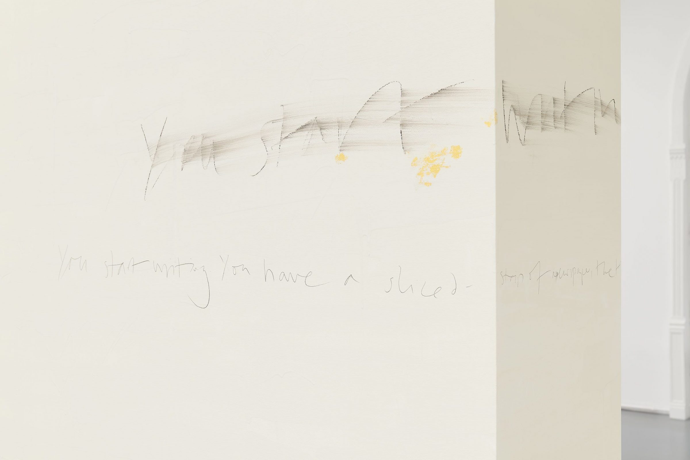
Edmund de Waal, 2019

Edmund de Waal, 2019
In addition to his fine art, de Waal is the author of two notable books: The Hare with Amber Eyes, a family history involving, among other things, a significant collection of Japanese netsuke, and The White Road, an evaluation of the people, histories, and traditions related to porcelain—de Waal’s preferred medium.
de Waal’s site, designed by John Morgan Studio, takes a pragmatic approach to the artist’s expansive practice. Instead of exhibitions, books, talks, and so on, the site adds a meta-level of navigation and bifurcates the site into activities: “Making” and “Writing.”
Navigating further in, you can see how the site’s hierarchy stacks underneath the primary navigation. It is elegant and compact, while retaining a lightness that’s necessary to coincide with all that white porcelain. (If you’re wondering about the typeface used, it is Arnhem by Fred Smeijers, a distinguished choice and a contemporary classic if ever there was one.)
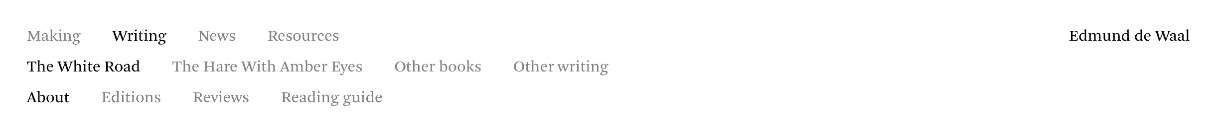
Active pages are in black, inactive navigation items are gray. Each new line is a level deeper into the navigation hierarchy. It manages to do this without being overbearing. I am not entirely certain how. This approach should be a recipe for disaster, but somehow it works. Perhaps this comes from the combination of Arnhem looking so damn elegant and the website’s navigation behavior. It drops the visitor into the third level of the navigation after clicking on something in the top-tier of the hierarchy. (Clicking on Writing sends you to The White Road’s about page.) This makes getting through the depth a little less laborious.
The three lines of horizontal navigation are probably making the UI designers shuffle their feet in discomfort. It’s something they would never choose, and perhaps this is why I find this solution so interesting—it is direct and works in spite of my expectations. Pleasant surprises are rare, but here is one.
There is a welcome lightness in this wrong approach, while interface conventions only offer weight. What do they say? Saddle up your content into three consecutive columns like a column-view Finder window. Or perhaps you would prefer to jump orientations? Have the top level run horizontally, then the next two run in columns vertically. If this sounds convoluted, yep. Say hello to an old friend: iTunes.
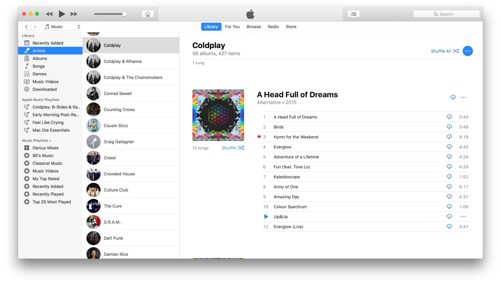
Three levels of navigational hierarchy above the content is something that almost never works—this is one of the reasons why iTunes was a mess for the better part of a decade. (That Homer car had four levels of navigation. Four!) iTunes got flattened to two levels when it was renamed to Music, and I think it’s the most significant change. Before it was a Rubik’s Cube of an interface; now we have something comprehensible.
Here is another bit of advice to shout into the darkness, this time on navigational hierarchy: Three levels is hard, two is easy, one is best.
If you have three levels of navigation above the content, try this neat trick: order a pizza and lock yourself in a room with everyone that has enough power to change the plan. Snarl. No one is allowed to claw out of that hell hole until you have two levels. If your navigation looks like your corporate org chart, you’ve failed. Fixing this will hurt, but think of this strategy as a way to consolidate all the pain you’d otherwise spread out across the whole project. Three hours of pain or three months, regarding work that probably can’t be changed for three years. Those are your options.
I am glad to have de Waal’s site offer an alternative to the boring ass column approach, but I need to avoid that extra top level of navigation. My pages have such superficial relationships to one another. There is no satisfying way to group them—another level would be obfuscating, primarily because the top level of links couldn’t describe what would be hiding underneath. How would you file About and Shop together? Am I gonna make those sweet bucks if I don’t put Shop on the top level? (Go buy a print.) Where does the link to my design studio go? Will I starve if it’s not visible on the top level?
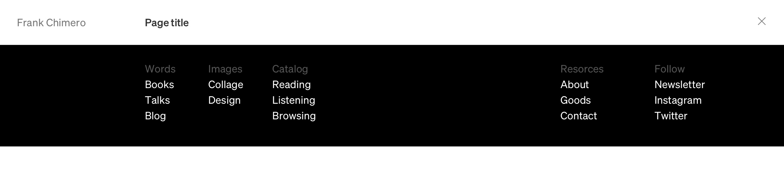
This website is my own pile of discordant garbage, and unfortunately, things need to stay flat. Here are some early attempts at organizing this riff-raff:

Good god, it’s soup. You can see some half-hearted attempts to label groups in the hope this would diminish the soupiness. But nope. Still soup. One can make the text play nice and seem organized with columns and colors, but there are no typographic tricks to make this many items feel slim.
I’ve designed for many years, but again and again, I have to relearn where to draw the line. I will strap myself to my desk and push around text blocks until I drive myself crazy. I will waste hours. I wish there was someone to drag me out of this whirlpool, but no, I compulsively need to follow through on it until I sink into sullenness and everything seems impossible. On sunny days we call this self-defeating process “exhausting discovery.” Clients love it, because it makes piles and looks like work. But when the day gets dark, we can see it for what it is: neurotic insanity—though, thankfully, a flavor of it that is socially acceptable and harmless (if I am excluded).
Nighttime is when the garbage voice starts chattering. It says “burn it down.” Get rid of navigation. Life is short, garbage tastes good, be free tonight. Keep everything. Show nothing.
This is against my nature: navigation should be shown. But undermining your values is an essential step in ruling Garbage Mountain.
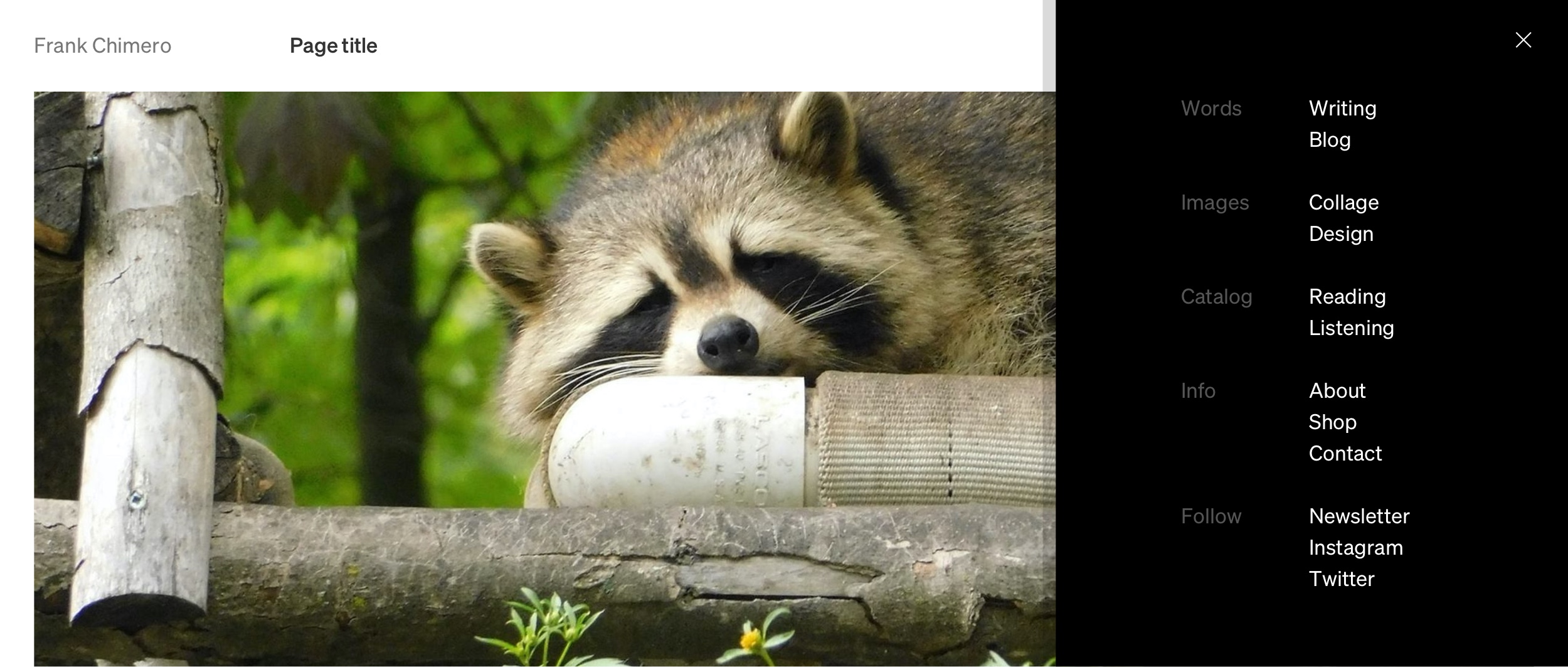
This:
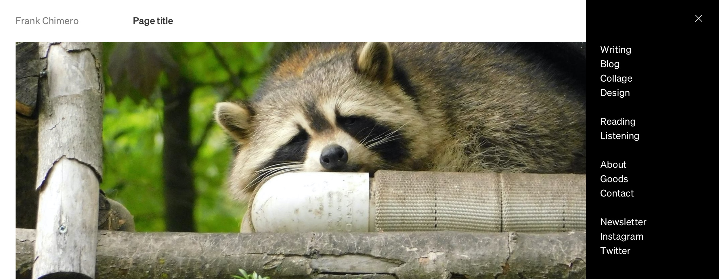
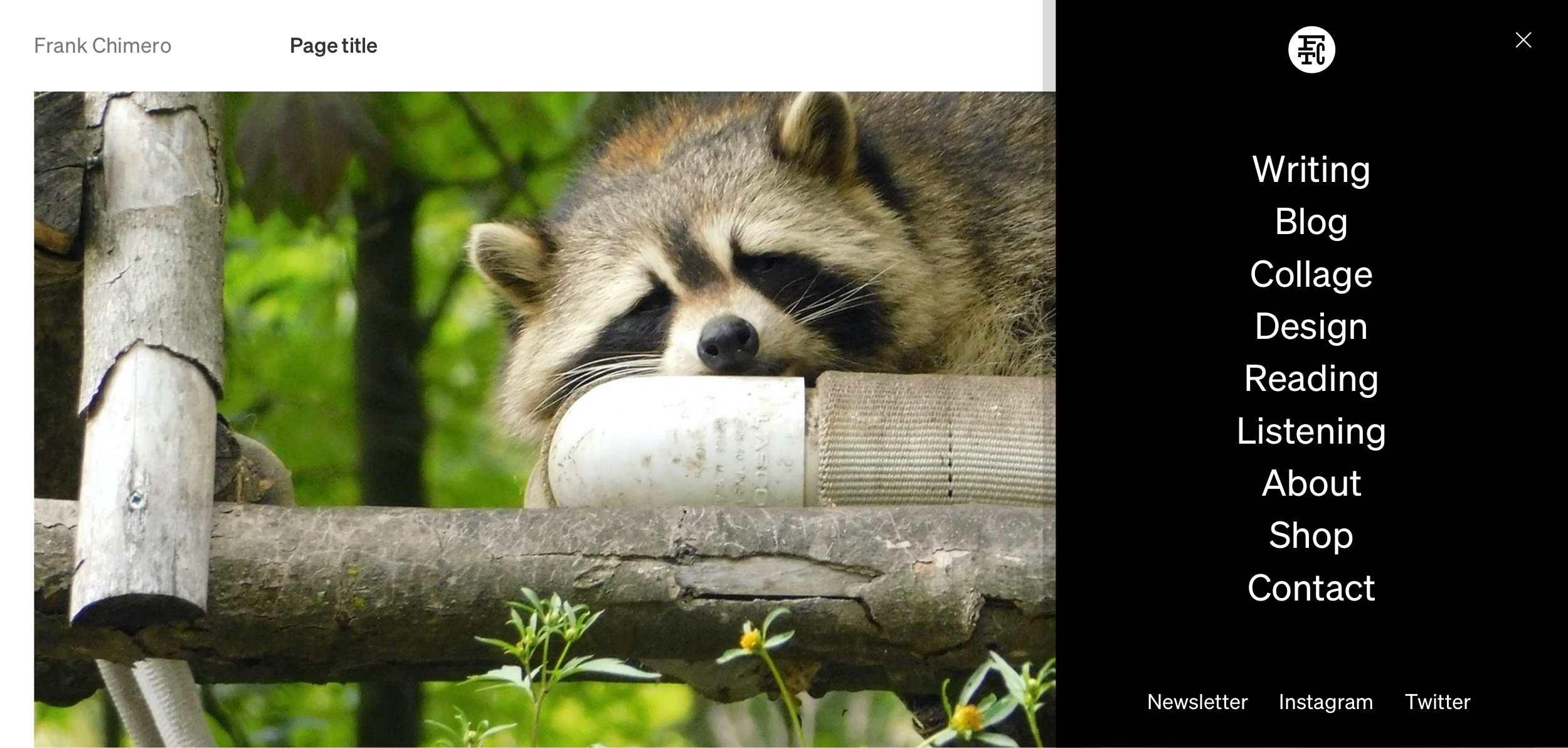
Becomes this:
Or even this:

You could call it a hamburger menu, but I am going to blow some smoke up your ass and call it progressive disclosure navigation. It is idiotic, I know, but allow me this. Design is the spin zone, and you should be taken for a ride.
You may ask: “What happens when my grubby little paws tap on that menu link?” Good question. The Raccoon King wants conquest. The menu expands, perhaps to more space than it needs.
Too timid.
Nope. Vertical is better. More logical about what to do if there’s overflow if it is vertical.
Interesting. Structure is nice, but maybe unnecessary. Also—if we are going to have this little tray of garbage come out, we should at least have a surprise in it.
Yes. Now we are talking. Some sizing and spacing issues to work out, but I suspect that will be easier to sort through in a prototype of some kind. For now, this feels good. The nav may be full of garbage, but it’s my garbage.
Long live the king!