Redesign: Scales and Hierarchy
In the last post, I selected two typefaces for the website—Ivar Text as the serif and Scto Grotesk A as the sans. This time, I want to establish a type scale and talk a bit about hierarchy.
Setting the size
The first step is to set a body text size. Responsive sites usually define multiple text sizes for body at different viewports. I do this, too, but my preference is to have as few sizes as I can. I want fewer things to manage, thank you.
As I’ve previously written, once I have enough visual space in the browser window to accommodate my preferred body type size, I stay with it. My preference is to approach the extra space of larger viewports as a layout challenge, not as a process of continually increasing the body text size. I want to use the space, not just fill it.
My process of selecting body text sizes has remained consistent over the last few years:
- Define it for mobile. Figure out what works in a text box 320 pixels wide by working outside-in (similar to the bed in the NYC apartment metaphor). Ideally, I am looking for a type size that allows 5 or 6 words per line.
- Define it elsewhere. Apply the mobile choices to a 700 pixel wide text box and make adjustments to the type size, line-height, and text box width as needed—typically bumping up the text size a pixel or two to take advantage of extra space, and increasing the line-height by 5 or 10% to accommodate the longer line length. The text block should get 10 to 14 words per line. Repeat for a third body text size if necessary.
- Find the breakpoint Determine the right width to switch between the type sizes
A lot of this is a nudging process guided by feel. The numbers above are only an attempt to be helpful—trust the eye over numbers. If you’re looking for a short, incisive text on typesetting, I highly recommend Jost Hochuli’s Detail in Typography.
Here’s where I landed:
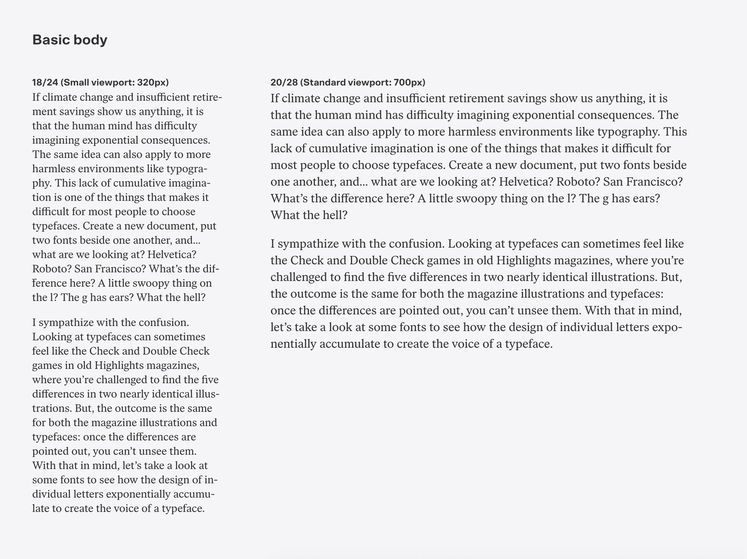
I’m looking for a few different things with these text blocks:
- Even flow: Good feel to the text, with a gently rolling right edge to the paragraph (called a “rag”). We’ll need to slightly lower our standards on the mobile column, due to it’s narrow width and CSS’s just-okay hyphenation engine. (Okay, fine. Here’s the link you’re expecting.)
- Similar color: Imagine looking at each text block through squinted eyes. The black and white of the letters with the white space between lines combine into a fuzzy gray. We call this “color.” I want a similar (though not necessarily identical) color between the two blocks to maintain its feel across different viewports. The color can be adjusted by changing the type size and line-height. For instance, smaller type with more line-height creates more white space, meaning a lighter color.
- Mathematical rhythm to the line-height: We’re looking for numbers that relate to each other by being commonly divisible, because we’ll use that unit in the rest of our type scale. I often nudge my line-height up or down a pixel to achieve this numerical relationship. I like to work in units of 4 or 8. You can read more on 8pt grids here, though it has more of a UI-focus.
It’s worth restating the obvious: half-pixels don’t exist, and 1px goes a long way to change the feel of a text block when we are talking about type that’s 16, 17, 18 pixels in size. My experience has shown that the wrong sizes are easy to spot, and tight columns like the mobile text block leave you with one or two clear candidates as a starting point.
Once I have my type sizes selected, I need to establish the breakpoint measurement where the body text switches from the smaller type size to the larger one. I do this by finding a common column width where both type sizes feel okay, but slightly off—the small type is a smidge over-extended and the large type feels like it could use a touch more room.
For this particular example, 600px was that spot of mutual, mild discomfort:
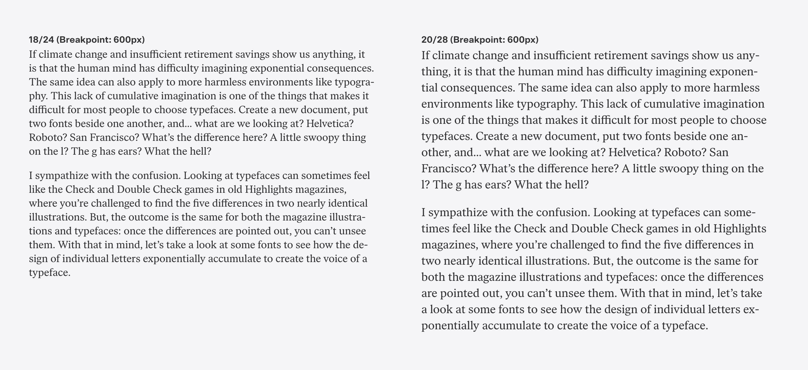
So our body text is defined. It will be 18/24 until 600px wide, then will switch to 20/28 with a max width of 700px.
Before I move on, one more thought about typographic color, because this may be the only chance I have to get this down. Every designer has their own preferences when it comes to typographic color, but there are patterns.
My observation is that digital designers prefer text blocks with lighter color—lighter typefaces with more line-height, ranging from 140–160%. Perhaps they are carrying over a typographic sensibility that is helpful in interfaces. Experienced print designers typically prefer a darker color—typefaces at heavier text weights with less line-height, ranging from 120–130%. This is one of those fascinating cultural differences, and may also be a repercussion of training—learning by mimicking digital design references versus being schooled in editorial and book typography. An argument could also be made that ties together screens as a light-based medium to lighter typographic color. There are many plausible causes.
Most running text on screens have too much line-height to my eye, especially on mobile. It’s interesting though—I think screens and online reading have created a shift towards designers applying more line-height everywhere. I see 150% line-height all the time on printed subway ads, high enough that it feels like the lines of the headline are about to float off. This may also be a consequence of design systems or assets being carried beyond their intended application: 150% line-height might make sense for some small text on a screen, but loses credibility when applied to a 180pt headline on a poster. Just another tiny context collapse exacerbated by digital technology.
Creating Hierarchy
I still haven’t defined a type scale, but before I get to that, I should talk about hierarchy. Many people think that establishing hierarchy with type means making type bigger and bolder. While this is one method (and the default provided by CSS and many word processors), it’s only one way to achieve visually structured information.
Designers have a few typographic tools at their disposal to create structure:
- Spacing
- Weight
- Color
- Size
- Typeface switch
- Accent
These tools can be used individually or in tandem. As an example, let’s take a blog post and it’s header, and apply one tool at a time to create hierarchy.
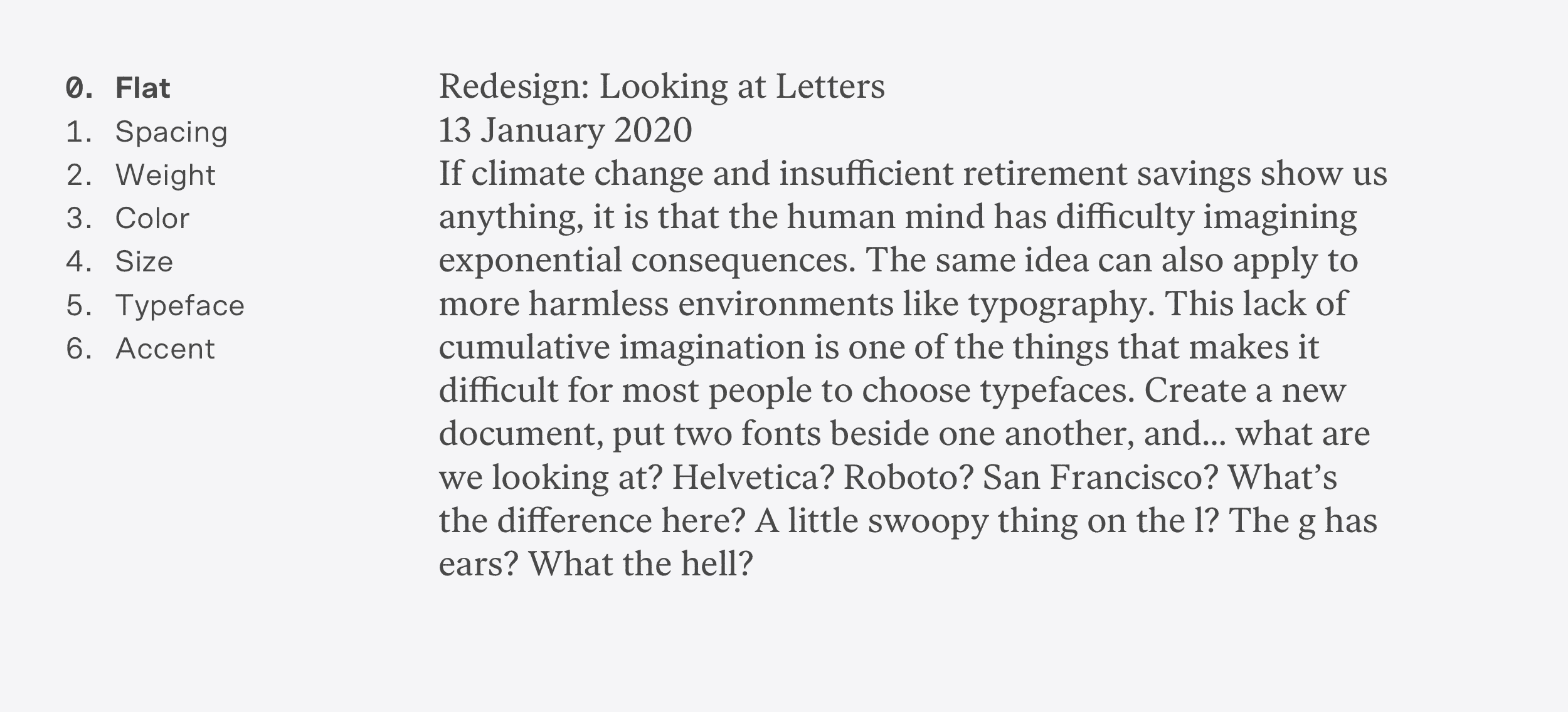
Let’s look at the content flat as a starting point. This is similar to what you see with a CSS reset. No styling—just text and line breaks. If the text can be said to have any hierarchy here, it’s determined by the order of the content:
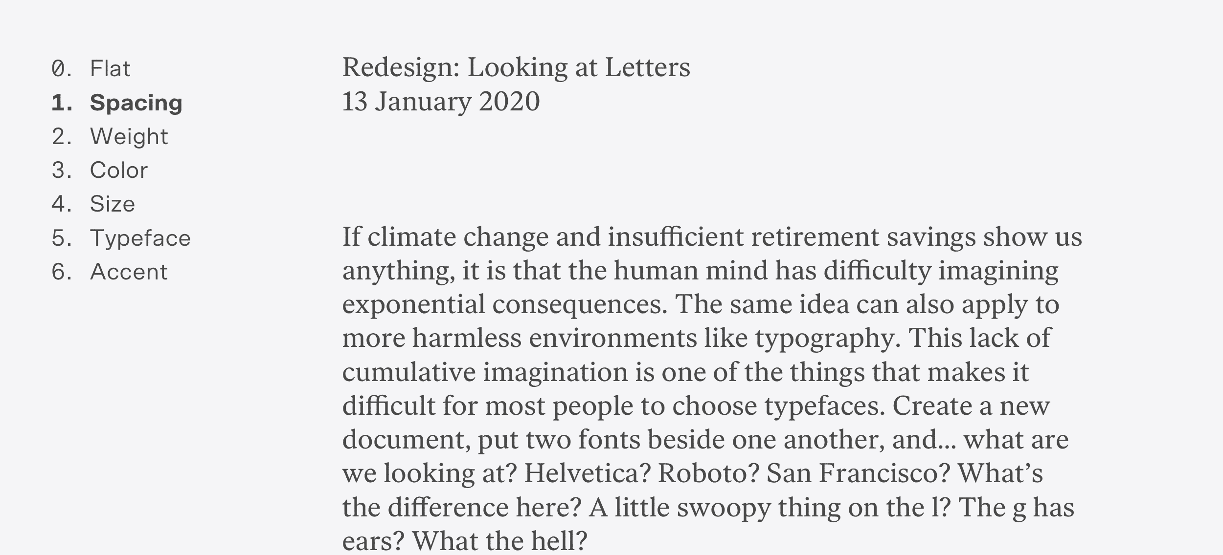
As a first step, let’s add spacing to create structure in the content. This is the most fundamental aspect of design—dividing space. A designer can structure information through composition, without needing to rely on bold fonts, colors, and the like. Space becomes an opportunity to focus on grouping information and creating rhythm:
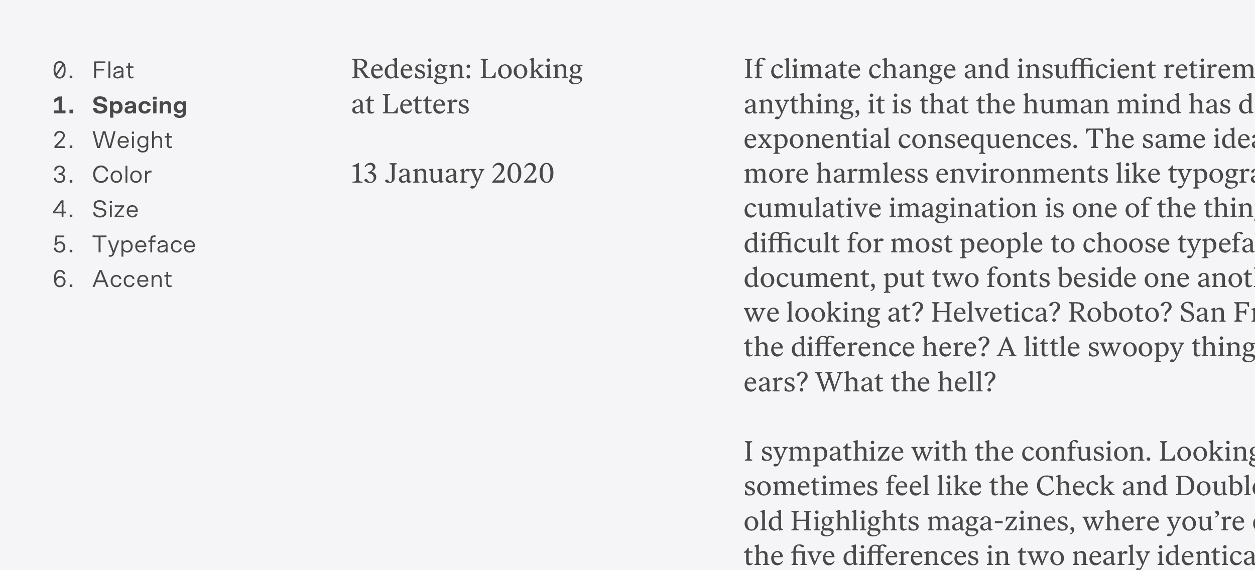
The tone of this is sitting somewhere between austere and dignified, no? Of course, I can also divide space horizontally, so instead of adding space under the heading text, I can separate our content into two columns to suggest its structure.
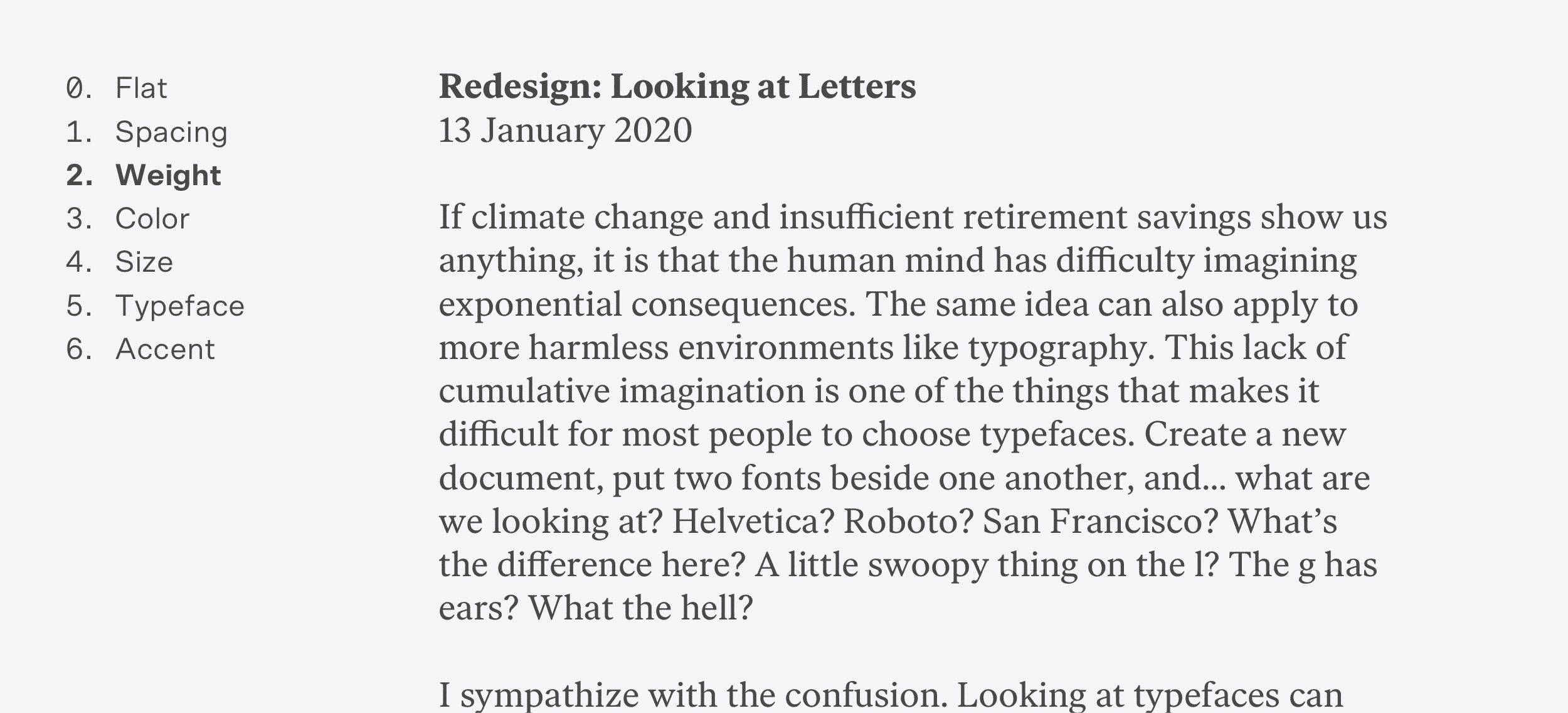
I can also reinforce hierarchy by using multiple tools to suggest something’s importance. Here, I’ve used space to group the heading text, then made the post title in bold to create a little more structure.
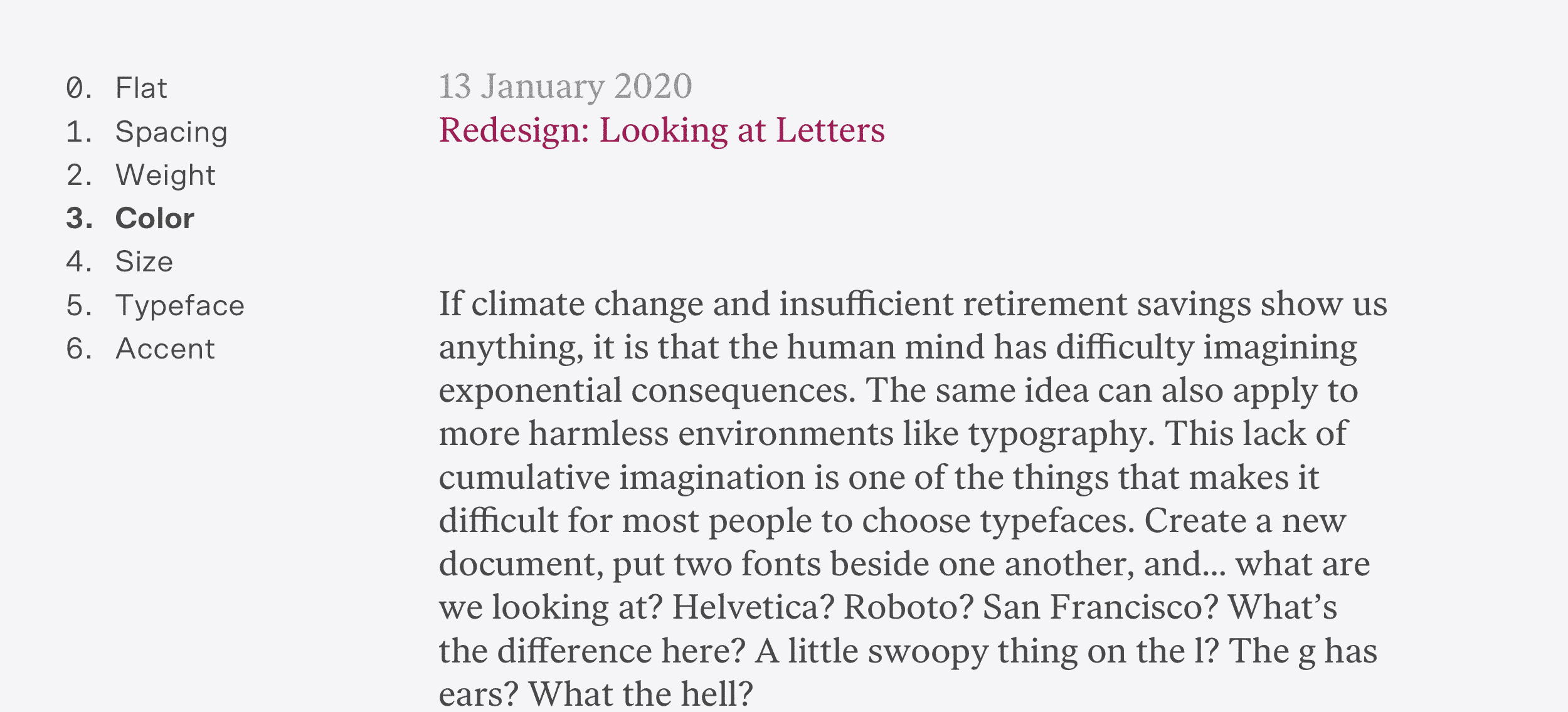
I can take the same approach and use color instead of weight.
An interesting observation: order matters a little less in the presence of more expressive hierarchy tools. With color, I can undermine the strict order of the content and place the less important date above the more important post title. Everything reads fine.
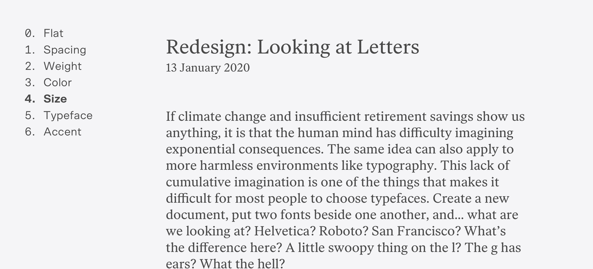
And yes, of course, I can make the type larger.
Or change the typeface to express significance.
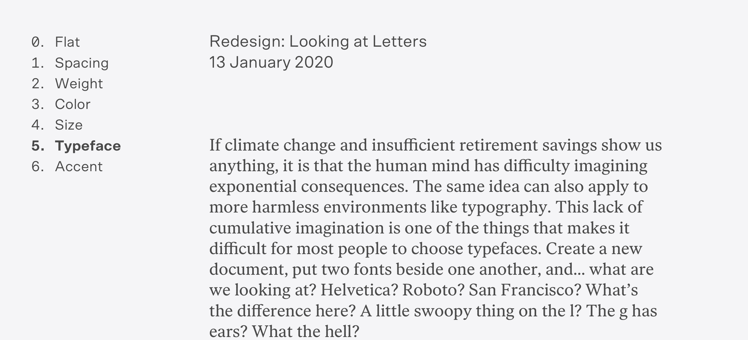
It doesn’t need to be a different typeface, either. Swapping styles can also suggest importance.
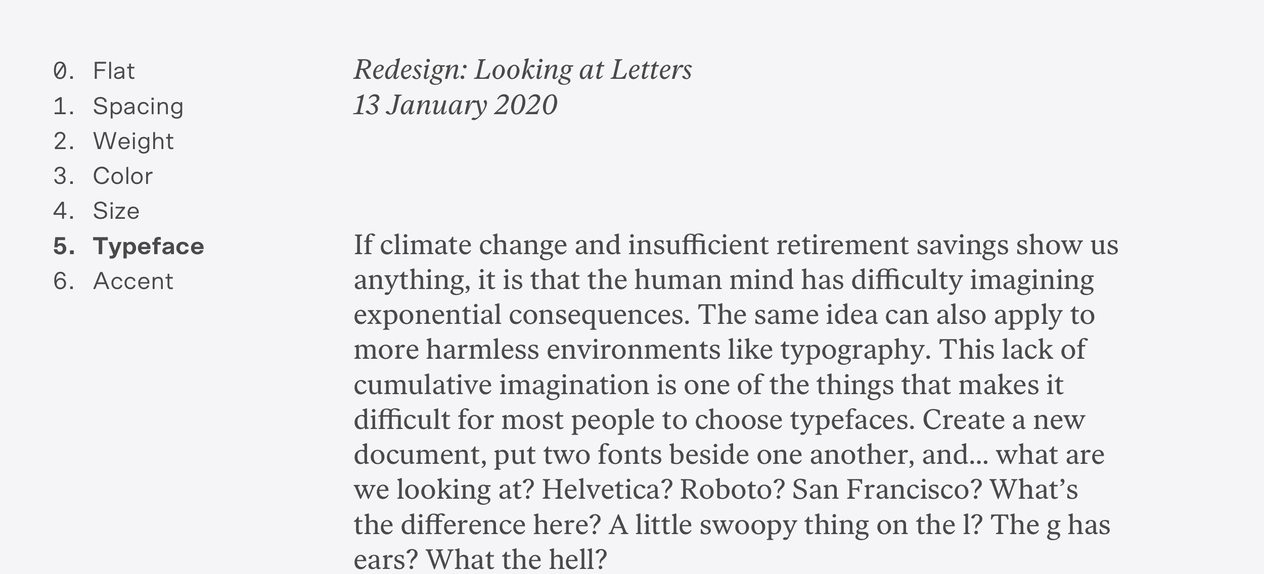
I am purposefully being reserved——one doesn’t need a big, red, sans-serif headline to go along side their body text.
The goal is to create contrast that communicates significance, and contrast is always contextual.
Oh yeah—you can also add a doo-hickey by the text to make people look at it.
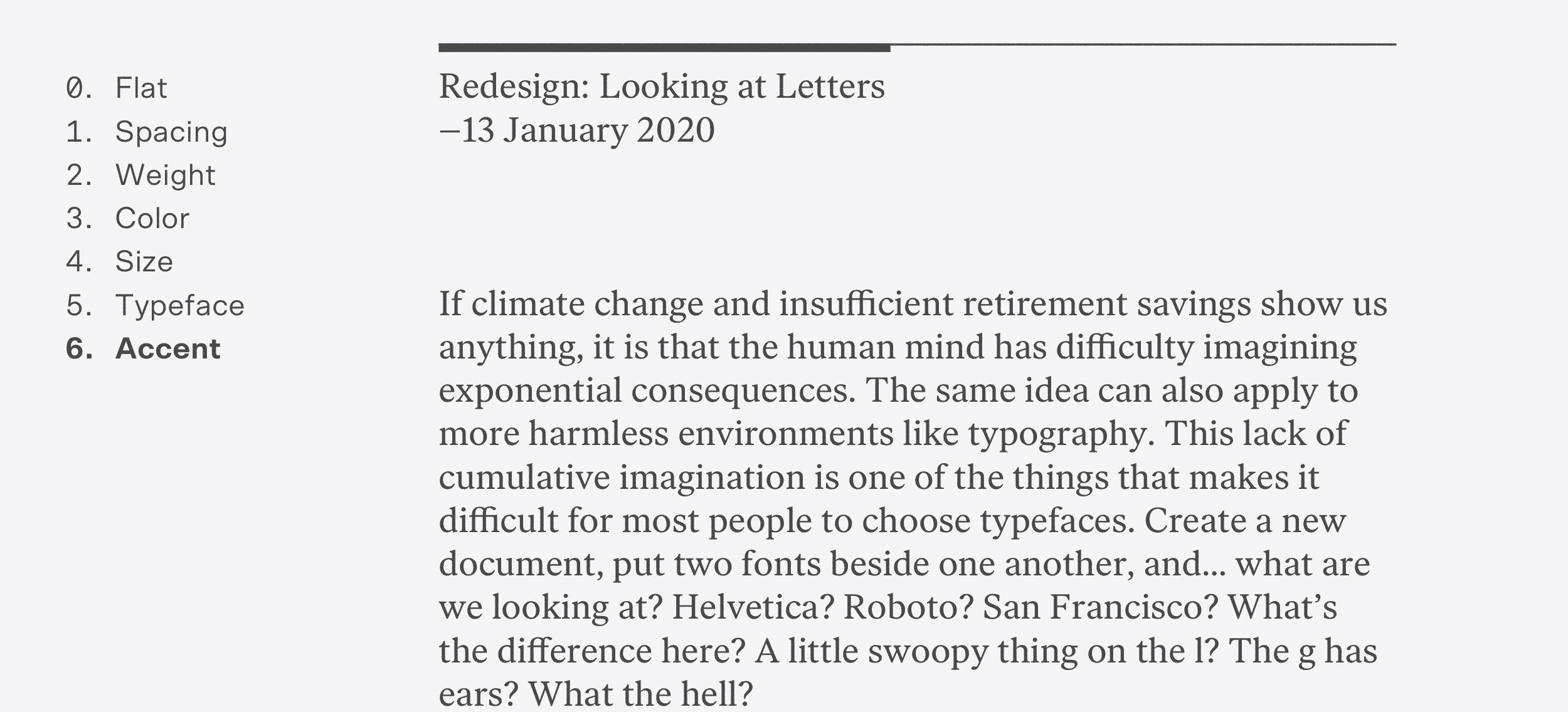
Or use a bunch of tools all at the same time. The tools can be worked in both ways, too—to increase or decrease the prevalence of content. The date is pulled back in this example by making it smaller and lighter, while my graphic accent accentuates the left-hand column, making it more important.
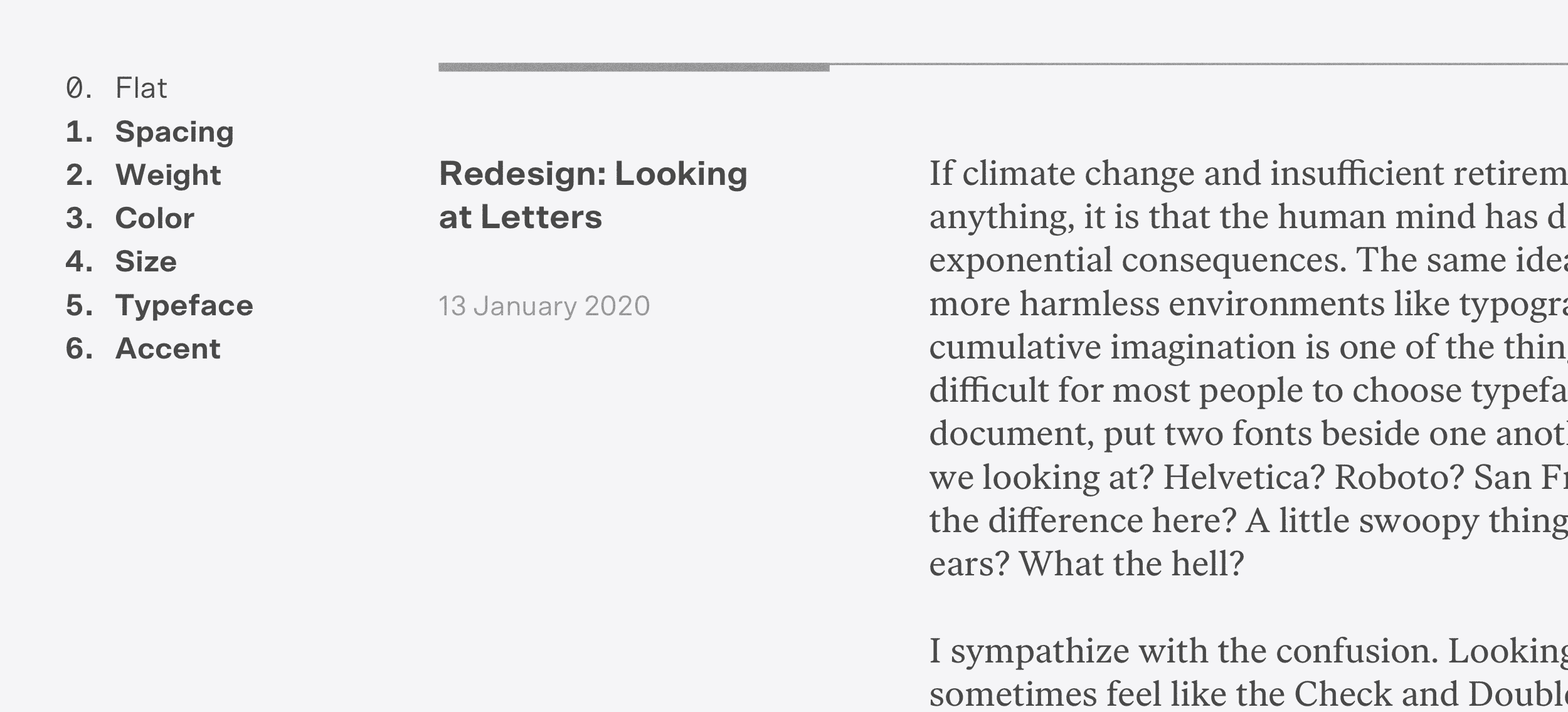
All of these examples are shallow, two-level hierarchies, that are kept simple to clearly show the tools we’ve got. That said, the more levels of hierarchy one is managing, the more tools a designer will need to express it. Our tools make for some interesting typographic challenges when combined with some of the constraints present in web design: how often should we use weight or swapping typefaces to establish hierarchy if we care about the website’s font payload? What’s the approach to using space to create hierarchy if we have limited real estate on a mobile screen? Do these choices collectively maintain their integrity in expressing hierarchy as we change their size and apply them in different contexts? Does the H3 still read as kind of H3-ish if there are no visible H1 or H2s? And so on.
One can only make so many things bold, only use so many colors before it looks like clown vomit, only add so-many doo-hickies. Most designs will eventually need to use to size to express hierarchy, and that’s where the typographic scale comes in.
Type Scale
I already have two values on our type scale: 18/24 and 20/28. These will act as the middle of the scale, and I will select a couple sizes smaller than body for things like captions, and a few sizes larger than body for headlines. If six or seven sizes are insufficient, take it as a signal that you’re either dealing with some gnarly shit or you’re improperly using the other hierarchy tools, like color or weight, to establish hierarchy.
I’m maintaining increments of four in my line heights, and doing the same for the larger type sizes. This keeps things proportional, and guarantees consistent and even vertical rhythm down the page. Sizes smaller than the body text size are just whatever creates visible size contrast without getting too microscopic—there aren’t too many legible sizes under 18px, so I’ll pick what feels like it can work best for my needs.
Listen: there are a bunch of methods out there for creating type scales. Some are modeled after musical scales—the fourth, the fifth, the minor fall and the major lift—and, ok, sure. Whatever. I’m going to be honest here: it is some nerd stuff and I have never felt much usefulness in these mathematically rigorous scales. I appreciate math and think the golden ratio is super cool, but me and my reader and my CSS are not going to understand the finer nuances of 21.33 pixel versus 22 pixel type. The eye is more forgiving to imprecise harmony than the ear. I just want my baselines to line up and to have enough contrast between type sizes so they are distinct from one another.
I try not to have three consecutive type sizes for my smaller units, because it means that the hierarchy is muddled and the scale is clogged. For example, having 13, 14, and 15 in the scale is probably not great, but simplifying to 13, 15, and 16 will help clarify things by forcing the designer to rely on font weight, color, and so on. All that said, it is incredibly easy to clog up the smaller values in a type scale while working on things like interfaces. It’s something to keep an eye on!
Enough with all that. Here is a first draft of a type scale:
- XS: 15/24
- S: 16/24
- M: 18/24 (Body text on small viewports)
- L: 20/28 (Body text on large viewports)
- XL: 24/28
- XXL: 30/36
Take a peek:
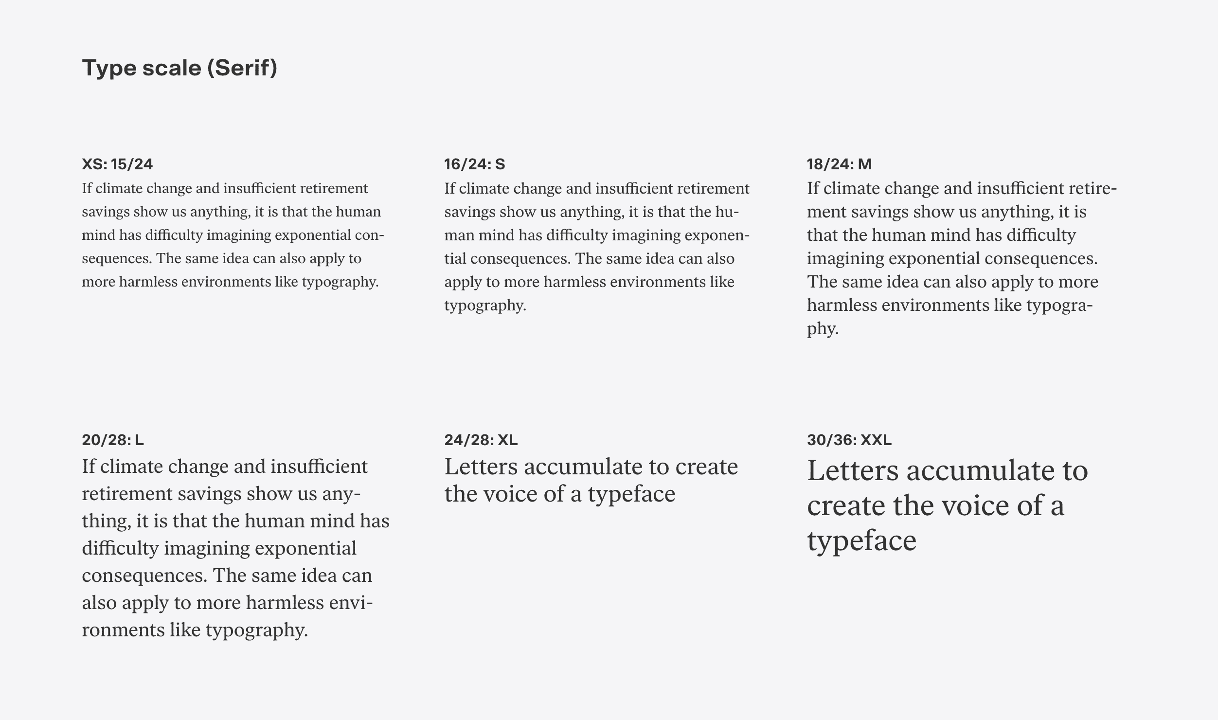
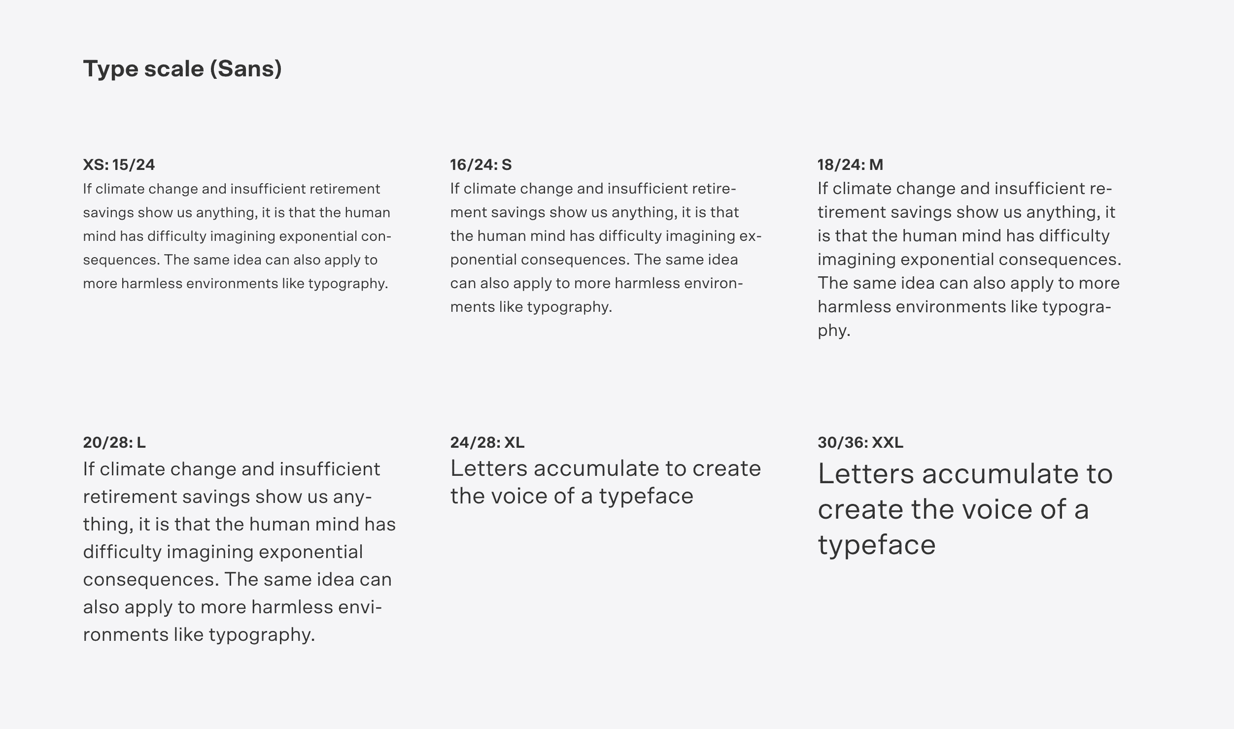
This feels like a reasonable starting point for me. Onward to using this thing.