These thoughts on digital canvases were first presented on November 14, 2013 at Build in Belfast, N. Ireland. This page is an adaptation of my talk.
The past two years were a wild chase for answers. I read books, looked at art, listened to my heroes, and sketched out scratchy thoughts of my own to search for any sensible response to a question that had been lodged in my head for months: What does it mean to natively design for screens?
I couldn’t get the question out of my head. I tried to find its contours, and just as I thought I had made some progress on a response, a new part of the picture appeared and showed I only had a shadow of an answer. After many failures, I began to see which approaches worked better. The way toward an answer is never what you expect, so I was surprised that mine began with a routine trip to the pharmacy.
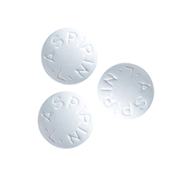
These are aspirin pills. I’m not big on medicating, so my aspirin purchase was the first in a long time. When I rattled a few of the pills out of the bottle, I noticed they seemed to be a lot smaller than I remembered.
I went online to see what was going on. It seems pharmaceutical companies have been able to make the active drug in aspirin more effective in the past few decades. The tiny aspirin pills are hardly aspirin at all, and the drug’s current version is so potent and physically minuscule that it must be padded with a filler substance to make the pill large enough to pick up and put in your mouth. Literally, you couldn’t grasp it without the padding.
When I read that, it occurred to me that we’ve been living through a similar situation with computers. I mean, have you looked at technology recently and taken stock? Things have changed under us. We take it for granted, because the transition was so fast and thorough.
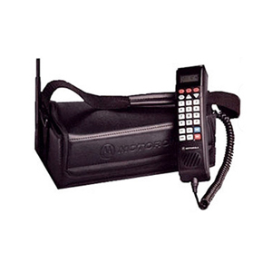
I remember my first cellular phone. It came in a bag and we called it a car phone. Now the phone fits in your pocket and you can use the damn thing to start a car. It’s remarkable.
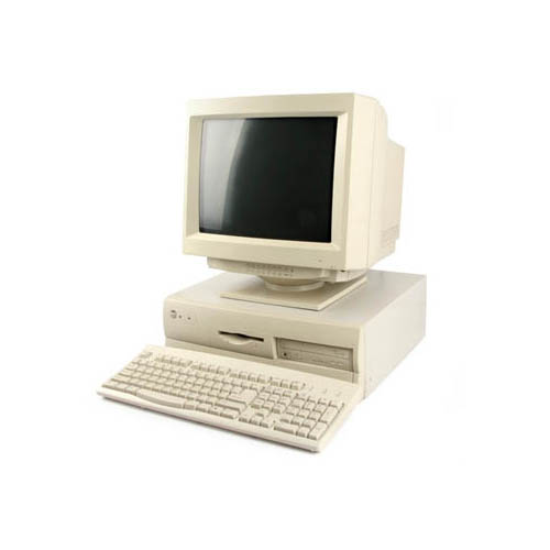
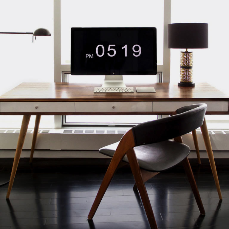
And I think about my first computer. The monitor sat on top the computer like an ugly, stupid hat: one big, dull box on top of another. But now they’re all the same thing. Your computer is a big, shiny pane of glass that spans the length of your desk.
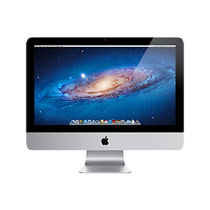
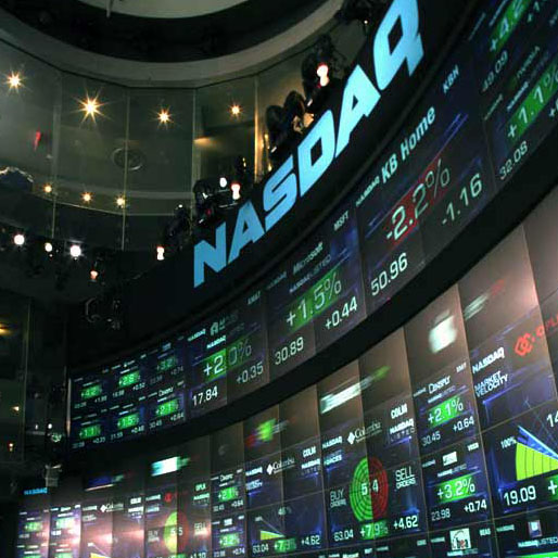
So just like the aspirin, we’ve made the guts of our computers more potent, powerful, and smaller. Chances are your computer’s footprint is entirely comprised of its screen. Even an iMac is just a screen with a kickstand. And now, because of touch screens, we’re using the screens for input as well as output. The whole feedback cycle of using a computer is entirely screen-based. It’s no wonder that the average person’s conception of a computer is the screen.
So, if computers are like aspirin, and we’ve been making the computers smaller and smaller, where’s the necessary padding that allows us to grasp things? I stumbled over the question for a while. Then it hit me.
The padding isn’t around the screens. It’s in them.
Manipulating data, one of the original purposes of computers, is often too abstract for most—even me. It helps to make things visible. Graphical user interfaces unpack some of the complexity in computing, and their implementation became a key to unlocking computers for most people in the ’80s and ’90s. The interfaces we build are where we put the padding. You give a user something to grasp onto when you make a metaphor solid. In the case of software on a screen, the metaphors visually explain the functions of an interface, and provide a bridge from a familiar place to a less known area by suggesting a tool’s function and its relationship to others.
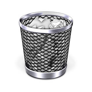
For instance, if I say “This is a Trash Bin,” you may not know a computer’s file management system or directory structures, but you’ve got a pretty good idea of how trash bins work, so you can deduce that the unwanted files go in the trash bin, and you’ll be able to retrieve them until the bin is emptied.
Metaphors are assistive devices for understanding.
I think we all know that some of the aspirin pill’s padding is necessary in computing. We need abstractions, otherwise we’d be writing code in machine language or Assembly, there’d be no work designing interfaces, and users wouldn’t understand much unless they took the years to learn everything from the ground up.
Computers, after all, are just shaky towers of nested abstractions: from the code that tells them what to do, to the interfaces that suggest to the user what’s possible to do with them. Each level of abstraction becomes an opportunity to make work more efficient, communicate more clearly, and assist understanding. Of course, abstractions also become chances to complicate what was clear, slow down what was fast, and fuck up what was perfectly fine.
Choosing the proper amount of abstraction is tricky, because each user comes to what you’re making with their own amount of experience. Experience gaps are not unique to computing, but I think it matters more here than in many other situations.
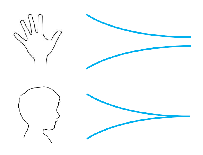
The best way to understand why is to look at the differences between your hands and your brain. Your hands can’t change size, but your mind can: if you’re paying attention, your brain becomes more keen to experiences over time. So while the size of an aspirin pill is constrained by your stubby little fingers, your brain can normalize the patterns of an interface and make way for more nuanced abstractions. With enough time and exposure, a user can shed the padding and metaphors that become dead weight, like taking the training wheels off a bike.
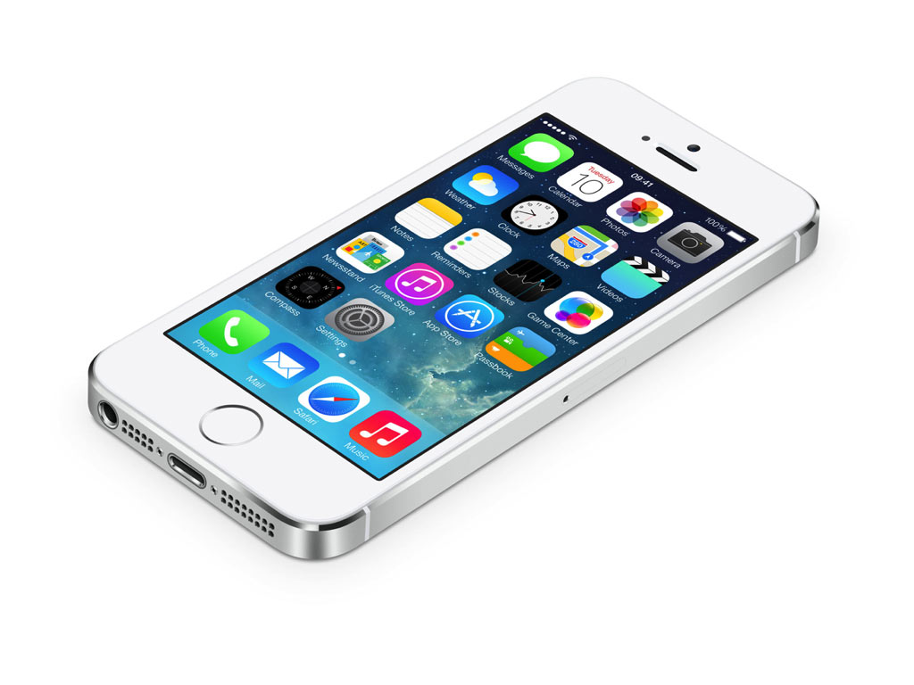
We’ve been living through that shedding process, and the interfaces of iOS 7 and Windows Metro suggest the keenness of our minds and our adeptness at navigating interfaces. Like them or not, Metro and iOS7 are major touchstones in our relationship to computing, because they signify that we’re beginning to accept a flexible medium on its own terms.
But it’s not the first time we’ve done this. Let’s go back 35 years.
I’d like to show you a video clip from a BBC series called Connections, hosted and written by James Burke.
Sound familiar? The progression of plastics is the same as screens and software. It’s a pattern of malleable mediums: if something can be anything, it usually becomes everything.
As a little formal exercise, let’s take every time Burke says “plastic” and replace it with “software.” (Please imagine I’m doing this in a charming British accent.)
Have you noticed what’s happened to software in the last ten years?
It’s become something in its own right.
I mean, early on, if you made something in software, you had to make it look exactly like what it was replacing.
I mean particularly leather, or people wouldn’t buy it.
It’s not been long since the word software was an insult. Nasty and complicated, remember? Not any more. It’s as if we suddenly changed our attitude to what real meant and recognized software for what it is:
something that permits us to do things we couldn’t possibly do if they had to be made with the so called real thing.
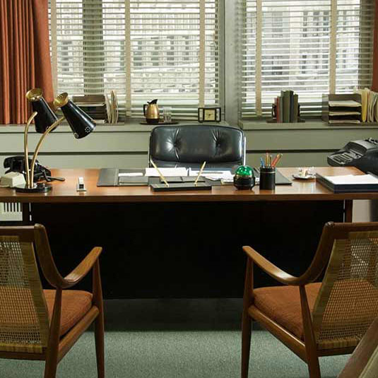
Now it’s everywhere. I mean, look at this office.
This is now software.
So’s that.
So is this.
And so are these.

And especially what’s inside them.
There’s software on the wall.
There’s software on this desk.

My shoes are software.

And now there’s a new generation of objects that can only be made in software.
It’s a software world. And because of software, it’s a soft world in a different sense, in the original sense of the word: it changes its shape easily.
So now we no longer buy the thing we want, we buy the shape of the thing we prefer.
And when the shapes change regularly, which they do, we begin to *want* them to change regularly.
When Burke talks about things needing to look like their old embodiments and the ability for those shapes to change, he’s talking about skeuomorphs. But he’d never use that word, because he’s much too clever. The word sticks in your mouth, right? Both halves come from Greek.
skeuo → container
morph → shape
So, skeuomorphs are about the shape we choose for the containers we build. This requires plasticity. Softness. Screens are a special material without much precedent, save plastic. And I think it’s best to view screens as a material for interaction and interface design.
Just like any material, screens have affordances. Much like wood, I believe screens have grain: a certain way they’ve grown and matured that describes how they want to be treated. The grain is what gives the material its identity and tells you the best way to use it. Figure out the grain, and you know how to natively design for screens.
And we’ve tried. Oh god, we’ve tried. Unfortunately, the discussion around screen-native design feels a bit stunted in its current form. We’re stuck in a pendulum swing.
There are two main ideological camps. On one side, you have proponents for flat design, the folks who say that because screens are flat, the designs should be too, and we should remove any hint or reference to the three-dimensional world because computing is something else entirely.
On the other side, you have folks who believe in the value of skeuomorphs as near-tangible, visible metaphors. This is the tribe of lickable buttons, realistic textures, folded paper, and stitched leather.
Any reasonable person would say the best approach is somewhere in the middle, but both arguments fail because they are based on aesthetics. Leaning on the look of things is a tempting argument to make: screens are output devices, after all. But, it’s a shallow answer to a deep question. I’ll do my best to refute both of these arguments.
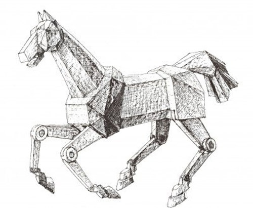
I’m going to use horses in this example, because horses are cool, and I need to circle back to them in a minute.
All right, here’s a color photo of a horse.
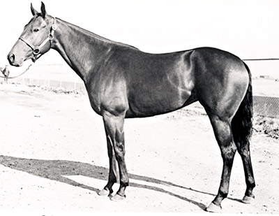
And here’s a black and white one.
There’s a drawing of a horse.
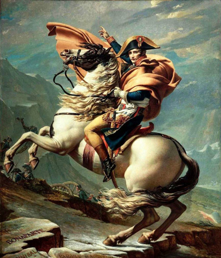
And a famous painting with a horse.

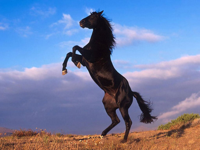
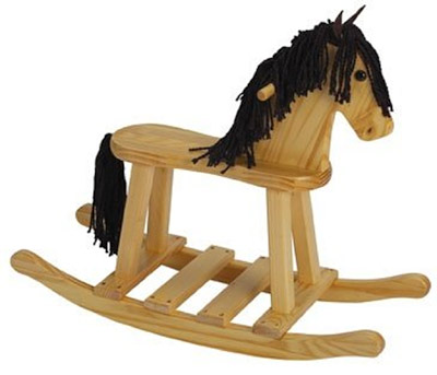
There’s a flat horse.
A skeuomorphic horse?
Apologies if this seems like an idiotic exercise. My point is you just viewed all of these on a screen, and that screen did perfectly fine showing them all to you. A screen doesn’t care what it shows any more than a sheet of paper cares what’s printed on it. Screens are aesthetically neutral, so the looks of things are not a part of their grain. Sorry, internet. If you want to make something look flat, go for it. There are plenty of reasons to do so. But you shouldn’t say you made things look a certain way because the screen cared one way or the other.
So how do you figure out that grain? Well, if you think about it, the grain of wood is documentation of how the tree has grown. Maybe the best thing to do is to figure out where screens came from. Which means I get to talk about horses again.
Let’s have a short history lesson.
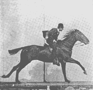
In 1872 a man took a photograph of a horse.
This doesn’t seem like that significant of an achievement, but almost 140 years later, it’s my favorite starting point to describe screens.
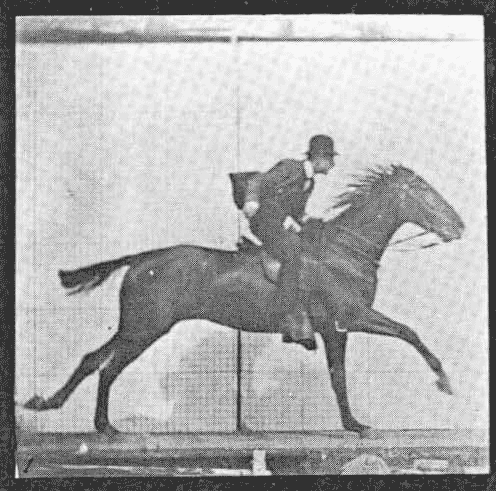
This is the photo, and I think it is probably familiar to quite a few of you. It was taken by a British man named Eadweard Muybridge, who lived in San Francisco and often found himself working in an area we now call Silicon Valley. The photo was staged at a horse track in Palo Alto, just a little bit away from the old Facebook headquarters. The photo on its own isn’t extraordinary, but there isn’t just one photo.
Muybridge took twelve, all taken in the span of just a few seconds.

The photos were originally taken to settle a gentlemen’s bet to see if all four of a horse’s hooves were off the ground at any point in their stride. (They were.) Aside from bets, the project had profound effects on time and movement. See, Muybridge’s little photo project was the first time we ever split the second. We all think splitting the atom is important because we can see the consequences, but I think slicing the second is just as profound.
Splitting time so thinly has its advantages. Because when you take those twelve photos and put them in rapid sequence, they do this:
This might not seem like such a big deal to us now, but photography up until that point required the subject to stay extremely still to keep the photograph from blurring. People smiled in the 19th century, but you’d never know it from the photos. It meant that before Muybridge, photographs could refer to life, but never capture its essence: movement.
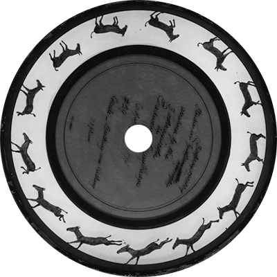
Muybridge had discovered how to bottle movement, and like any good inventor, he did experiments to see if he could reanimate his frozen horses. Muybridge’s first attempts to set time in motion were to print the high-speed photographs radially on a glass disc and spin it while it was lit from behind. He called it a zoopraxiscope.
Here’s a zoopraxiscope projection at work. Keep in mind what you’re watching is a volume of traveling light, and that light needs to land on something to show itself. This is one of the origins of screens.
And you know, these little animations look awfully similar to animated GIFs. Seems that any time screens appear, some kind of short, looping animated imagery of animals shows up, as if they were a natural consequence of screens.
Muybridge’s crazy horse experiment eventually led us to the familiar glow of the screen. If you’re like me, and consider Muybridge’s work as one of the main inroads to the creation of screens, it becomes apparent that web and interaction design are just as much children of filmmaking as they are of graphic design. Maybe even more so. After all, we both work on screens, and manage time, movement, and most importantly, change. So what does all of this mean? I think the grain of screens has been there since the beginning. It’s not tied to an aesthetic. Screens don’t care what the horses look like. They just want them to move. They want the horses to change.
Designing for screens is managing that change. To put a finer head on it, the grain of screens is something I call flux.
Flux is the capacity for change.
Yes, this could be animation, because that’s what I’ve been talking about up until now, but I think it’s a lot more, too. Flux is a generous definition. It encompasses many of the things we take for granted in the digital realm: structural changes, like customization, responsiveness, and variability.
Some examples:
Flux is changing the colors of your website at night, to customize for a different reading experience based on time.

It’s having some fun with a fashion lookbook if you know it’s mostly going to be seen on screens.
It’s building a responsive website for a little company.
It’s using movement to more clearly describe the steps of a complicated process.
There are many more examples, and I’m sure you can think of some too. I break flux into three levels:
Low
These are really small mutations we take for granted when it comes to computing, like the ability to sort a table row on your spreadsheet. One of the major reasons the spreadsheet software has the capacity to change is because the screen can show the change produced. You can’t do that on paper. You need processing and a malleable display surface.
High
These are the immersive interactive pieces you think of when I say “Flash website.” I think this sort of stuff is rarely a good idea on the web, but we’re talking about screens in general. I’ve seen a lot of really cool stuff done with high flux in museums, public installations, and in film. High flux is great in physical spaces.
Medium
This area is most interesting to me, because it overlaps with what I do: websites and interfaces. Medium level flux is assistive and descriptive animation, and restructuring content based on sensors. It clarifies interactivity by allowing elements to respond to that interaction and other, measured conditions.
Probably the most well-known example of medium flux is OS X’s genie effect on window minimization. The animation clarifies the interaction by treating the window as a physical object, and sucks down the window to show its eventual position in the dock when minimized.
I’ll show you a few more examples.
These come from a great blog post by Adrian Zumbrunnen of IA in Zurich.

This one shows animated scrolling after clicking on a navigation item. The animation describes the position of the content on the page, and helps you understand the path you took to get there. It preserves context.

This next one is a stateful toggle, meaning supplemental form elements displace the original list to consolidate space, and infer a relationship between them.
This is a sticky label. It’s handy if you’re scrolling through a long list, because it keeps useful metadata present and visible.
And last is a comment field with progressive disclosure. This method allows the designer to reduce UI components to their essence. Input forms are only revealed when necessary to avoid confusion, and the animation aids them in understanding the origin of the new form fields.
Movement, change, and animation are a lot more than ways to delight users: they are a functional method for design. These examples are essentially animated wireframes, but extra detail isn’t needed. Designing how things change and move is enough for us to understand what they are and the relationships between them. You don’t need the heavy-handed metaphor, because the information is baked into the element’s behavior, not its aesthetics.
A designer’s work is not only about how the things look, but also their behaviors in response to interaction, and the adjustments they make between their fixed states. In fact, designing the way elements adapt and morph in the in-between moments is half of your work as a designer. You’re crafting the interstitials.
We’ve been more aware of this interstitial work in the past few years because of responsive design’s popularity and its resistance to fixed states. It’s a step in the right direction, but it has made work crazy frustrating.
I’ve worked on several responsive projects in the past couple years, and it’s always been a headache—not from technological limitations, but because there weren’t suitable words to describe the behaviors I wanted. I had to jump into code, and waste time writing non-production markup and CSS to prototype a behavior so the developer could see it. That’s really wasteful, especially if all you needed was a word for the behavior. The community has been putting a lot of effort in developing tools that allow for quicker prototyping, but explaining yourself can happen multiple ways. Clear wording with consistent meaning reduces the number of prototypes you need to build, because a simple word will do.

We need to work as a community to develop a language of transformation so we can talk to one another. And we probably need to steal these words from places like animation, theater, puppetry, dance, and choreography. Words matter. They are abstractions, too—an interface to thought and understanding by communication. The words we use mold our perception of our work and the world around us. They become a frame, just like the interfaces we design.
At Build 2012, Ethan Marcotte gave a lecture called “The Map is not the Territory.” It was a talk about abstractions, looked at through the lens of maps and physical terrain. The longer I’ve considered Ethan’s thoughts, the more I believe cartography is an apt metaphor for our industry’s current situation. The builders of interfaces in a technology-laden, abstracted, and mediated world hold sway, much like mapmakers do.
Rather than try to make that case myself, I’ve got a clip for you about maps. It’s from The West Wing.
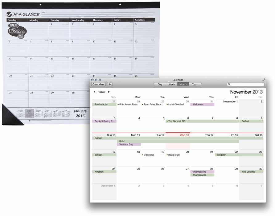
Maps are abstractions that attempt to express the unexpressable by distorting reality into something presentable, something understandable. For instance, time is hard to grok on its own, but a calendar serves as a map to the territory of time, and it makes time management a little easier.
But an abstraction can only give you one facet of a complex reality. Things get bad when those abstractions become the terms your mind uses to consider the thing itself—you mistake the map as the territory. And it’s funny how those maps begin to mold your understanding of the world around you.
For example, a few years ago, I flew to Hong Kong from Chicago, and my brain just about broke because the flight path took us over the North Pole. I forgot that was even possible! My brain was so programmed with representations and maps that I, well, forgot that Earth is a sphere, and you can navigate it any which way you want—not just east and west. An abstraction’s distortion blinded me to a portion of the reality. Abstractions always distort and omit, because they have to. The trick is to be mindful it is happening.
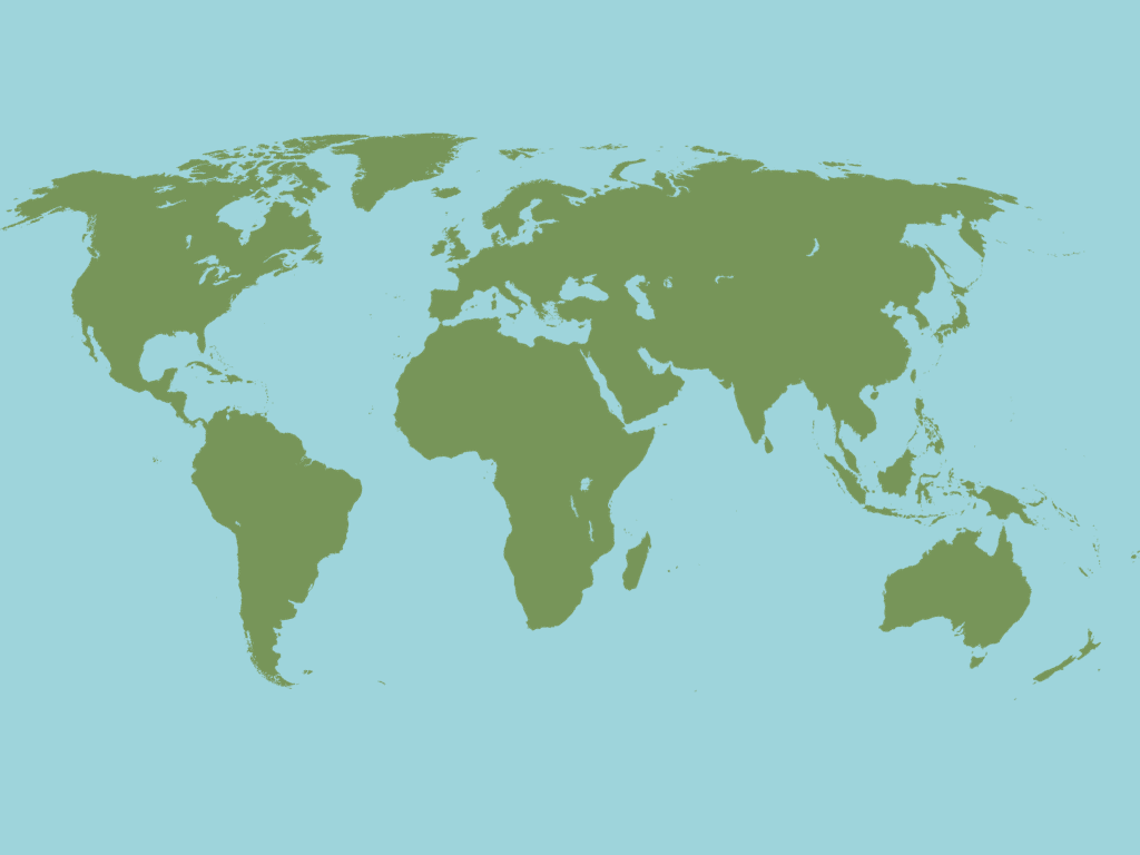
If I asked you to picture the world, you probably think of this.
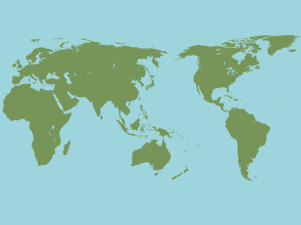
But there’s nothing that says you couldn’t think of it like this.
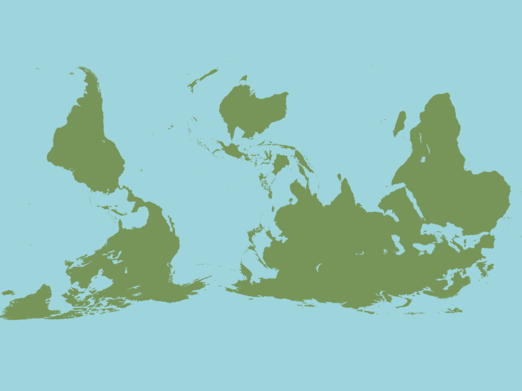
Or even like this. Who says north is up?
For the characters on The West Wing, they misunderstood the relative size of nations and their actual position on the globe, because the map in their mind was made for easy sea navigation. The accuracy of the sea came at the cost of the land.
When I realized that, a little light went off in my head: a map’s biases do service to one need, but distort everything else. Meaning, they misinform and confuse those with different needs.
That’s how I feel about the web these days. We have a map, but it’s not for me. So I am distanced. It feels like things are distorted. I am consistently confused.
See, we have our own abstractions on the web, and they are bigger than the user interfaces of the websites and apps we build. They are the abstractions we use to define the web. The commercial web. The things that have sprung up in the last decade, but gained considerable speed in the past five years.
It’s the business structures and funding models we use to create digital businesses. It’s the pressure to scale, simply because it’s easy to copy bits. It’s the relationships between the people who make the stuff, and the people who use that stuff, and the consistent abandonment of users by entrepreneurs.
It’s the churning and the burning, flipping companies, nickel-and-diming users with in-app purchases, data lock-in, and designing with dark patterns so that users accidentally do actions against their own self-interest.
Listen: I worry about this stuff, because the further I get from everything, the more it begins to look toxic. These pernicious elements are the primary map we have of the web right now.
We used to have a map of a frontier that could be anything. The web isn’t young anymore, though. It’s settled. It’s been prospected and picked through. Increasingly, it feels like we decided to pave the wilderness, turn it into a suburb, and build a mall. And I hate this map of the web, because it only describes a fraction of what it is and what’s possible. We’ve taken an opportunity for connection and distorted it to commodify attention. That’s one of the sleaziest things you can do.
So what is the answer? I found this quote by Ted Nelson, the man who invented hypertext. He’s one of the original rebel technologists, so he has a lot of things to say about our current situation. Nelson:
The world is not yet finished, but everyone is behaving as if everything was known. This is not true. In fact, the computer world as we know it is based upon one tradition that has been waddling along for the last fifty years, growing in size and ungainliness, and is essentially defining the way we do everything. My view is that today’s computer world is based on techie misunderstandings of human thought and human life. And the imposition of inappropriate structures throughout the computer is the imposition of inappropriate structures on the things we want to do in the human world.
Emphasis mine. So, what is Nelson saying? First, he’s saying technology is shining back on us. We made it, and now it is making us. The abstractions we created have distortions that hurt and reduce us. Damage. Most importantly, he’s saying we need more maps.
Like Ethan’s talk said: the map is not the territory, so a bad map doesn’t necessarily mean bad territory. Our saving grace is that one territory—in this case, the internet, technology—can have more than one map. We can make maps that distort less, or at least accurately represent our goals for all of this technology.
The land comes at the cost of the sea, remember? Maps support the values of those who make them, and distort everything else. So, if your goal is a poker game for rich old white guys, we’ve got a fantastic map right now. I think it’s in all of our best interests to get working on a new vision for the web, and a new role for technology.
We can produce a vision of the web that isn’t based on consolidation, privatization, power hierarchies, and surveillance. We can make a new map. Or maybe reclaim a map we misplaced a long time ago. One built on: extensibility, openness, communication, community, wildness.
We can use the efficiency and power of interfaces to help people do what they already wish more quickly or enjoyably, and we can build up business structures so that it’s okay for people to put down technology and get on with their life once their job is done. We can rearrange how we think about the tools we build, so that someone putting down your tool doesn’t disprove its utility, but validates its usefulness.
Let me leave you with this: the point of my writing was to ask what screens want. I think that’s a great question, but it is a secondary concern. What screens want needs to match up with what we want.
People believe there’s an essence to the computer, that there’s something true and real and a correct way to do things. But—there is no right way. We get to choose how to aim the technology we build. At least for now, because increasingly, technology feels like something that happens to you instead of something you use. We need to figure out how to stop that, for all of our sakes, before we’re locked in, on rails, and headed toward who knows what.
One of the reasons that I’m so fascinated by screens is because their story is our story. First there was darkness, and then there was light. And then we figured out how to make that light dance. Both stories are about transformations, about change. Screens have flux, and so do we.
So the pep talk is that things are starting to suck, but there’s a capacity for change in what we’ve made, who we are, and what we believe. Everything was made, and if we want, we can remake it how we see fit. We only need to want it.
And then we have to build it.