Plainness and Sweetness
It’s human nature: I over-value where I have influence. Since I am a designer, this frequently means placing too much emphasis on how things look and work rather than the direction they are pointed. But reflecting on the other side of the issue is also interesting: I find that the more input I have in the content and strategy of the project, the less burden I place on the aesthetics. Perhaps this is because I believe the aesthetic of the work should be an extention of its objectives, so if you get the strategy right, the look follows. Since I like to tackle problems sideways, I must risk being plain and rely on direct visuals to keep the work comprehensible.
I am for a design that’s like vanilla ice cream: simple and sweet, plain without being austere. It should be a base for more indulgent experiences on the occasions they are needed, like adding chocolate chips and cookie dough. Yet these special occassions are rare. A good vanilla ice cream is usually enough. I don’t wish to be dogmatic—every approach has its place, but sometimes plainness needs defending in a world starved for attention and wildly focused on individuality. Here is a reminder: the surest way forward is usually a plain approach done with close attention to detail. You can refine the normal into the sophisticated by pursuing clarity and consistency. Attentiveness turns the normal artful.
Plain design frequently uses defaults: Helvetica or Times New Roman, default link blue, A4 or letter-sized paper. These choices are loaded. Not only do they carry the original intention of the default materials, they are also saddled with the cultural meanings associated with choosing them. If a designer uses Helvetica, it suggests one of three things: they are ignorant of the cliché, choose to look past the cliché, or want to ironically play with the cliché. None are satisfactory if one wants to create plain design without wading into the issue. This is why we must continually invent new, plain materials. As soon as a popular and plain material becomes burdened with too many associations, we can drop the baggage and move on.
Last week, Kris Sowersby of Klim Type Foundry released two new typefaces: Untitled Sans and Untitled Serif. Their designs are visually unrelated, but bound together in concept by Kris’s attempt to produce, in his words, “common-looking typefaces.”

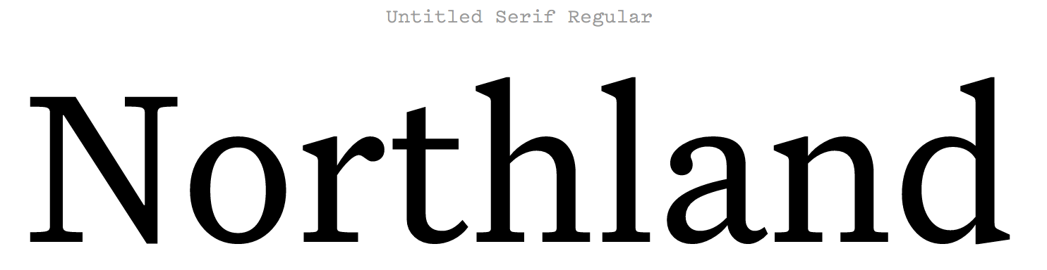
After working with them for a few hours, it became apparent that both will become staples here at the studio: they are easy to work with, have excellent craftsmanship in their construction, and have an added flexibility for my purposes by not possessing too much flavor. Vanilla.
In his write-up, Kris points to the references which helped him understand the value and usefulness of the quotidian. First, Jasper Morrison in his book, Super Normal:
There are better ways to design than putting a lot of effort into making something look special. Special is generally less useful than normal, and less rewarding in the long term. Special things demand attention for the wrong reasons, interrupting potentially good atmosphere with their awkward presence.
It’s telling that Morrison, an industrial designer, places the work into the built environment. The consistency of normalcy improves the experience of living with the objects, because the longer we spend in contact with the products of design, the more their willful attempts at individualism irritate us. A few items surely deserve to have an identity (perhaps an attractive pattern on the sofa or the blanket on your bed), but not everything deserves it (highly patterned floors make me dizzy). Most everything must fade into the background for our built environments to be hospitable.
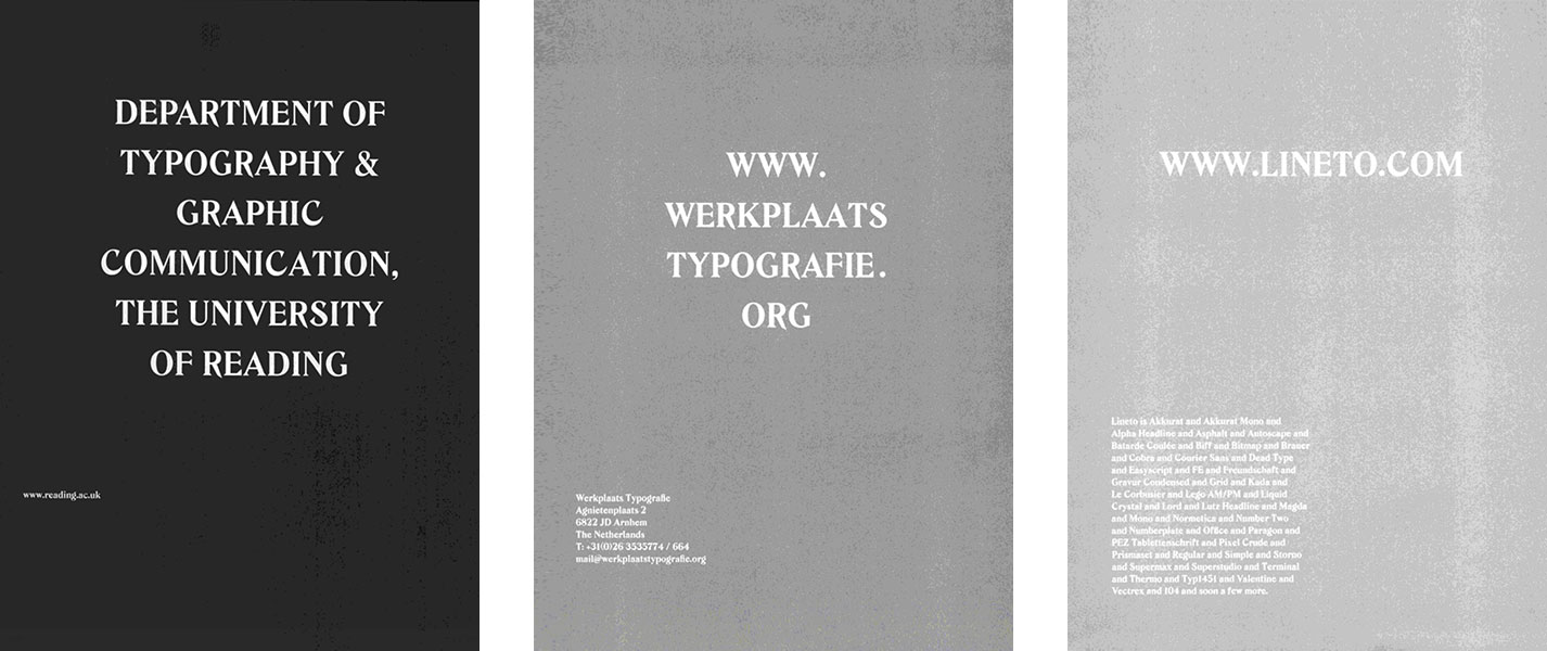
This also applies to other forms of design. The most evident are the design guidelines by tech giants to normalize interfaces across diverse apps, like Google’s Material Design and Apple’s Human Interface Guidelines. As for print, most of the drive for individuality and attention is driven by irresponsible advertising. My favorite example about bucking the trend comes from the now-defunct Dot Dot Dot magazine. Across several issues, ads were normalized in size and designed by the magazine’s team in a standard ad design. The type was reversed out in white, and the amount the advertiser paid determined the darkness of the background. More money meant more legibility. Here are a few examples:
In Kris’s write-up, he also quotes a report from K-HOLE on the Normcore trend, describing young people’s affinity to the commonplace which would typically be thought of passé in an era of individual identity. :
Individuality was once the path to personal freedom — a way to lead life on your own terms. But the terms keep getting more and more specific, making us more and more isolated. Normcore seeks the freedom that comes with non-exclusivity. It finds liberation in being nothing special, and realizes that adaptability leads to belonging. Normcore is a path to a more peaceful life.
Adaptability seems the key here. Many believe that normalcy and consistency breeds monotony, but what about the trap of an overly accentuated, hyper-specific identity? When the world changes around you, what do you do? Personal identities are not corporate communication or software, though now we prescribe all to have brands. All contain the aching desire to be noticed when instead they should focus on being useful. Which leads me to something my grandfather used to say occassionally while I was growing up, “Not everyone gets to be special, but everyone can be useful.” It is so plain, yet so sweet.