The Web’s Grain
This site is an interpretation of my talk from Webstock, 2015. It is a companion to What Screens Want, a previous essay on designing natively for screens.
Can I play something for you? Trust me: it’s worth it. Oh, and while you’re listening, pay attention to your chest. You may feel a growing warmth, kind of like the fiery trickle after a shot of whiskey.
All right, here we go:
Wasn’t that great? I’ve listened to those irritating bing-bongs 30 or 40 times in the process of making this page, and while you can’t see it, I’m typing this with a big, stupid smile on my face. If you came online in the ’90s like me, you’re probably smiling too.
That sound, of course, is the audio handshake of a modem connecting to the internet. And the fiery feeling in the chest it creates is the warm pang of nostalgia. I’ve managed to tether that grating sound to all the wonder and magic I felt my first years on the internet. Back then, if you told me that I’d get to spend the next decade or so making things for the web—well, that would be just about the best news I could be told.
But things have changed, as they always do. I’m writing this fifteen years after the bing-bongs, and the fascination has faded. What happened is what always happens: the wonder I felt was diminished by experience.
The awe goes—time takes it.
There’s a quote from the French philosopher Gaston Bachelard: “We begin in admiration and end by organizing our disappointment.”
Now, this is a bit pessimistic—he is a French philosopher, after all—but right now the statement does ring true for the technology industry. Think about the weight we’ve added to the world: attention-greedy devices and services, new business structures that turn out to reinforce existing inequalities instead of working against them, technocratic blowhards, never mind the surveillance shit storm we all now must navigate.
How could any self-aware person who works in technology not start to organize their disappointment? It’s gotten to where several of my peers are floating half-hearted speculations about their next careers. This isn’t good: you want the talented and mindful people to stick around, not get husked out, then leave frustrated, exhausted, and conflicted.
The closer I get to it all, the more I become confused and overwhelmed. A thing I knew so well has reached out wider and wider, only to make less and less sense. So last year, instead of being stubborn, complaining, or feeling powerless, I went searching for a different perspective. I wanted to take something big and make it small again. This was urgent: I needed a way to re-engage with my craft on a foundational level. Otherwise, I’d also be looking for a second career.

In Buddhism, there’s something called the beginner’s mind. If you’ve ever done any kind of guided meditation, you’re probably familiar. It refers to having an attitude of openness, of eagerness. You drop your heavy preconceptions and revitalize a practice by finding a new way to look at it. Making things for the web started to feel very heavy to me, so this seemed to be what I needed.
Most investigations into beginner’s mind eventually lead to the same zen koan. It’s a small story, and it goes like this:
Before I began to practice, mountains were mountains and rivers were rivers.
After I began to practice, mountains were no longer mountains and rivers were no longer rivers.
Now, I have practiced for some time, and mountains are again mountains, and rivers are again rivers.
So what’s the lesson? Here’s my take: we eventually work through the naive belief that profundity comes from complication. It simply isn’t so. Things have enough depth and worth on their own terms. No metaphors or analogies are needed for insight, only the willingness to listen to the subject speak for itself, even if it contradicts received wisdom.
I’d like to do some listening today.
What is there to see when you look at a website as itself? A lot, actually, but let’s simplify things down to their core. As we go through this, please excuse me for stating the obvious. My intent is to describe and document the apparent. Rivers as rivers, remember?
Here we have a very vanilla website. No styles, just markup. All defaults.
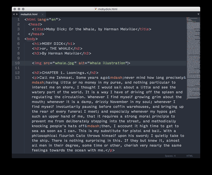
The first thing to notice about this page is that it is fluid—it adapts to the width of the viewport to fill it up. We can’t quite say it’s responsive, because responsive sites require media queries, but this site, like a responsive one, isn’t opinionated about the size of the viewport. It works well at whatever size you throw at it.
The page’s fluidity leads to the second thing to notice: the page is vertical.
Okay, terribly obvious, but let’s tease this apart.
Elements get stacked like a layer cake by default, and it make sense—vertical stacks are much easier to adapt across all kinds of screen sizes, because you don’t have layout issues to manage with more or less space across. You simply keep the elements the full width. This is especially handy for design methods like mobile first, since narrower screens can’t necessarily hold designs where elements are beside one another. By stacking, you get greater consistency in a design, what ever the screen size.
But not every site can be a big vertical stack of bricks, can it? What happens if you place things side-by-side?
This leads us to the primary visual challenge of responsive design. It’s the big daddy, the ur problem, the foundational thorn in your side that, for some reason, I have never seen documented.
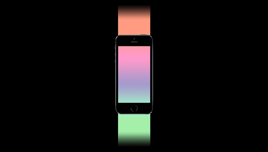
I’m going to go back to my vanilla HTML page, but let’s add a couple lines of CSS so that our image is beside the text, and both scale in width as the viewport changes.
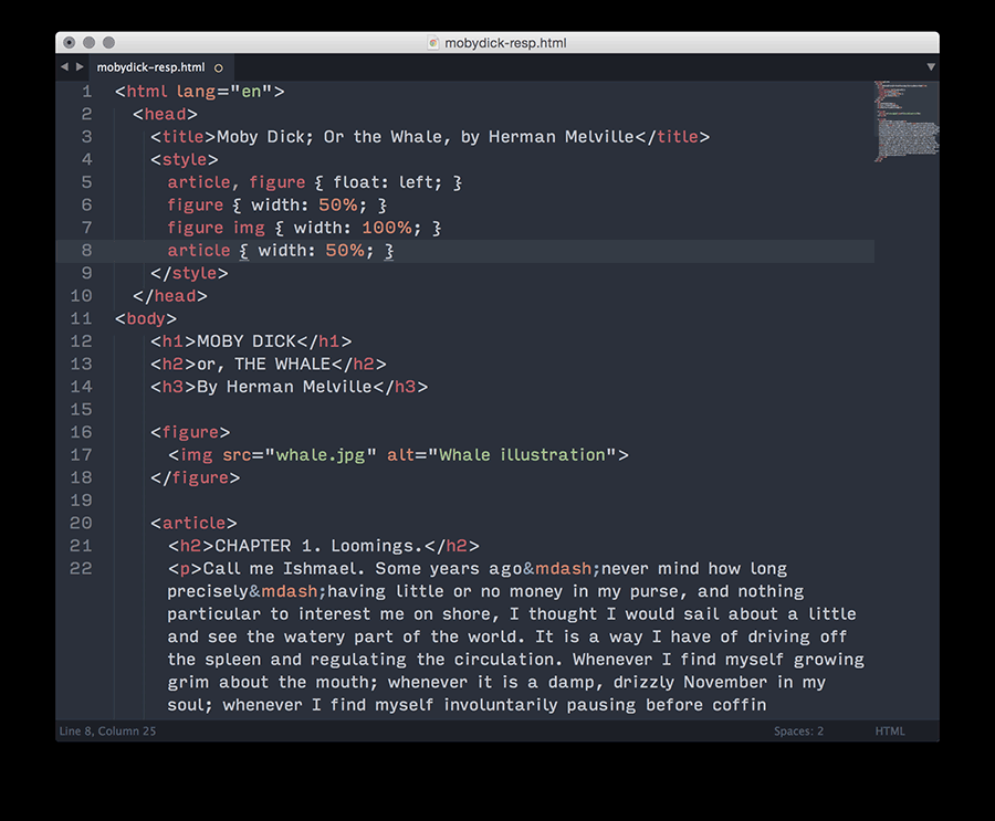
Okay, take a look:
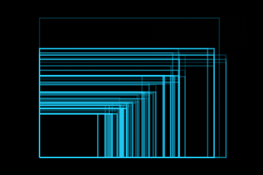
I’ll explain what’s happening. When I change the window width, the image gets taller as it gets wider, because its proportions are fixed. The text, on the other hand, gets shorter as it gets wider since it has no fixed proportions.
If you’ve ever designed a responsive website, this is the source of all your sadness. This is the fount of your tears, the wellspring of your suffering. If you believe in the afterlife, this is the circle of hell where they light the soles of your feet on fire.
You know how people say to add a breakpoint to a responsive design when the layout starts to look weird? This is the thing that makes the layout look weird. Every time. But, this contradiction is unavoidable and unsolvable, so the only choice is to recognize it as implicit to the medium, and devise strategies to manage it.
Most of the solidified techniques about our practice come from the natural ways of the web that have been there since the start. The answer is right there in front of us, in the website itself, and each step we take away from its intentions makes our creations weaker.
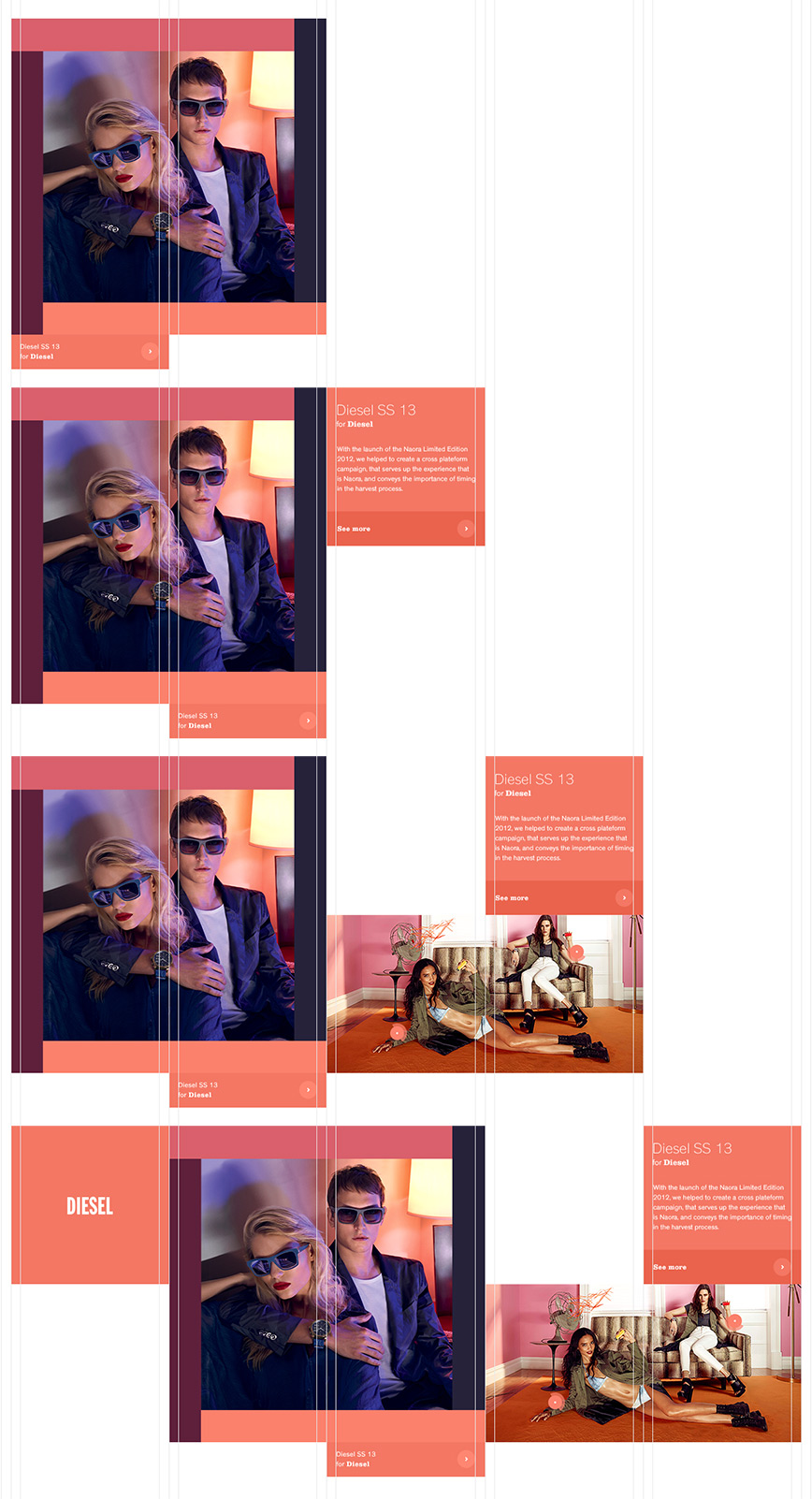
What does it look like when you work against the web’s natural character? Well, it probably looks like this:
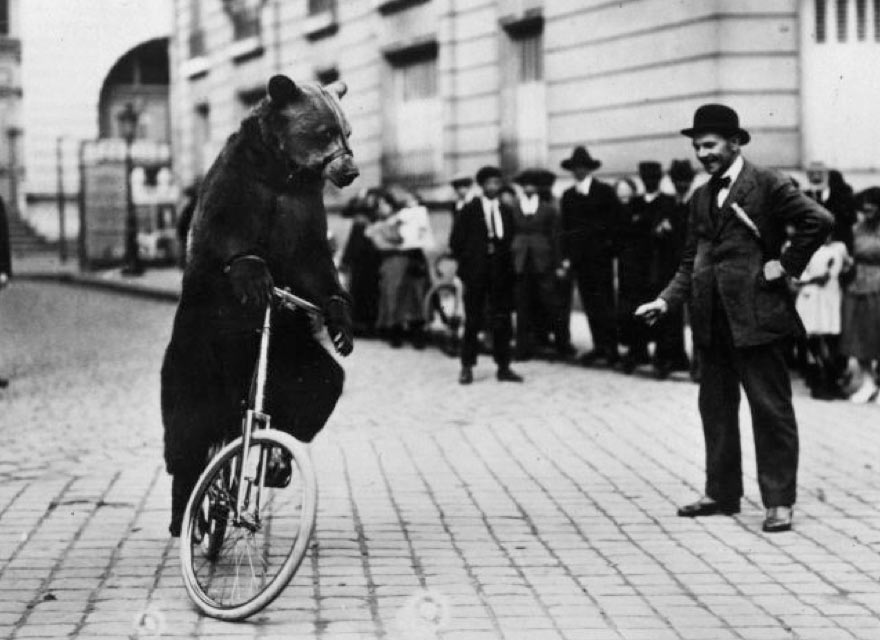
I think you make what I call “bicycle bear websites.” Why? Because my response to both is the same.
“Listen bub,” I say, “it is very impressive that you can teach a bear to ride a bicycle, and it is fascinating and novel. But perhaps it’s cruel? Because that’s not what bears are supposed to do. And look, pal, that bear will never actually be good at riding a bicycle.”
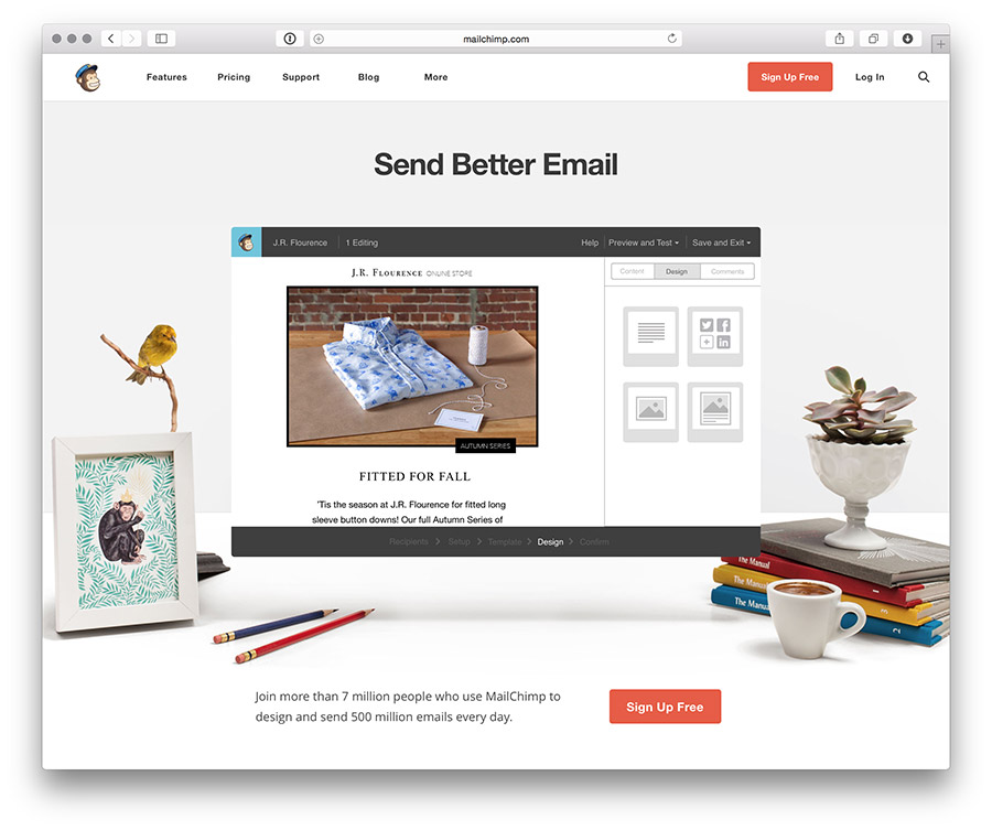
This is how I feel about so many of the fancy websites I see. “It is fascinating that you can do that, but it’s really not what a website is supposed to do.” For example, behold Apple’s Mac Pro website.
Same response as the bear on the bicycle: all glee, until things go haywire, and you realize it is coming right for you.
What is this monstrosity? Why does it feel like docking a spaceship? Why can’t I scroll? And why is there lag on my fancy laptop? What’s that sound? My computer’s fan?
Apple’s pursuit of cool yielded an incredibly fragile, willfully esoteric website that’s good for no one. And I’m certain you can think of a few similar examples of your own: clumsy sites that work counter to the inclinations of the web. Back to the zen koan—if we see the mountains as mountains and rivers as rivers, these are the sites that try to be different, yet end up swimming up stream and climbing uphill.
I believe every material has a grain, including the web. But this assumption flies in the face of our expectations for technology. Too often, the internet is cast as a wide-open, infinitely malleable material. We expect technology to help us overcome limitations, not produce more of them. In spite of those promises, we typically yield consistent design results.
We use flat colors and simple gradients, because they’re lightweight, easy to draw with CSS, and can easily scale for areas of unknown proportions.
Sites have large horizontal stripes of content, because of the vertical bias I mentioned earlier.
We use text as interface, because the nuanced but significant differences in technology’s abstractions are difficult to communicate visually.
Ambient, atmospheric, blurred, or tinted photographs become background images, because we can’t quite be sure how it will be cropped across different viewports.
And big type is overlaid on top of these images because every client simultaneously wants big images and big type. Plus it dances around those text versus image scaling problems I showed earlier.
We use photography with props, because software is abstract and hard to embody, so we show it on a device in a related context to have it seem like the product that it is.
And mosaics, because every page presents a multitude of elements, and we need structured ways of showcasing this variety.
The web is forcing our hands. And this is fine! Many sites will share design solutions, because we’re using the same materials. The consistencies establish best practices; they are proof of design patterns that play off of the needs of a common medium, and not evidence of a visual monoculture.
So this is a good start, but it is only a start. Could those simple sites I showed earlier assist us beyond the page and provide a larger way to think? To put a finer point on it: What would happen if we stopped treating the web like a blank canvas to paint on, and instead like a material to build with?
It turns out, I found the answer from a painter who also thought to step away from the canvas. Let’s have a short art history lesson, shall we?
Meet David Hockney—artist, painter, and conflicted photographer. In the early ’80s, he took a small break from painting to pursue these mentioned photographic joiners. They were an investigation of time and space. Now, that seems really heady, but once you see them, you’ll know exactly what I’m talking about. They kind of look like cubist paintings, but much quicker to read. I’d like to show you a few.
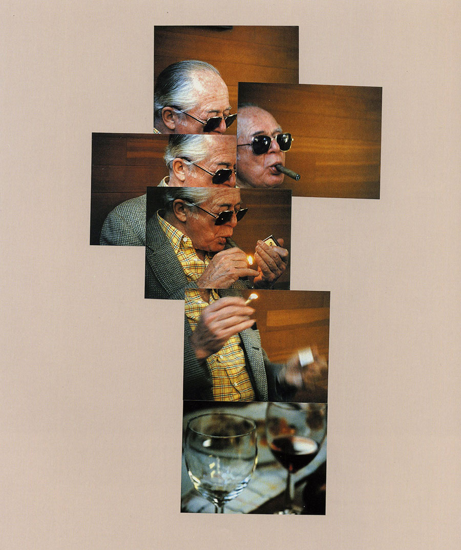
As Hockney says in the video, he started the project with Polaroids. You can see them tiled together here, because each individual photo can’t capture the whole picture.
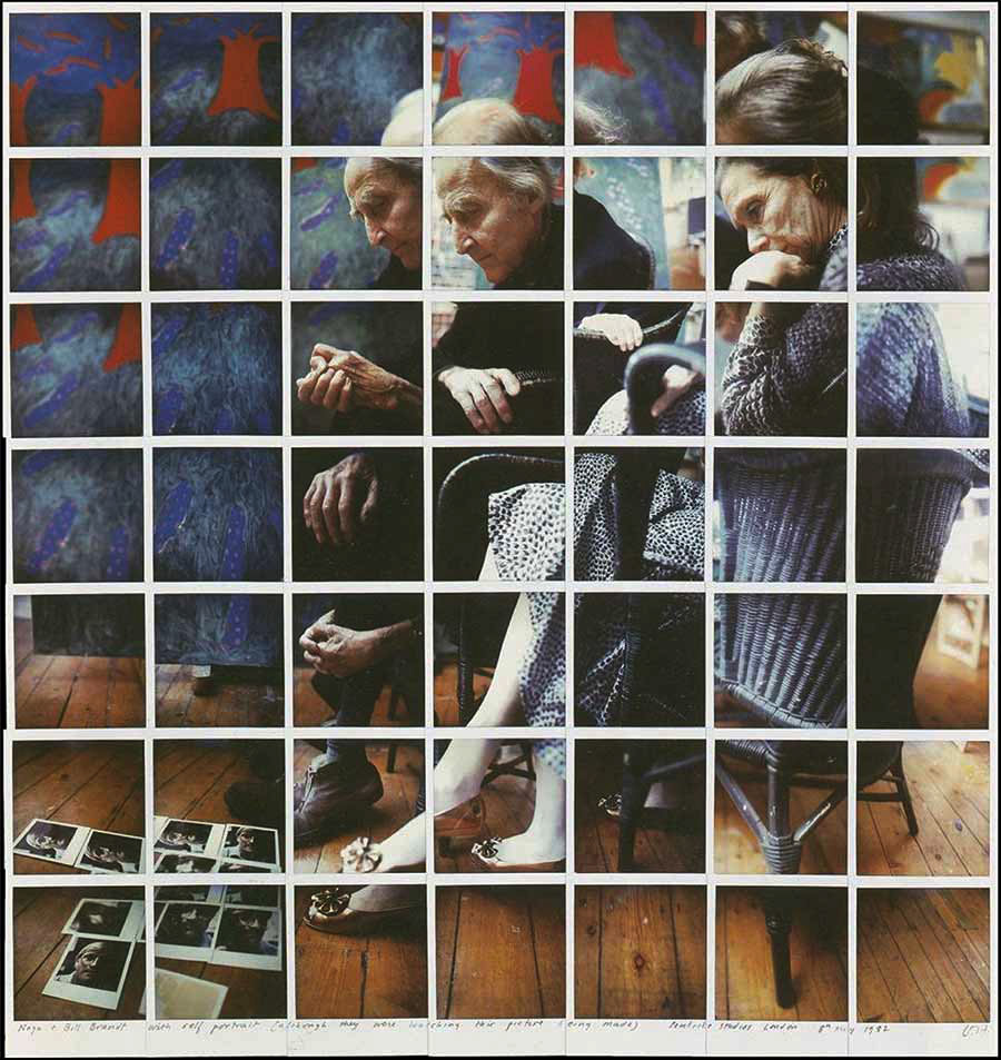
Inside, Hockney is using redundancy to show action. How many hands are there? How many heads does that man have? Two faces in this image, but you don’t interpret it as a two-headed man. It is two glances at one face—facets of the same thing.
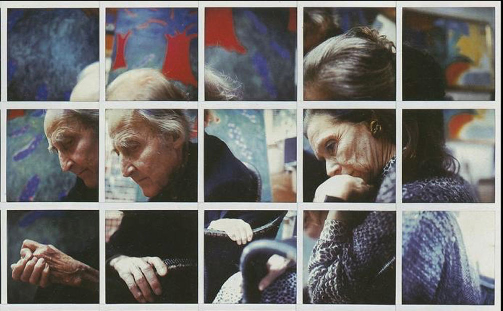
It’s so seamless, you’d probably not count the faces without me mentioning it. You just know, because this is how you see. You have a small focal range; your brain stitches the bits together into a complete whole.
Here’s another piece, even more advanced. This one is my favorite, because it’s so economical—like a comic strip.
Do you see what’s changed? Hockney stopped using Polaroids. The grid is gone, replaced by overlaid, borderless photos. Nothing cut or cropped, nothing tricky. Hockney’s able to do a lot of work with only six images.
What would this method look like with many more? Hockney asked the same question.
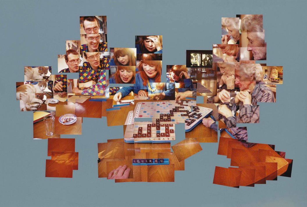
This is The Scrabble Game, and in my opinion, it’s the masterpiece from this era of Hockney’s career. This piece is all over the place: so many faces, so many hands. The game board is out of sync from image to image, so you can actually piece together the plays in the order they were made. Also, there are no ends to my aggravation about how he does not see he has a word in his tiles. (Liqueur, anyone?)
So, do you see what’s happened? Recall the first joiner I showed you with the Polaroids, and compare it to The Scrabble Game.
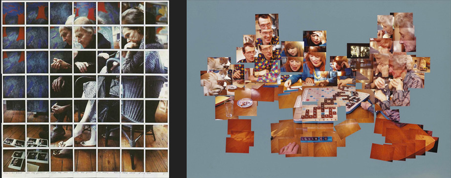
Hockney began with an image-making practice that relied on the grid necessitated by the Polaroids’ borders and produced a rectangular final work. When he switched to normal film, he was able to overlay images in any necessary shape that accurately described the time and space of a scene. Nobody would set out to make a picture with these edges—what you see is what was required by the images he managed to snap.
In essence, Hockney abandoned the notion that a two-dimensional work of art needed to exist at a fixed, rectangular size. Instead, small individual photos were overlaid and assembled until they formed a complete picture. Individually, the photos don’t mean much, but collectively they… does this seem familiar?
Okay, I’m sorry. I’ve tricked you, and we’ve come full circle. We’re back to responsive design. Let’s make an analogy.
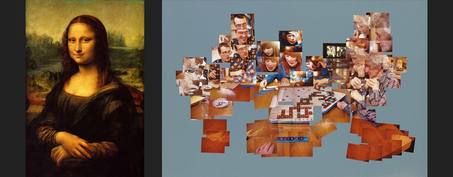
On the left, the Mona Lisa. Cliché, but why the hell not? The painting, to me, is like designing for the printed page. On the right, The Scrabble Game. This assemblage more closely resembles designing for a screen. Do you see it? It is control versus discovery, uniformity versus multiplicity.
With the Mona Lisa, we have fixed, uniform edges that can be planned for with a high degree of certainty and control. We revere and celebrate this painting because of that exquisite control.
With the joiner, we have a different kind of beauty. It is an edgeless surface of unknown proportions, comprised of small, individual, and variable elements from multiple vantages assembled into a readable whole that documents a moment.
Also known as web design. Here, I’ll restate what I just said, but this time, imagine I’m talking about web design and not the Hockney photos:
an edgeless surface of unknown proportions comprised of small, individual, and variable elements from multiple vantages assembled into a readable whole that documents a moment
That’s a pretty good description of the visual challenges in interaction design, huh?
In November of 2013, I gave a talk called What Screens Want, where I tried to answer what it meant to natively design for screens. I said it was something I called flux—the capacity for things to change. This could be as showy as animation, but also as simple and fundamental as a spreadsheet sorting itself and showing new results. You can’t do that on paper. So, designing for screens is managing this change over time, and expressing it in clear, communicative, and powerful ways.
Now, after looking at Hockney’s work for far too long, I can add another item to the list: edgelessness.
A lack of edges permeates the web at all levels. You just have to look for it:
Edgelessness is in the web’s structure: it’s comprised of individual pages linked together, so its structure can branch out forever.
Edgelessness applies to the screens that show the web, because they offer an infinite canvas that can scroll in any direction for however long. Boy, do we take for granted that a screen can show more content than is able to be displayed in a single shot.
Edgelessness speaks to the diffusion of device and viewport sizes. Above is a chart of screen sizes across Android devices. How could there be a clear edge on a spectrum with such minor differences between each size?
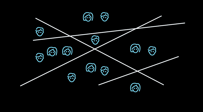
And, most interesting to me, edgelessness means blurred lines between the disciplines that work together to make things for the web. Everyone that I’ve spoken with that’s worked on a large responsive project with a big client says that the process disrupts workflows, expectations, and work culture.
Simply put, the edgelessness of the web tears down the constructed edges in the company. Everything is so interconnected that nobody has a clear domain of work any longer—the walls are gone, so we’re left to learn how to collaborate in the spaces where things connect.
Let’s take a look at how edgelessness affects how we work. Suppose you’re about to start a web project with some sketches. How would you begin?
You’d probably draw a box.

Then you’d fill that box with the page’s elements.
Whoops.
Remember the Hockney photos? The size of what we’re making is unknown until we know what we’re putting there. So, it’s better to come up with an arrangement of elements and assign them to a size, rather than the other way around. We need to start drawing, then put the box around it. Let me show you an example.
This set of images comes from the portfolio of Danish designer Kasper Laigaard. It’s the perfect example of not drawing the box until you know what goes in it. Here, he’s sketching out different content lockups for a redesign of Hello Monday, a digital agency in Denmark and New York. The sketches explain the idea more clearly than my words ever could.
So just like Hockney’s joiners, we’re creating assemblages of elements, then associating them with the appropriate space.
The practice of assembling conflicts with most of the terminology we have in place for responsive design. Our words make it seem that we’re designing how elements break down, but really, we should be focusing on how they build up. And this concept, just like the layouts we create, can reach out a bit further.
We often think making things for the web is a process of simplifying—the hub, the dashboard, the control panel are all dreams of technology that coalesces, but things have a tendency to diverge into a multiplicity of options. We pile on more tools and technology, each one increasingly nuanced and minor in its critical differences. Clearly, convergence and simplicity make for poor goals. Instead, we must aim for clarity. You can’t contain or reduce the torrent of technology, but you can channel it in a positive direction through proper framing and clear articulation.
Technology only adds more—it is never this or that; it is always this and that.
A quick example from my life: Twitter didn’t replace Facebook. The iPad didn’t replace my phone. My phone didn’t replace my TV. Now, I watch YouTube on my iPad, toss the video up to my TV, while checking Twitter and Facebook on my phone. It’s a little constellation of technology. But I keep asking myself: how many more things can I juggle? And for how long?
The answers offered are typically technological solutions. Algorithms. Automation. Tiny programs and sets of rules to filter out what bursts from the internet’s flue hole. While well intentioned (maybe), these answers only become extra points of control and influence.
Using technology to solve the problems it causes is as futile as cleaning a grass stain by rubbing grass on it. More technology only amplifies the problems created by an abundance of it. This leads to the most pressing question: How far out will technology grow? And when does it cross the line of comfort?
We’re building edgeless environments of divergency. Things are added in chaos, then if successful, they expanded further and further out until they collapse and rearrange. This is probably why responsive design feels so relevant, maddening, and divisive: its patterns mimic the larger patterns of technology itself.
What we build is defined and controlled by its unresolvable conflicts. In responsive design, it’s the text and image conundrum I showed earlier. In other, more grand arenas, there is capital versus labor, or collective control versus anarchic individualism. In technology, I believe it comes down to the power dynamics of convenience. To create convenience—particularly the automated convenience technology trades in—someone else must make our choices for us. In other words: the less you have to do, the less say you have.
Up to a point, swapping autonomy for ease is a pretty good trade: who wants to run the math on their accounting books or call the restaurant to place a delivery order? But if taken too far, convenience becomes a Trojan Horse. We cede too much control and become dependent on something we can no longer steer. Platforms that promised to bring convenience to a process or intimacy to a relationship now wedge themselves into the transaction as new middlemen. Then, we’re left to trust in the benevolence of those who have the power to mold our dependencies. Citing a lot of the concerns I mentioned earlier, those people are less responsible and compassionate than we had hoped. In pursuit of convenience, we have opened the door to unscrupulous influence.
You could say that our current technological arrangement has spread out too far, and it is starting to look and feel wrong. Fortunately, we can treat this over-expansion just like everything else I’ve mentioned. We can draw a line, and create a point of reassembly for what we’ve made. We can think about how to shift, move, and resize the pieces so that they fall back in line with our intentions. This power is compounded for those of us who make this technology.
But this is not a technological response. It is an explicit act of will—an individual’s choice to change their behaviors about what to use, where to work, what to adopt, what to pay attention to. It is simple mindfulness, that thing which needy technology makes so hard to practice. And it starts with a question: what is technology’s role in your life? And what, really, do you want from it?
As for me? I won’t ask for peace, quiet, ease, magic or any other token that technology can’t provide—I’ve abandoned those empty promises. My wish is simple: I desire a technology of grace, one that lives well within its role.
How will we know that we’re there? I suppose we’ll look at what we’ve built, notice how the edges have dropped away, and actually be pleased it looks like it could go on forever.