When the Work Looks Back At You
A few weeks ago, the folks at Milanote asked to interview me and brought along an unexpected brief: “let’s sit down and talk through the process of one of your projects.” As someone who is consistently banging the drum about the importance of a diligent process, it was a good chance to step back from the day-to-day workings of the studio and get a better perspective on what’s changed in my creative process in the last few years.
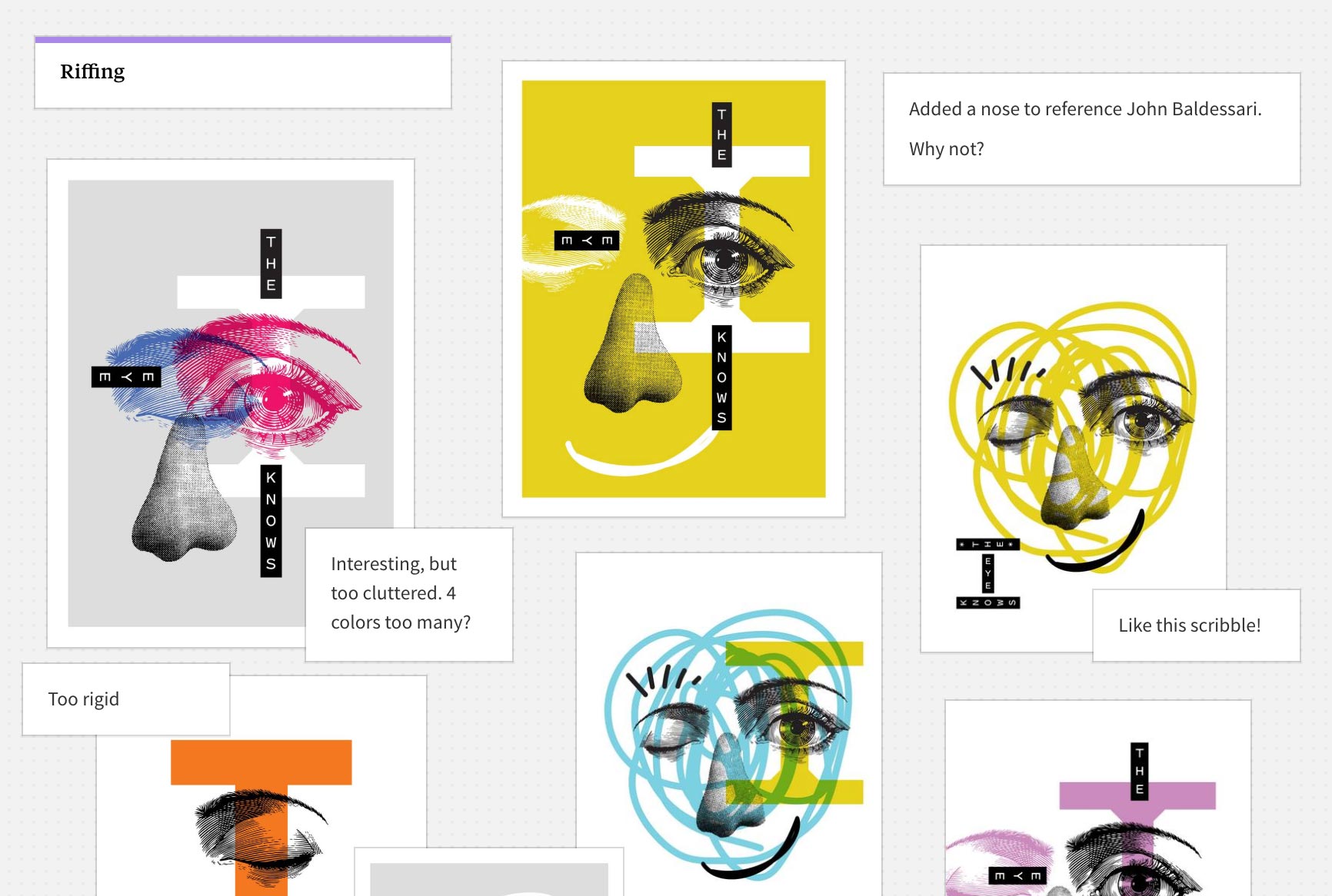
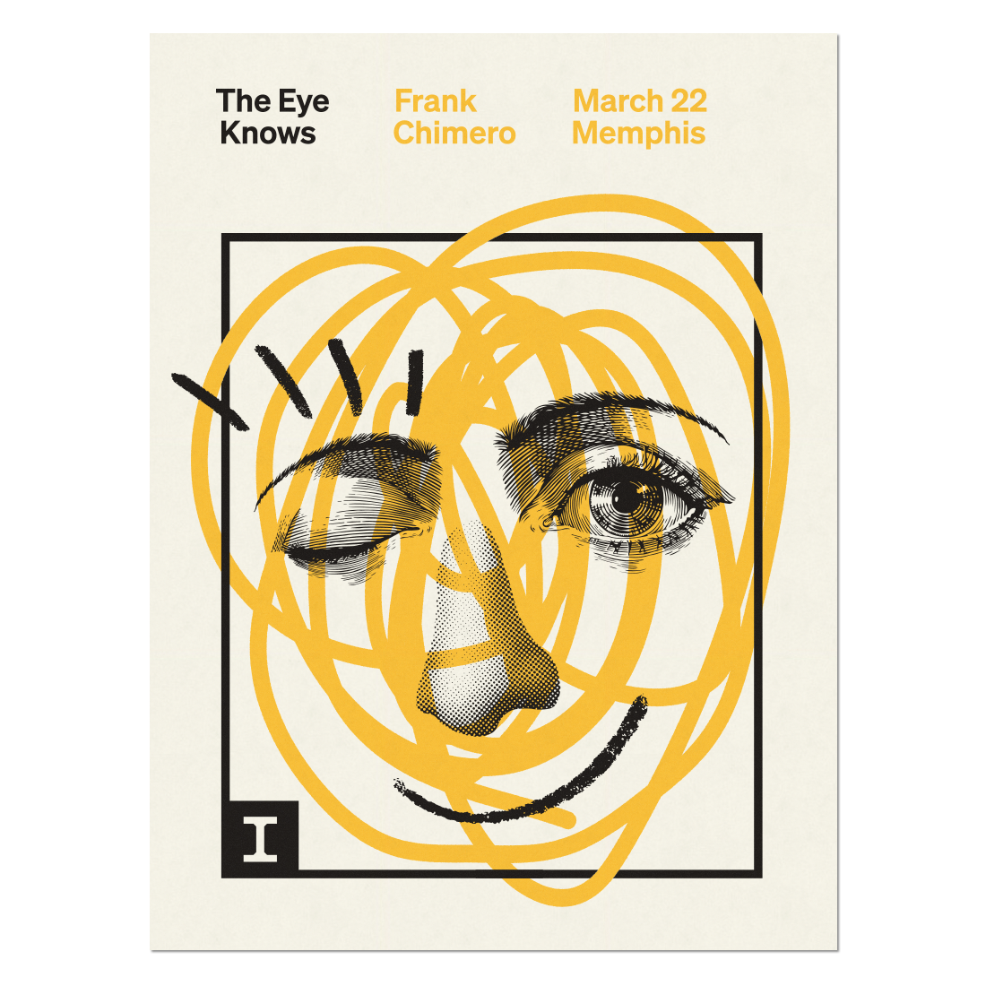
The most important change, I think, has been a commitment to staying open to new ideas for a longer period of time. Two-thirds through is where the good surprises tend to happen. I decided to talk with Milanote about the last project that pleasantly surprised me like this: a poster I designed for my lecture in Memphis this past March with Creative Works.
Milanote has posted a really nice write-up to their blog, and I’ve reproduced my answers in full below. Thanks to everyone at Milanote for asking good questions and giving me the opportunity to think it all through. Thanks also to Josh Horton over at Creative Works for the invitation to speak and providing carte blanche on the poster’s design.
Is starting a new project like this hard? Do you feel any fear or anxiety? How do you deal with it?
Designing posters is usually a fluid and enjoyable experience, but this one was tricky because it was about me. Ugh, you know? It’s hard to get enough distance from yourself and your ideas to accurately capture them. And just to make things more challenging, the talk was about what I find fascinating and important in design—the interdependence of images and words—requiring a double distillation of my creative personality. A challenging brief to capture in an image!
I was tying myself into knots over it, but eventually a friend bopped me over the head and said I was over-thinking. They pointed out that if I liked the design, it was good enough, because the poster was a proxy for me and my ideas. What a relief! It felt like a magic trick: the heaviest design challenge became light and enjoyable by having modest expectations.
Where were you when you created this piece of work? How did that environment influence it?
The poster was an after-hours project made by lamplight. Home is probably the best place to do self-referential work like this because you’re in your cave and relaxed. You can glance at the things around your house and wonder what they all have in common. The wall above my desk has all kinds of recent discoveries taped up: quotes, postcards, visual references, and print-outs of images I find online. The wall is my real-life Pinterest. Everyone should have a wall.
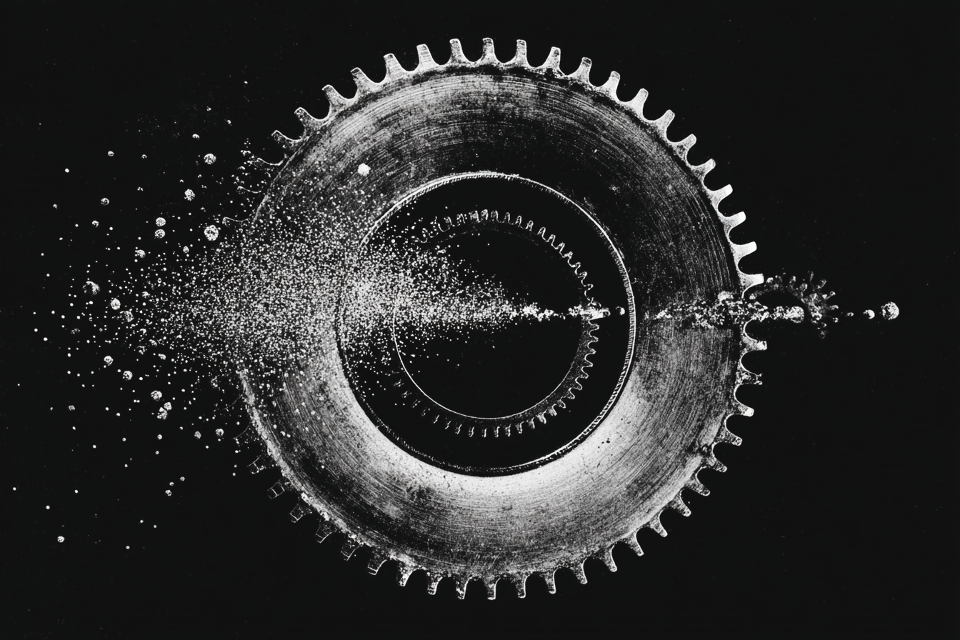
It’s satisfying to rearrange things with my hands to understand them differently. I printed key slides from my presentation and taped them up alongside all the visual inspiration, and eventually stumbled into the poster’s concept by adapting an image I made weeks earlier for the middle of the deck. It was right there in front of me.
What did you not understand at the start of the project that you understood later?
Making this poster reinforced that design needs to be attractive. That’s a very simple-minded realization, but I mean “attractive” in both senses of the word. Attractive as in beautiful, yes, but also attractive as in magnetic.
Part of my job is to create energy that pulls in people. It’s always felt narrow to say that design is problem-solving; there’s more to it than that. Design can inform, yet that very often needs to begin by seducing. That’s the aspect of design I find most fascinating.
If someone tried to tackle this project, what would they get wrong at first?
I think there are two modes of designing. The first requires specificity and clarity. That route would probably say that the poster should be about me, since, you know, it’s a lecture I’m giving. But this route was a dead end for this project and things didn’t really click until I got out of the way. So I took the second road, the other mode of design that runs on suggestion, excitement, and provocation. In these cases, the design’s value comes from its ability to be attractive and create anticipation for something that isn’t completely defined—it’s all built on the promise of possibilities.
Talk about a time when you were stuck or had a “creative block” on this project. What did you do about it?
I almost always start stuck and the first part of the process is letting go of my preconceived notions that are easy to dress up as experience or expertise. You have to work back to the beginner’s mind. Other than the recommendation from my friend, the second change that really helped was to focus on words instead of images.
There isn’t much text on the poster, but the talk does have a title. “The Eye Knows” is an unfortunate pun that I find funny. It gets to the tension between images and words: they both come in through the eye, but we absorb it all across two channels. The image for the poster clicked into place once I named the talk, because then I could have images and words sitting in a conceptual relationship with each other.
What surprised you about how this project evolved?
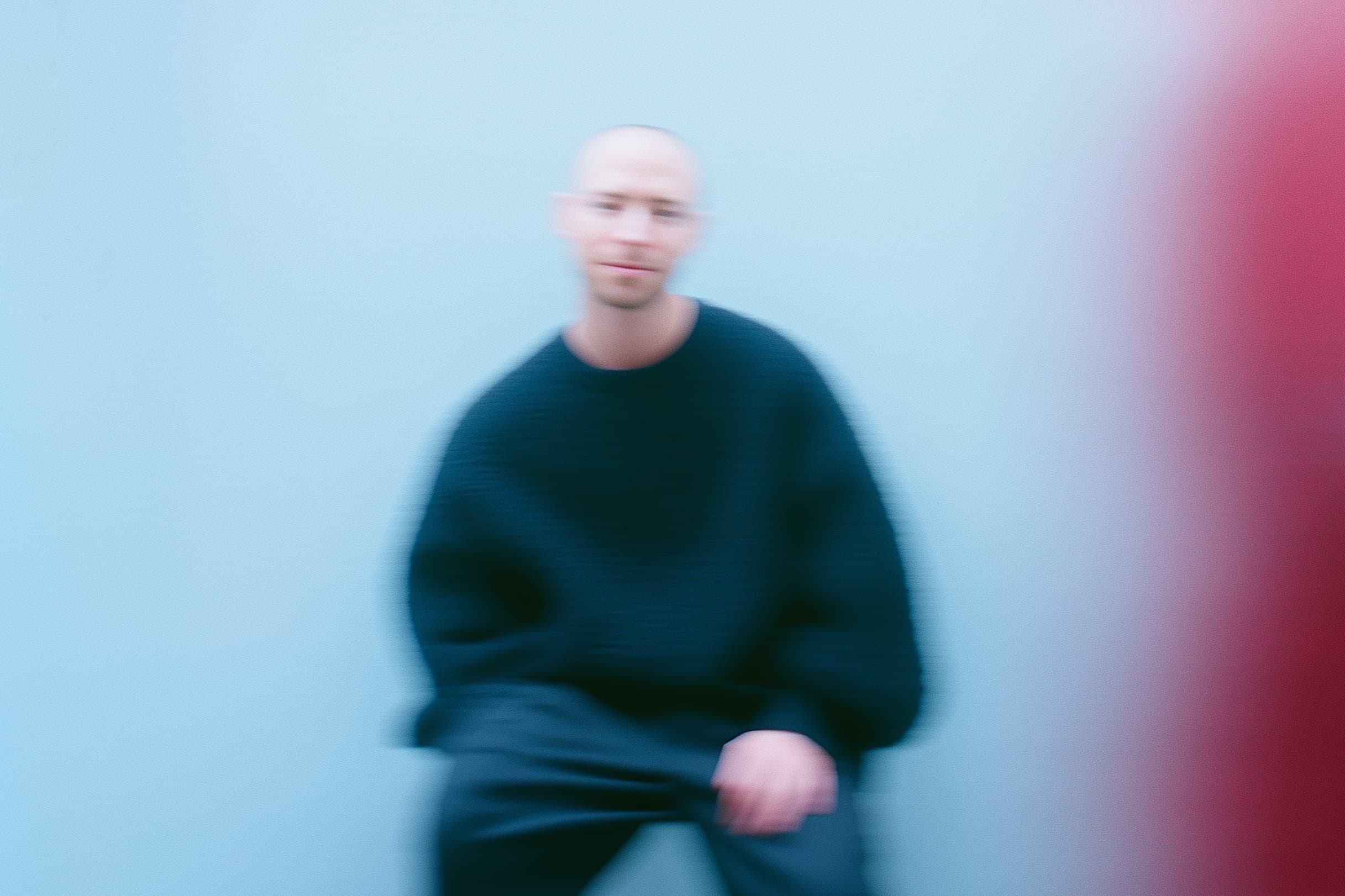
This is dorky, but I forgot how nice it is to work on something and have it look back at you! The last couple years have been a lot of branding and interface work for me, which means I’m mostly staring at colored rectangles all day. I love it, but those shapes don’t look back. There’s a face on this poster, and as I continued to refine the design, the energy it was shooting out became more real, more warm.
How did you know when you were finished?
On assignments like this, I’m a big proponent of “once through, cleanly.” You think about your idea, sketch a little, then put some glue in your chair and bang it out in one sitting. All of my best work happens this way: posters, collages, essays, outlines for talks, and so on. The work seems to be more cohesive and its energy more concentrated and palpable. If you sit down and what’ve made is bunk, you walk away, come back later, and start over. Nothing is kept but the memory of what went wrong. It’s a silly method, but it works for me. Once through, cleanly, because there are no half karate chops.
It’s probably irresponsible to work this way when other people are involved, and it is definitely no way to write a novel, but for my smaller self-initiated projects, this method has produced the greatest rate of success. It makes it so much easier to know what you’ve got while you’re working on it: the closer you are to finishing, the more difficult your enthusiasm makes it to sit down, focus, and finish.
Did this project change you at all?
Sure! Choosing how to represent yourself and your ideas is intensely personal. I’m still surprised I’m so happy with the outcome. Maybe I can value this design a bit more honestly because it feels like it came from somewhere else. It does a good job of capturing my attitude towards design: affable, intelligent, and clear, expressing some welcome charm.
