The Green Ray
On colorful boundaries
Last week, early morning, the sky flushed that fuzzy summer cirrus peach: I wake up inspired to send a brief newsletter with one nice idea. An admirable goal—let’s finally get to writing! But of what?
I walk to get coffee, and before stepping in to the coffee shop, a maintenance guy asks for help. He is painting over bad graffiti and needs assistance picking a paint swatch that will match the color of the wall. He is colorblind—could I help him pick? Yes. Absolutely. I am eager to help and feel verified in every designerly life choice leading me to this moment. The wall was a ruddy red ochre—the oldest color for walls if you go by cave paintings. We made a good swatch selection. He went off to his truck to gather his tools, and I went in to order my coffee. Black. More inkish, really. “Guess I’m writing about color,” I thought, so here we are.
I have been thinking of the opportunities in color: partially for my design work, partially as a way to add variety and stimulation to an experientially-limited pandemic year(s). Even boring things can be made somewhat interesting if cast in new colors. I sometimes fantasize about painting my apartment a variety of interesting colors—ochre? oxblood? ombré?—but find myself doubting my impulses and leering at my restrictive renter’s lease. My exuberance gets curbed and the walls stay a middle grey—a comfortable, but unpronounced 18% photo card grey, a color waiting for another color to happen.
I always believed that color with intensity, at scale, was beyond me. I’m not colorblind, but my lowest university grade was in color theory. I developed all kinds of justifications to avoid re-engaging with color on a deeper level. My ridiculous explanation for the terrible grade was that my professor and I disagreed about where orange stopped and red began. We would enter passive aggressive tugs of war over whether a color was red-orange or orange-red. I forgot his exact words in these contests, and I don’t remember much color theory, but I will never forget the exact shade of his red-orange face.
Color sits in a continuum—ok, sure—a spectrum, dictated by scientific fact, registered through personal experience, and ossified with shared cultural framing. That sounds fancy, but in short: “Red” is a vague term that is solid in the middle and hazy at its edges. Fights over redness always happen at the boundary of orange-red and red-orange, because the edges of definition are determined by all the stuff that makes other people fascinating, annoying, and real: their perception, their labels, their culture, their location.
Burgundy is a place, but it is also a color inspired by the wines of the region. Do people from wine country have more shades of red? Maybe so. But landscape and abundance can also deprive: over in the Aegean, the ancient Greeks spoke of wine dark seas, and some speculate that they (or Homer, at least) lacked a word for blue. This is peak irony: look at parts of Greece through squinted eyes and all you see is blue. We all want to believe that the blueful are the most naturally blueless. Like a fish in water, there is no identifying, nor making sense of, what completely surrounds you.
After 18 months of semi-quarantine, I should have many shades of solitude. Instead, I have one flattened, wine dark abyss.
I feel this same flattening effect as a lover of words who works in technology. The tech industry is where words go to die. It’s a tragic bit of irony: tech work is all abstractions, and those abstractions can only be considered and revised through precise language. But we are slobs and so poor at wielding language. I’m reminded of my color-blind painter friend. Except our deficiencies come from laziness (guilty) or violence—less nuance means fewer distinctions, and at scale this diminishes the imagination for other potentials. Parrot “red” enough times, then there’s no more red-orange, nor orange-red, and even orange is at risk. All that’s left is monolithic “red.”
The pandemic has given me a cynical distance to professional language—work words slough meaning in the dissonance of a world pretending it is business as usual in truly exceptional times of suffering. As an exercise, I started a list of meaningful distinctions, wondering how I could find a kernel of interest, truth, and personal resonance in the catch-all, vague, lazy words I despised. I am sharing my list after 18 months, because it has become a pocket-sized ethos, a dialectical approach where the separation of ideas makes each more coherent. It is a reminder that no matter how crudely we may label things, the actuality of a red-orange face, the peach of the sky, the whichever wine blue of the sea are all still there, waiting to be summoned again with the right word.
Meaningful distinctions:
- Profit vs benefit
- Simplicity vs clarity
- Success vs progress
- Convenience vs comfort
- Fun vs satisfaction
- Thoughts vs thinking
- Information vs knowledge
- Choices vs decisions
- Scale vs resonance
- Achievement vs influence
- Descriptions vs evaluations
- Expansion vs growth
- Consumption vs consideration
- Control vs initiative
- Happiness vs fulfillment
Midday, New York August, only sun and nothing else—all white and no color, blown out in that comically overexposed ’90s music video way. My inverted seasonal affective disorder hits in the summer and I can’t think straight. Body and mind feel like they are bombarded by too much information: too much light, too much heat, too much dissonance with other peoples’ affinity for summer. I am trying to write. Trying. I must wait for dusk, the golden hour—less light, more color, room to think. Time comes, and I walk toward the water.
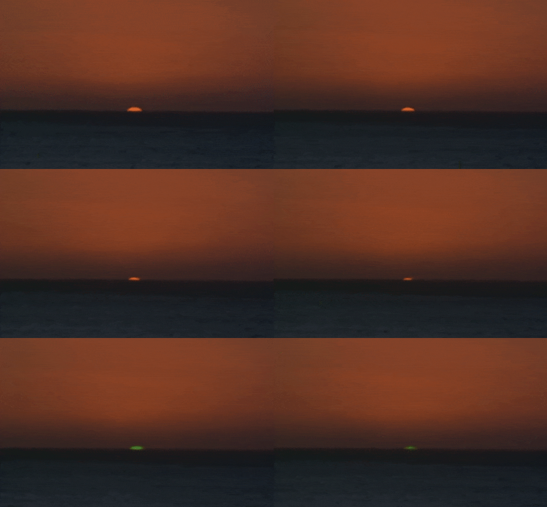
If you dig deep enough into the Wikipedia of quotidian things, you will eventually arrive at a page called “Mirage of astronomical objects.” This is the page to answer all seaside sunset questions. “Why does the sun look wobbly while it is setting?” “Why does the moon sometimes set?” The page also provides new names: the Novaya Zemlya effect, Jules Verne’s Etruscan vase, and, my favorite, the Green Ray. Imagine this: the top edge of a setting sun grazes the horizon before it disappears completely. At this point of connection, if the conditions are just right, light skews and inverts. For a brief moment, intractable white light splits into new color and new possibilities.
Late day, late August, ocean front, looking out: wine dark sea, red ochre sky, and at the boundary? From nowhere: chartreuse.
